Elke Claus’s career began at Rutgers University in New Jersey, where she worked in a professional print studio, The Rutgers Center for Innovative Printmaking. There, she collaborated with New York City artists in the creation of lithography editions. At the same time, she was an intern at the infamous Franklin Furnace, an avant-garde art space in Tribeca. During those years it housed the country’s largest collection of artist’s books, which she helped organize. These two formative influences have left her with a deep love for technical craftsmanship and the daring of non-conventional, contemporary artworks. After moving to Chicago, Claus became a teaching assistant at the School of the Art Institute of Chicago. She has taught printmaking at Lillstreet Art Center and The Hyde Park Art Center (both in Chicago).
Reevah Agarwaal: How did you get interested in printmaking?
Elke Clause: I’ve been interested in it since I was a kid. Back then I would take pieces of scrap wood out of our garage and cut into it with razor blades, making my first woodcuts. Later, I was lucky enough to go to Rutgers University for college and major in art with a concentration in printmaking. It was just kind of a natural thing; something I just fell in love with immediately. I ‘ve been a printmaker ever since.I came to Chicago to go SAIC (School of the Art Institute of Chicago), I also had a concentration in printmaking when I went there.
RA: How did you decide to come to SAIC?
EC: Because I wanted to expand my horizons and live somewhere else. I knew about the history of art in Chicago. I was really impressed with the tradition of non-conventional printmakers: people like Nancy Spero and Jim Nutt, both of whom went to the SAIC, so I was honored to be accepted.
RA: Do you think living in Chicago has impacted your practice?
EC: Yeah, especially Anchor Graphics and The Center for Book and Paper Arts at Columbia College. There are some opportunities here and a pretty big community of printmakers, but it’s not always the best place for artists. We don’t get the same kind of financial support or publicity here that we do in other cities. It seems like almost every artist I know who leaves Chicago is much better off for it. Still, there are an impressive number of printmakers here. During the Print Crawl in May, we saw an amazing diversity of people, a variety of artists and print shops. The bar of quality was just excellent. I don’t know any other city in the Midwest that has that.
RA: In your bio I read that you worked at the Franklin Furnace for a little bit…
EC: Yeah, that was a long time ago, that was the late 80s.
RA: How was that experience for you?
E: That was a great experience, it was a lot of fun, it was great too see how an alternative gallery space is run and this was at a time when they were a big deal and they were also in the news a lot for being controversial. There was a lot of discussion about censorship and the right to free speech that was constantly coming up because people were doing things like trying to shut down exhibits at the gallery. So, it was dramatic for sure. A lot of really interesting characters went through there because it was also a performance space, and a lot of the more avant-garde performance artists were really committed to promoting the kind of artwork that pushes boundaries and defies convention, and my work is not that unconventional but I’m so glad I had that experience because I learned so much.
RA: I think your work is quite unconventional, I feel like haven’t seen a lot of work like this around.
EC: It comes out of this tradition of pop artists and people like Rauschenberg and Lichtenstein and how they used printmaking to make products that in the end were more like paintings. They were so thickly layered, they were almost always one of a kind and things were not planned as meticulously as they are in a traditional print. I feel like nothing I do is a perfect edition and it really is more about the kind of issues that painters think about, creating depth and using layers and colors to create space, it’s very formal but the purpose is purely aesthetic.
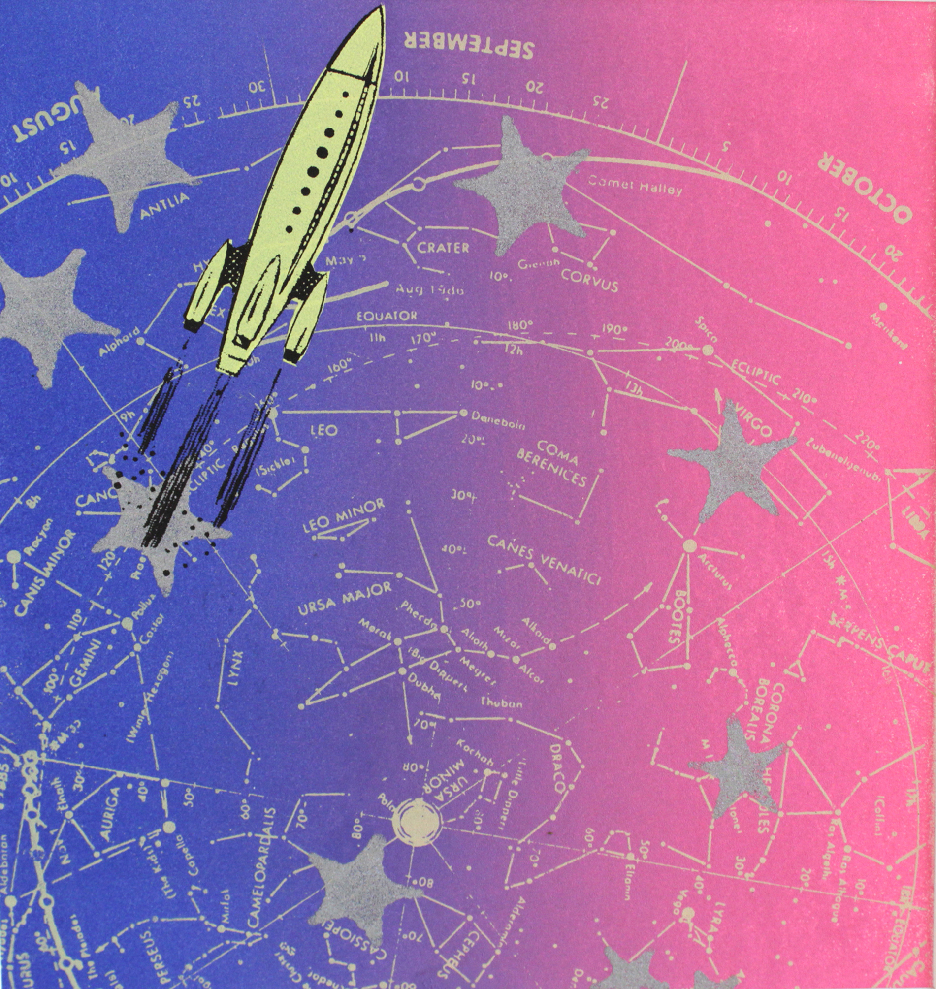
Yellow Rocket, Screenprint, 2015
RA: I noticed that there are a lot of references to science and space exploration in your work, can you tell me a little bit more about them?
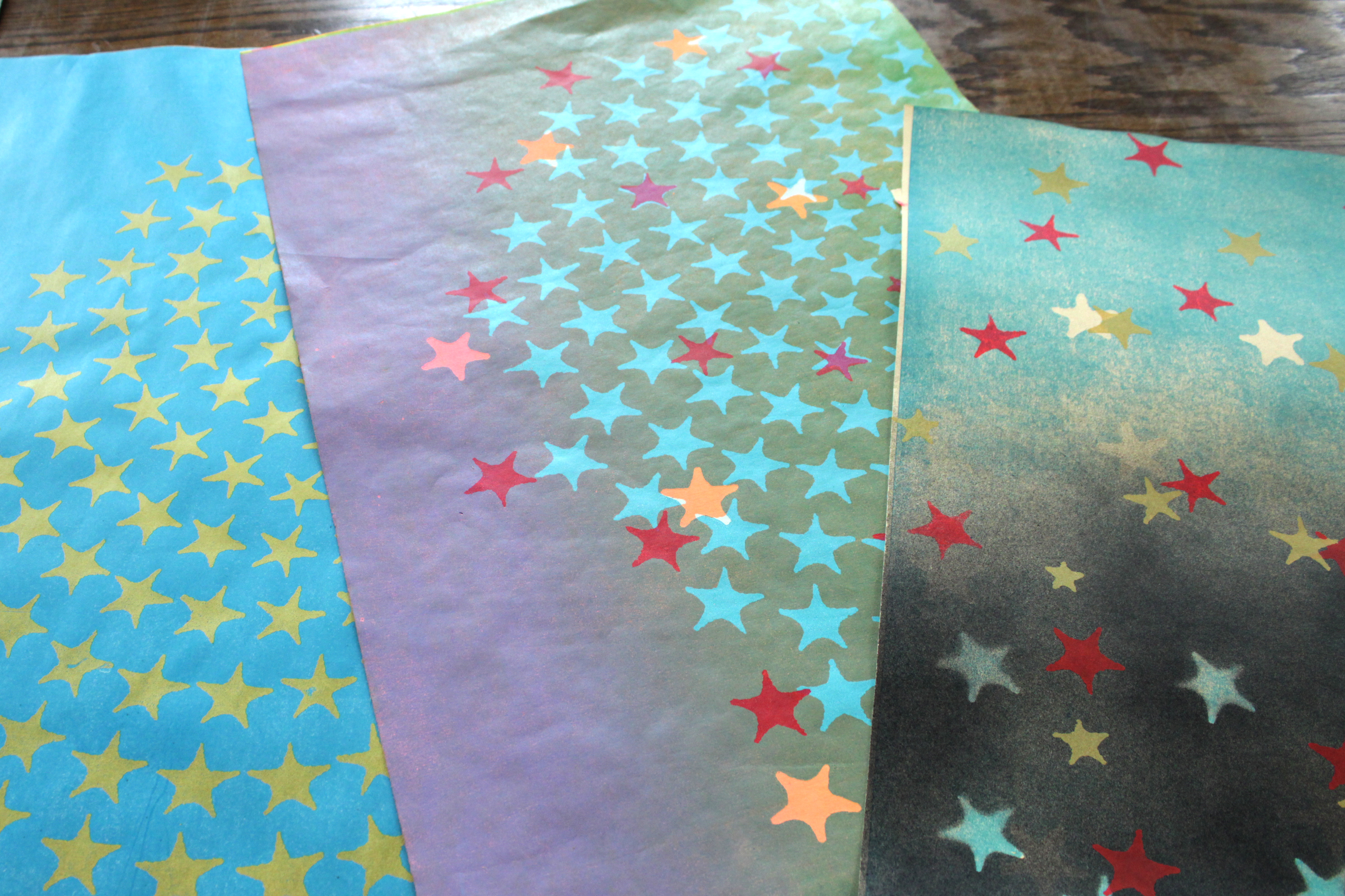
EC: I work with this imagery for a couple different reasons. First, the image of the sky is the most universal thing imaginable. There’s no cultural baggage with a star or a cloud. I’ve taken classes in astronomy at the Adler Planetarium and have researched and photographed art from their collection. I also collect old science textbooks. They have these illustrations that attempt to make visible the invisible. I find these images so fascinating, so sublime. They are a huge influence. Secondly, every surface I work on is an attempt to create depth; not a conventional perspective-based depth, but a cosmic type of depth. I want to evoke something like strata of atmosphere or the scene in the Flammarion engraving, which represents mystical space.
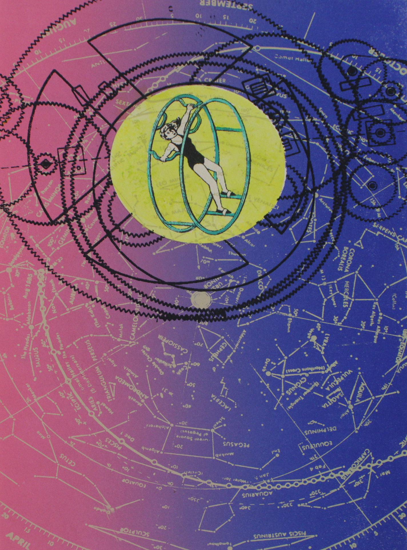
Celestial Cartwheel, Screenprint, 2014
RA: What are some other things that influence your practice?
EC: My love of printmaking, there is something about the technique that can be incredibly satisfying. The teaching I have done has informed my practice. I have always had interesting students, I feel like I learn as much from them as they learn from me. I’m inspired when I watch the struggle and the joy that they experience when they are creating
RA: Where did you teach?
EC: I taught one class here, which was a fantastic experience. It was the very first youth-based class they had at Spudnik, and Angee and I did everything from the ground up. We did a lot of research on grants and where to get money for the class, we were getting in touch with all the high schools in this area to help recruit students and let people in the area know that we’re here. It was a lot of preparation to get this class off the ground. It was a single class on Saturdays that went for ten weeks, we had about eight students and it was fantastic. I also taught at Lill Street, and the Hyde Park Art Center for nine years, that’s probably where I have worked the most consistently. I did teach one class, a really long long time ago at SAIC. I’ve taught workshops at a place in New Jersey called the New Jersey Center for Printmaking which is now called Frontline Arts and that was a really great experience too.
RA: How do you go about making your work? Are you a meticulous planner or do you go more by intuition?
EC: More off of intuition but there is a lot of revision in my work. I use printmaking not so much to create an edition but as an editing tool. I constantly revise whatever stencil or block I have and use different color combinations to get what I want. I think like a painter when I am printing. It’s all about constant addition and subtraction and just working with the canvas or paper until it looks right.
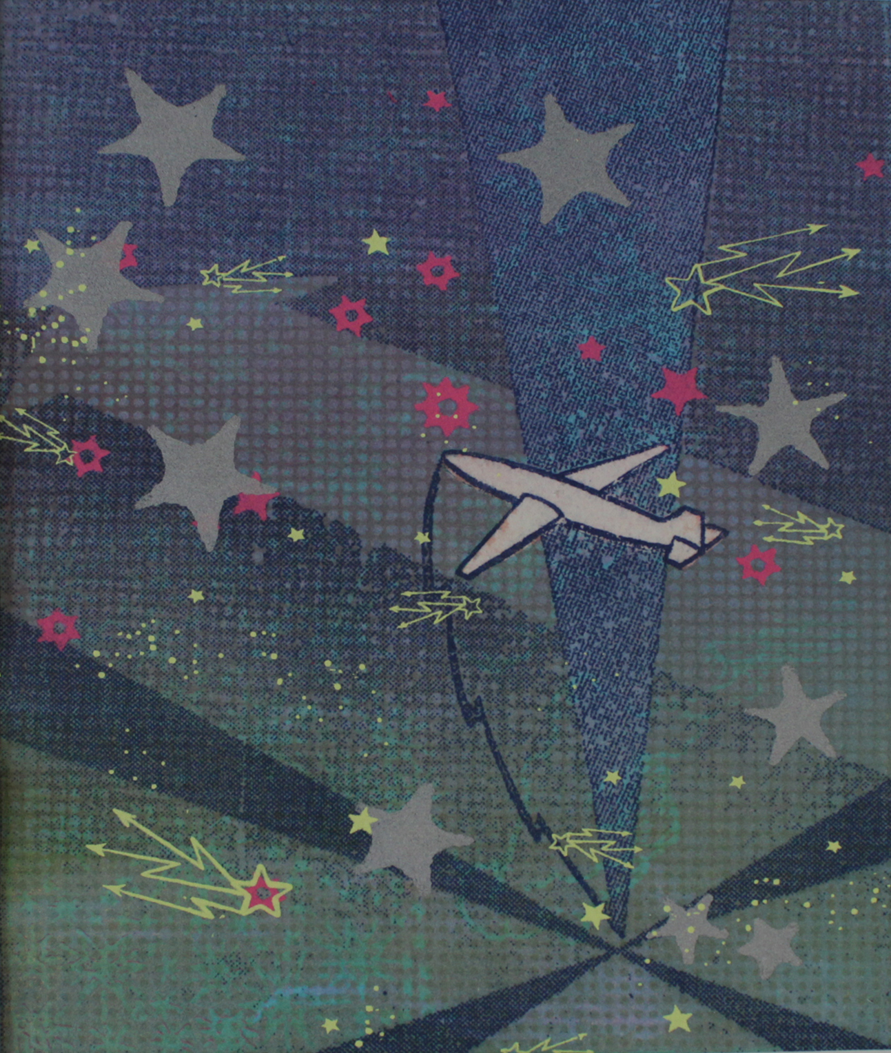
Plane with Radar, Screenprint with lithography, 2016
RA: I noticed that you integrate a lot of techniques in your work, how do you make decisions about what technique to use for what image or part of your print?
EC: That’s a good question, I layer oil-based and water-based inks in my work. This doesn’t always work but after some experimentation I found success. Basically it creates depth when the softness and transparency of oil-based inks form a background and the sharp, flat look of silkscreen is used in the foreground. I also experiment with cyanotype. It’s interesting how cyanotypes and gum prints are easily combined with silk screen, lithography and relief. I’m really surprised more people don’t do it, it looks fantastic.. There is just something about working with the chemistry of these alternative photographic processes that feels like alchemy, and the results seem magical sometimes.
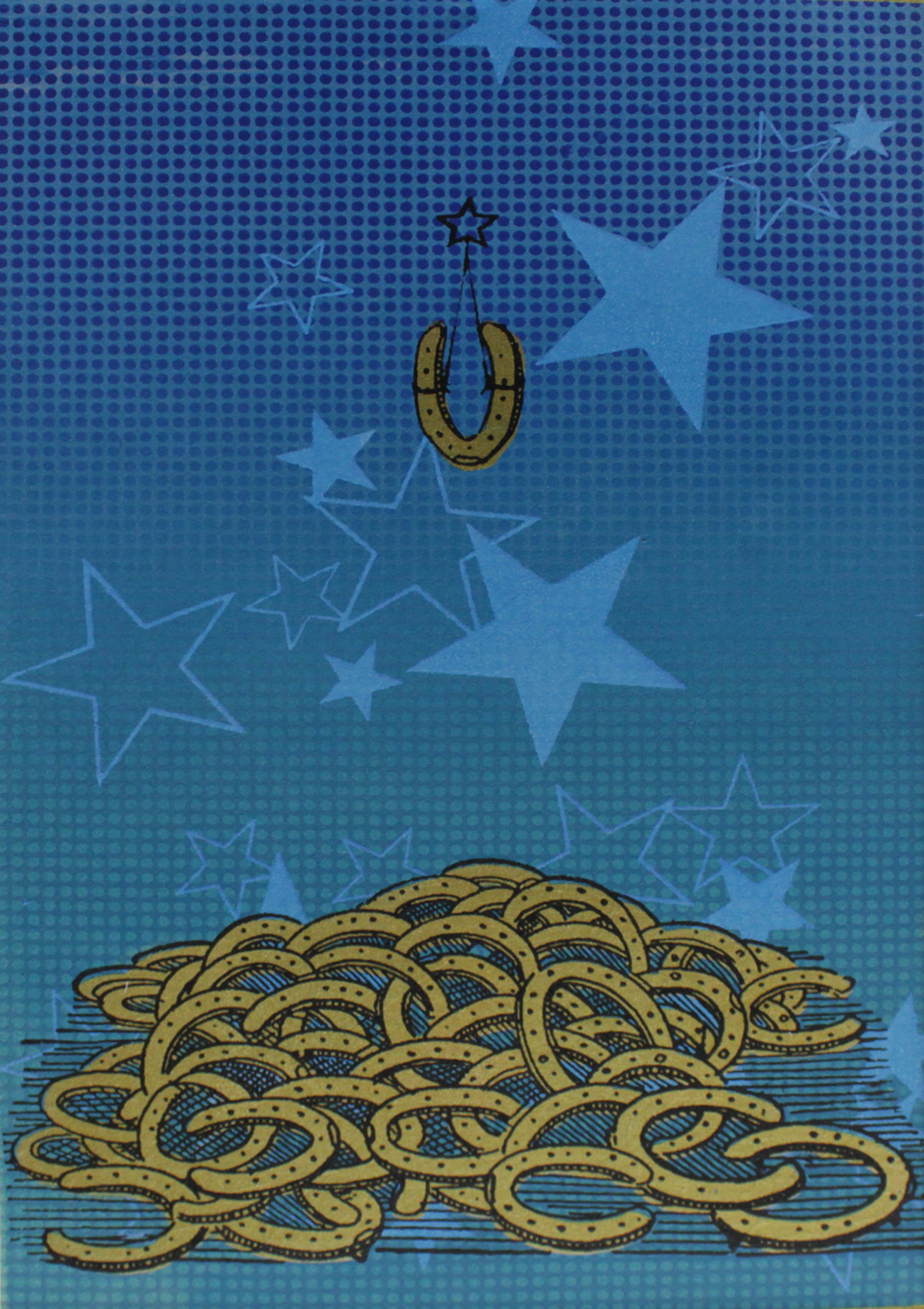
Lucky U, Screenprint, 2017
RA: Do you have an example of the cyanotype?
EC: Yeah! This is a cyanotype right here. The stars were cut out of rubilyth and then I did a cyanotype over it, so all of the dark parts are cyanotype. It gave these really crazy crisp edges and fine detail. This is a gum print, all of the background stuff here where there are the little specs of white on this yellow-green color. Gum prints are a little bit fuzzier and not as dramatic in color but with a gum print you can choose any color you want even though they tend to be a little less intense than the cyanotypes, much softer. I love playing around with both of them. This is a cyanotype but unfortunately this is on paper that is not the best quality so it turns more gray than blue. I love cyanotypes because no matter what you do with them it’s a sky color. If you’re doing something that is a landscape or has a sky in it, cyanotypes just create a very realistic looking sky tone that works nicely for creating depth specially.
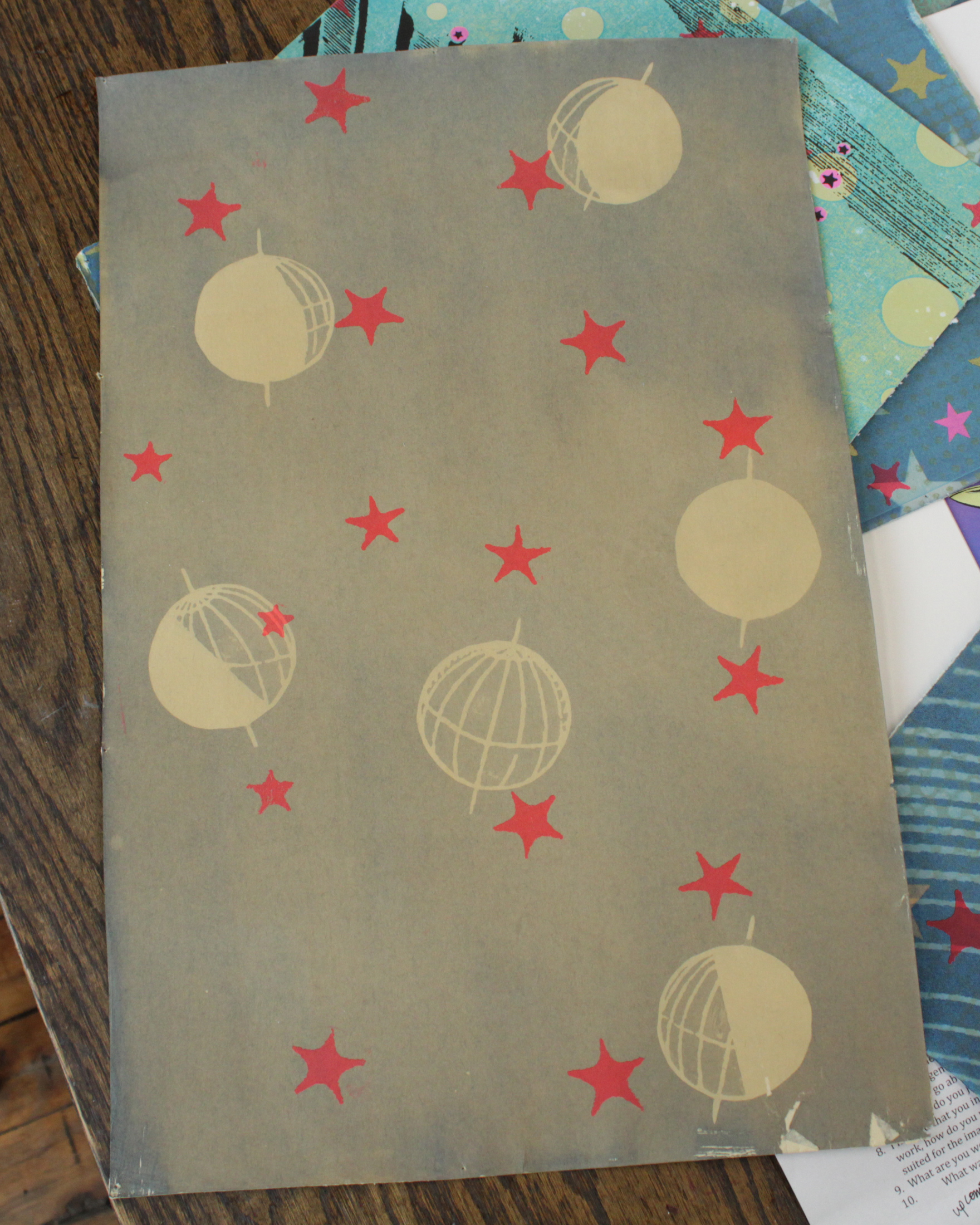
Example of a Cyanotype in progress
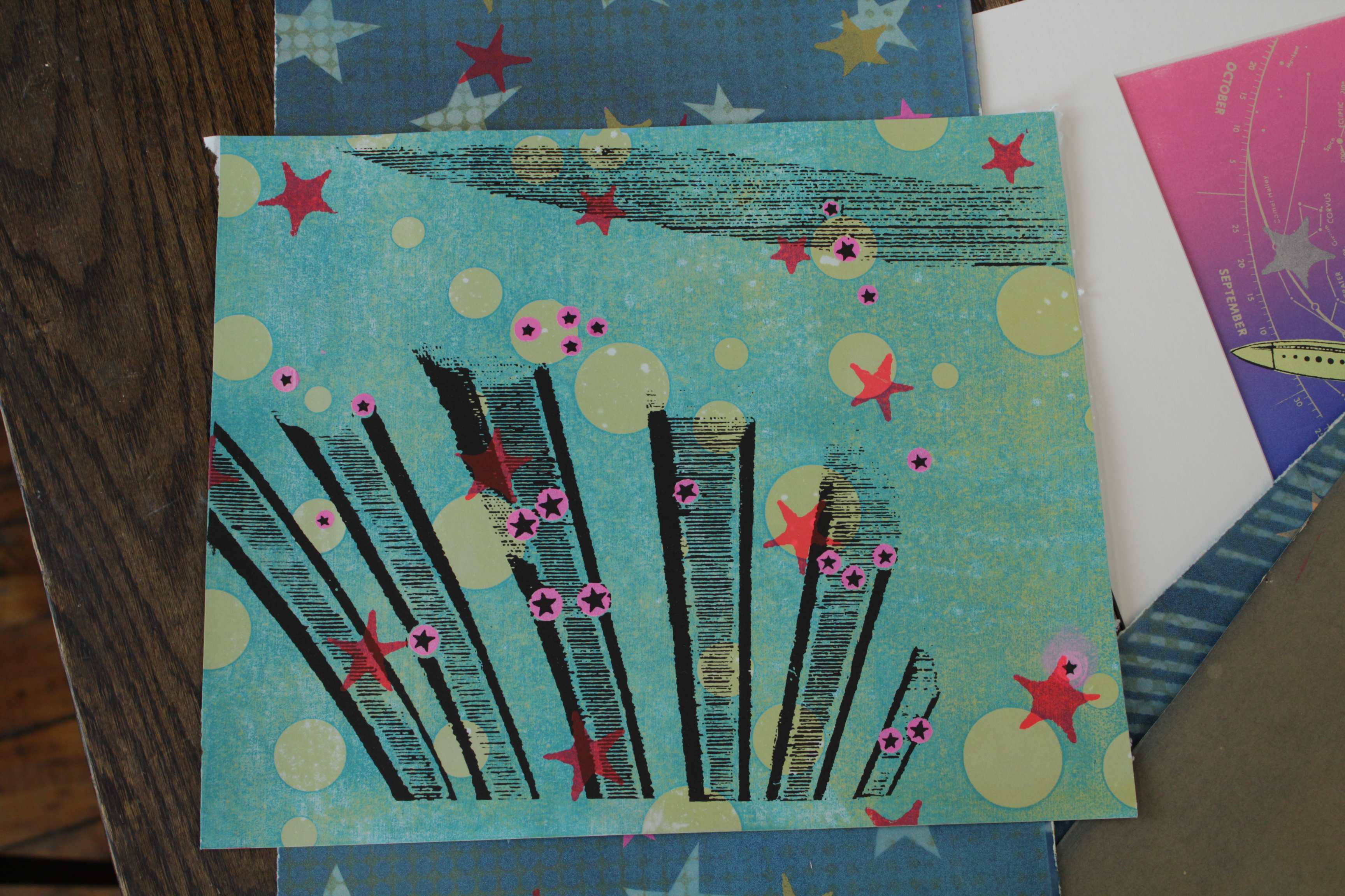
Work in Progress
RA: Your use of color is cohesive because there are a lot of common elements across your work like the pink and blue, is there a reason you’re drawn to these colors?
EC: I think that’s just something subconscious, I think there’s just something going on in the art world in general where people are really embracing color, and when you go to art fairs or flip through an art magazine a lot of the new artists are using a lot of really bright and intense color. In the 90s when I was going to art school it was exactly the opposite, very few people would have used a palette like this, everything was shades of ochre and lots of black and white. So I think I am subconsciously being affected by trends in the art world but a lot of it also has to do with my love of silk screen, and one of the things that’s very inherent in working with silkscreen is that you can get these amazingly bright colors. You can’t really get that bold, vivid color so easily in any other medium. You can’t get this fluorescent red in oil paint if you go to the art store, you can’t find it, it just doesn’t exist, whereas when you go to the silk screen aisle there is tons of day glow colors and they’re fun to work with. I also like, in this one, the vintage circus poster-look that using fluorescent colors gives a work of art. It’s something that is inherent in the world of silk screen, you can use these intense colors and they always look so good so might as well have fun with it!
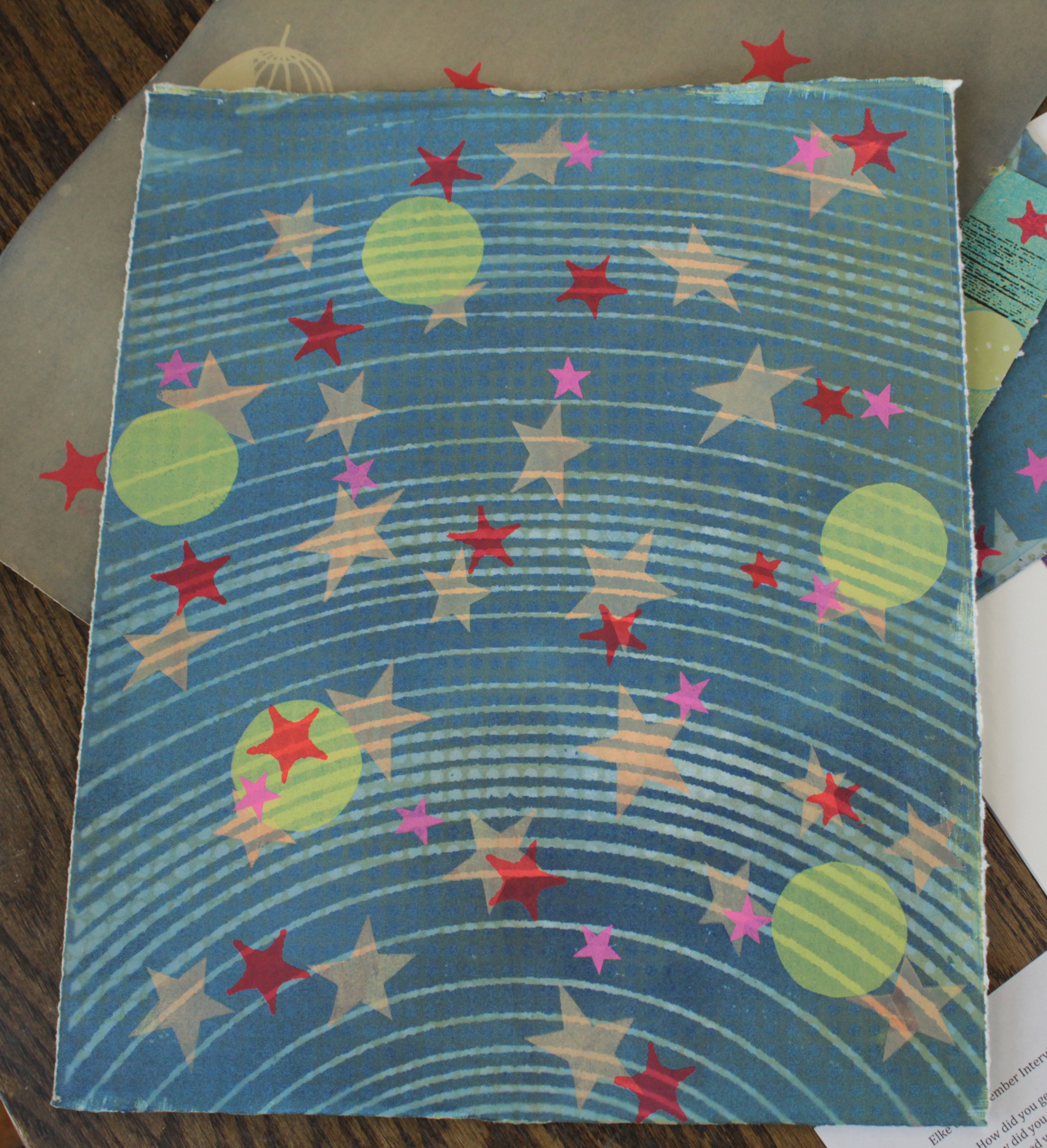
Work in progress
RA: Can you tell me a little about these works in progress?
EC: They’re about aesthetics, so I focus on formal qualities. It’s about creating depth and using balance, harmony, colors and layers to create a sense of vastness within a space that is actually flat and limited. I’m just trying to create a place of depth and mystery that elicits some sense of joy and wonder. I also want to celebrate all that is unique about printmaking. Everything originates from the hand of a printmaker, but is easily accessible to the viewer. I’m not making a message or trying to tell my life story. I just want these things to be beautiful. When somebody looks at my artwork, I want them to feel like they just heard a really good song on the radio. Art should offer that kind of simple pleasure.
Works in progress
RA: That definitely comes across, they’re very visually striking and beautiful to look at. Are these going to be in an upcoming show?
EC: No, I have an exhibit now that’s up for a couple more weeks. I’m just continuing to work on these. These prints are almost done but they need a little something to anchor them, give them focus and balance; but they’re pretty close to done.
RA: Where is your current show up?
EC: It’s at Morpho Gallery, 5216 N Damen.
RA: Great! What’s the best platform to keep up with your new artworks?
EC: Instagram! @elkeworks.art