Posts By: Studio Assistant

Member Interview: Margot Harrington

Margot Harrington is a visual artist working in graphic design, print media and painting. She is the owner and founder of Pitch Design Union. Her work explores the contemporary landscape of Chicago, as well as the Internet, intersectional feminism, gender identity, Japanese culture, Scandinavian design, Chinese medicine, meditation, and art in support of oppressed peoples. Her work aims to discover and uplift new role models.

Ali Tomek: To start, from looking at your website, your work seems to cross boundaries among fields like graphic design, illustration, and printmaking. How would you describe your work?

Margot Harrington: I mean, that’s a pretty great description. My degree is in fine art with an emphasis in graphic design. However, I do a little bit of everything. I have a lot of different interests. I’m more of a generalist versus someone who has a specific niche or very focused way of working. That’s how I’ve always worked, blurring lines across a broad range of mediums, which reflects my personality and keeps me from feeling too boxed-in.

AT: How do you find inspiration?

MH: The best answer is always, everywhere. I interpret this question as live a rich life. Say yes to things, go to concerts, go to shows. Sometimes I let myself work to the point of frustration before I step away.

I think a lot about this in terms of appropriation of cultures. For example, my dad and I, we used to email each other haikus once a week or so. Haiku led to Wabi-sabi, Japanese printmaking, and how Japanese people approach creativity in general. Obviously, I’m not Japanese, I am a white person, but I’m very aware of the privilege to learn about another culture and how important it is to be respectful of those historical practices.

Inspiration and appropriation are very closely related terms. Appropriation is rampant in the art world. That’s something I spend a lot of time thinking about for myself in terms of how to be respectful of other cultures and what is really meaningful to me: am I just borrowing for the sake of borrowing? I try to be super honest about it and approach it the best way I can.

AT: So what is it about Japan, specifically, that is so inspiring?

MH: Well, it’s a way of exploring my relationship with my dad. He passed away two years ago and studying Japanese culture helps me remember him. I will definitely say that he was appropriating Japanese culture in our home growing up, which I recognize now, but I learned about something different because of that. It planted a seed. I started to research all of these practices Japanese people have around making work creatively. There are terms for things that don’t exist in American culture that I think we could benefit from. Actually, there’s a few startups that have adopted some of these practices, with varying levels of success. One is the concept of Kanban, which is basically shorthand for defining your bandwidth to be able to complete or create a task. For example, do you have room in your Kanban for new work? It’s almost like efficiency is great to a point, but then you can become too efficient where you’re suffering or hurting yourself.

I also had a chance to visit Japan last year. I went there by myself for two weeks. In part, this trip was in honor of my dad, because he never went there himself, although he would have loved to. Also, I wanted to experience immersing myself in a place where I don’t know anyone or the language and where the culture is extremely different. You’re immediately labeled as an outsider.

AT: You mentioned printmaking earlier. How does your background in printmaking inform the rest of your work?

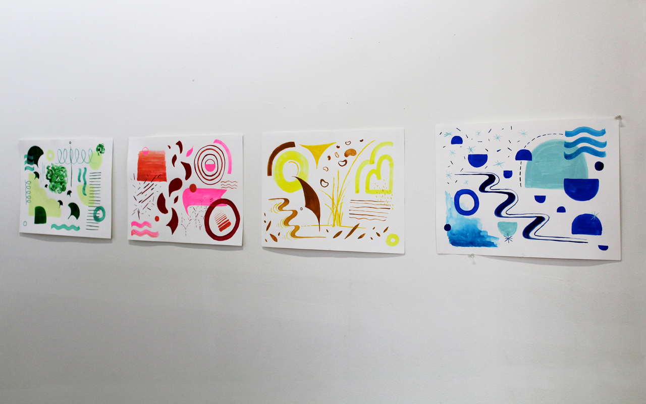
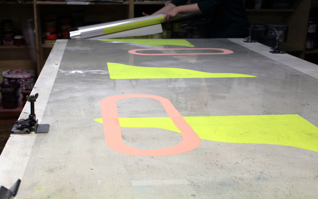
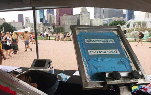
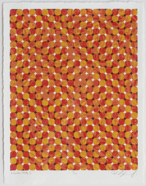
MH: The most printmaking experience that I have is in screenprinting, which is a similar approach to design in that you can collage a composition together and layer things. My work uses a lot of color, overlapping shapes, and abstract geometric forms, which I feel comes from a collage aesthetic.

The other thing that I didn’t mention is that I also paint. It looks similar to my prints when I’m finished with it, but sometimes painting to me is more urgent in that it doesn’t require as much setup or advance planning. You can just sit down and something comes out, which I find very helpful if I’m unable to make it to the studio. I can still do something with my hands that’s not on the computer.

I also always just loved vintage type and objects. I think that is what brought me to printmaking originally. I wanted to modernize a really classic traditional practice and do something new and fresh and vibrant with it. Also, my grandpa was a letterpress printer, which I didn’t know until after I started printmaking. It skipped a generation, but it’s in my blood.

AT: As someone who is studying graphic design now, I’m curious how you balance digital and physical making. Lately, staring at a screen for too long makes me a little sick.

MH: Yeah, it’s like you live your life by the glowing box. Like a weird episode of Black Mirror or something. I will say that I don’t always have a balance there. It’s not like I can have a perfect percentage or a perfect hourly breakdown everyday of what task I’m doing or if it’s on my computer or not. It still takes me a lot of discipline to be able to do both.

What I have at home — that’s my primary workspace — is a room with my digital desk, and then a similar version of my studio set up here at Spudnik. If I really need to, I step away from my computer for 15 minutes or so and do something else to keep my brain fresh. I also incorporate some illustration into my design work, so I’ll draw something, scan it, work on it in the computer, draw on it some more, scan it again — it’s somewhat of a cyclical process.

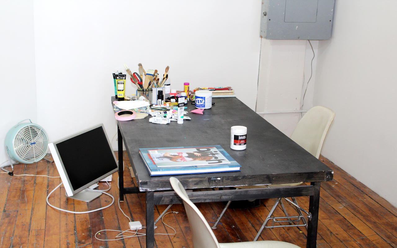
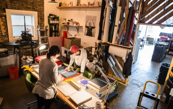
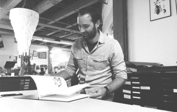
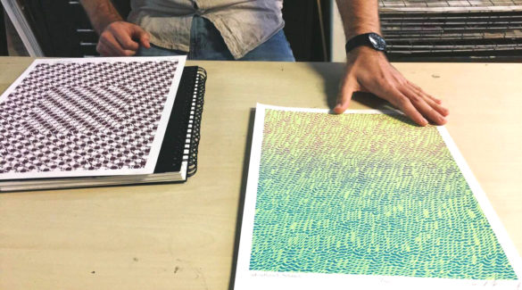
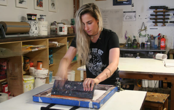
Harrington’s Spudnik studio.

And then here [Margot’s Spudnik studio], I really try to prioritize this space with my art, although as you can see I have another computer display on the floor. I take it off the desk most of the time because otherwise I just end up working on my computer. I try to visit my studio at least one full day a week and will come in more often if I’m working on a project. However, there are also some weeks where I’m just on a deadline and can’t do anything on the side.

Until I get paid as much to make paintings as I do for my design work or to build websites, they’ll be in conflict with each other, and I don’t know if that’s necessarily a bad thing. There’s always conversation about design and art and craft as these three opposing things, but I don’t think you really can’t have one without the other.

AT: Building off of that, I noticed a couple artist books on your website. I also make artist books and wondered how these fit into your practice? Additionally, how does writing and teaching inform your work?

MH: Through artists books, I can easily incorporate my painting, printing, and hand binding. It’s something I would love to do more of in the next year or two. I feel like I’ve fallen off that practice a little bit, but it’s super meaningful to me in that I also love publishing. Books were something I just fell in love with as a kid. I was one of those kids that always read, and my parents would tell me “Go, outside.”

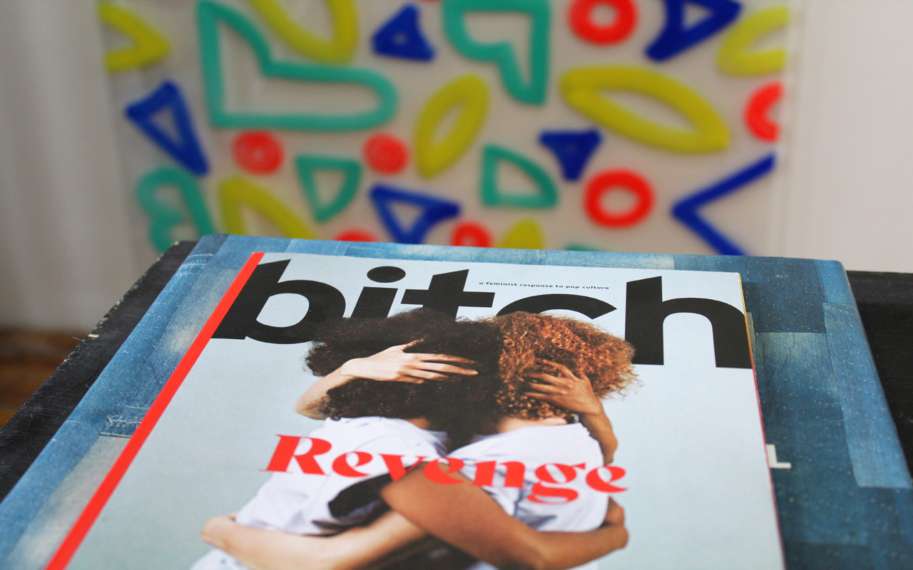
One of my main clients and I also produce a quarterly magazine called Bitch. This, I think, scratches the same itch as producing artist books. I don’t know where this project will ultimately lead us to, but I like that it helps me feel like I’m connected to a literary community, and I get to produce a three-dimensional object that reads like a book that deals with social justice issues that are important to me.

I think writing is another important component of bookbinding or printmaking or comics or zines. There’s a very strong connection between these things. Through an image, you can share or convey a feeling in a way that’s sort of universal, but because words are so specific, to really say something bold, you have to have a clear vision of what you’re trying to say. It’s like a main line to your brain. I have a lot of respect for writers that are able to be so vulnerable and share so much of themselves with the world.

Teaching is a way to give back. I think I have a non-traditional path as an artist and creative professional, which I like to share with students and hopefully they can take something away from my experience and apply it to their own life. Teaching also lends credibility to my work and to my practice.

AT: What do you think it means to be an artist in Chicago? Do you feel like you are part of a larger artist community?

MH: Yes and no. I love Chicago because there’s less ego involved with making work here, which I think is a pretty known thing about this city. People live here as artists because they just care about the work. They’re not trying to move to Berlin and be a famous, capital-A Artist (although Berlin is great, and if you need to be there, do you, boo). Chicago has a kind of blue-collar approach to visual work or working in service of something, which I really love and connect with a lot.

However, at the same time because the School of the Art Institute is such a big part of the artist community in Chicago and because I didn’t go there, I don’t feel like I belong to it. That can feel like a little bit of a barrier at times. Yet this doesn’t stop me from establishing meaningful connections with other artists, even those who are part of the SAIC community. It’s more just a perception thing.

AT: Your perspective on Chicago is really interesting because I just came back from New York. I was there for two weeks and wondered what it would be like to live in such a pressurized environment all the time. It was thrilling, but Chicago feels more approachable.

MH: I could have moved to New York and lived with my dad and stepmom. I could have figured it out, but it would have been a lot harder. I definitely made the right call in hindsight. You can take more risks here because the cost of living is much lower. That, to me, takes a lot of the pressure off. It’s possible I would live in New York now, but it would require a major job change or a residency or a commission.

AT: As I was preparing for this interview with you and reviewing the work on your website, I noticed your riso print The Certificate of Safe Space. It seems like some of your work focuses on social issues/concerns, which you also touched upon in regard to Bitch magazine Bitch. Is that an important theme in your work? Do you feel like art can help build a better world?

MH: Totally. The piece you referenced was done for a show where every artist was assigned a topic, and mine was sexual harassment in the workplace. This was a couple years before the Me Too movement. At that point in my career, I had already experienced what it felt like not to be respected in the workplace. I definitely felt a personal connection to it. The idea behind The Certificate of Safe Space is that in the same way that spaces have to put up their business license, this is something someone could put up in their workplace that would tell employees they’re actively involved with creating equitable, fair processes or systems that would allow people to be treated with respect in their workplace, fighting microaggressions, racism, gender issues — really anything.

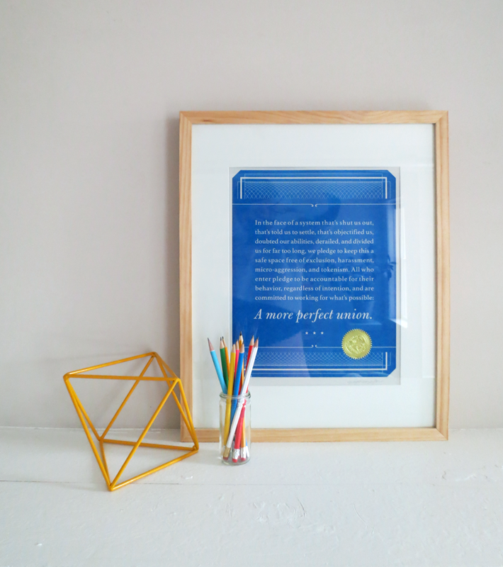
Harrington’s piece, The Certificate of Safe Space. Image courtesy of Margot Harrington.

The rest of my work is more abstract. You‘re allowed to project your own thoughts onto it. So when I’m projecting my own thoughts onto it, it’s always a mixture of what I would want to see in the future, but doesn’t yet exist.

A really concrete example of this is my painting, The Fifth Female President of Color. I knew the title of the piece before I had even started it. I created the painting in 2015 and during this time I wondered whether this was something that would happen in my lifetime. Because it’s an abstract painting, we don’t know who the person is, what they’re going to look like, or what the path is to get there. Despite this uncertainty, it’s a really happy, beautiful, and vibrant work. And while the results of the last election were not what I expected, I still believe that positive projection is really important in terms of manifesting what you want to see or be in the world.

AT: What are you currently working on, and where should people go to see your work?

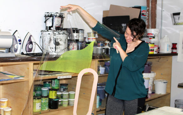
MH: Today I’m working on some acrylic and acetate pieces I’m printing on slash painting on to use as photo shoot props. Also since the contract I have with Bitch is all year, we have one more issue left of the magazine that’s going come out in late fall.

Beyond that I have a couple feelers out for a mural that I’m still working on finding a location for. I ended up doing a small crowdfunding fundraiser for it since this type of work can be expensive. I’m hoping to secure a space and wrap up the project before the year is out.

AT: Awesome. And then a fun question: what are you currently reading?

MH: The book I’m reading right now is by Samin Nosrat. Salt Fat Acid Heat is the title. It is a cookbook, but not in traditional format. It teaches you how to cook and then sets up the variable types of dressings or flavor profiles to build your own recipes. The recipes are open-ended. Before bed, I read a couple pages. Usually I’m reading all sorts of things, but that’s the only one right now.

If you want to find out more about Margot and her work you can visit her website or follow margotharrington on Instagram.

Chicago Print Crawl Spudnik Member Art Market

Sunday, June 24
12pm – 8pm

$12 Full Table
$8 Half Table

This opportunity is for members of Spudnik Press only. If you are not currently a member please join or renew prior to signing up.

Members! This summer we are very excited to be organizing a super fun all Chicago event, the Chicago Print Crawl. The crawl part includes a self-guided tour of printmaking production, publishing, exhibition and sales venues throughout the City of Chicago. We’ve already got more than a dozen stops on the tour. Naturally, Spudnik is one of them.

The Chicago Print Crawl takes place Sunday, June 24, 2018 from 12-6 pm with an after party for all the venues and participants from 6-8pm.

The Spudnik stop will include shop tours, print activities, and a parking lot party with music, food, and cold beverages. Most importantly though, is the opportunity for you to show and sell your work.  The art market portion of the event (and After Party) will be located at the beautiful new Low Res Studios on the first floor. Air-conditioned and no worries if the weather is crappy. We look forward to highlighting the member participants as we promote the event.

The fee covers the cost of a table and a chair. Artist are responsible for their own signage, sales, packaging, etc. If you want to bring a friend to work the table with you, you’ll want to bring that second seat.

To Participate:

  1. Pay the full table or half table fee online. Spaces are first come, firs serve.
  2. Send us your links and handles: Send us an email with your website and social media handles.
  3. Look for an email with more details about how to help promote the event.

Save the Date: Chicago Print Crawl

This year, we are very excited to introduce a fun new summer event (drum roll) the Chicago Print Crawl! The Chicago Print Crawl is self-guided tour of printmaking production, publishing, exhibition and sales venues throughout the city of Chicago.

Sunday, June 24

12-6pm, 6-8pm after party

Naturally, Spudnik will rock our spot from the parking lot to the third floor with a food trucks, cold beverages, a member market, shop tours and print activities. Escape the heat at Low Res Studios at 6pm, when the member market turns after party!

Details to come, stay tuned!

Behind the Chili Interview Series: Candor Arts

Candor (pronounced kan-der) is the quality of being open and honest. Candor Arts publishes books about life, learning and healing. Operating on the basis of open and honest communication, the efforts of the organization are rooted in the support of its affiliated authors and collaborators. Specializing in handmade artist book editions, Candor Arts produces a range of design and print projects driven by each artist’s vision.

As a returning chef, we asked Matt Austin if he’d share a little more about their work and, of course, their thoughts on chili.

SP: Candor Arts always seems to be experimenting with economic models that are pushing a more equitable agenda. Was this emphasis on a alternative funding models with a bit of a moral overtone part of the plan from the beginning or something that has evolved out of need or trial and error?

CA: It has certainly been an evolution—I see any current existence of ours as a response to the circumstances we exist within, as well as a culmination of our learning through experience operating as a small institution. I think our model has been built partly in necessity to sustain our work without being so vulnerable to abrupt losses of support, like inconsistent/unlikely grant opportunities or the uncertainty of finding individual donors, and partly in observing the overall lack of financial support and equity for artists in America.

SP: Where did you get your mad bookbinding skills?

CA: A guy named Sage Reynolds on YouTube. He is an excellent teacher, gentle man, and does not require student loans to learn. 😉

SP: Do you have a favorite style of bookbinding? If so, why?

CA: Not necessarily a favorite style, but I think my favorite thing to make is complicated clamshell boxes. I think there’s some kind of madness to it, like you might mess this whole thing up in one small mistake over the course of hundreds of moves made to put it all together.

SP: What book(s) are you reading right now?

CA: An Indigenous Peoples’ History of the United States by Roxanne Dunbar Ortiz, Five Fifths by Growing Concerns Poetry Collective, 11 poems for addicts/normal people by Justin Nalley.

SP: Can you tell us a little about your newish studio space?

CA: Yes! We have a nice nook in west Logan Square (3520 W Armitage) where we do much of our in-house bookbinding, foil stamping, and some digital printing. We share the space with talented awesome artists April Sheridan, Daniel Mellis, and the boys of Ghost Press: Ryan Troy Ford, Cooper Foszcz, and Josh Davis.

SP: What is the key to great chili?

CA: Consistency.

SP: Name something people should not put in chili, but do all too often.

CA: Too much heat.

SP: Who is one person, living or dead you would have over for chili and why?

CA: Gerhard Steidl, so we can critique the chili in our lab coats.

SP: Do you have a favorite chili story?

CA: True confession: I don’t think anyone will ever top the legacy of Cowboy Mustang Jane’s Flamin’ Hot Freedom Chili from the 2015 Hashbrown Cook-Off, but we will continue to try.

The Hashbrown Show Down:
Spudnik’s Rootin Tootin’ Fair & Chili Cook-Off

Saturday, February 24, 2018
5:00 pm

Reserve Your Tickets


Behind The Chili Interview Series: Fata Morgana Press

What exactly is fata morgana? Simply put, it’s a mirage. More specifically,  it’s an unusual and complex form of mirage that is seen in a narrow band right above the horizon. These rapidly changing mirages significantly distort the object(s) which they are based on. Often times making the object completely unrecognizable.

Fata Morgana Press is the studio of Mary Clare Butler and Amy Leners. They embrace all forms of craft from the traditional to the experimental. This interdisciplinary practice allows Mary Clare and Amy to constantly shift their approach to traditional craft, making the outcomes unique and unexpected.

Come February 24, Fata Morgana Press will present their manipulation of vegetarian chili for our consumption at The Hashbrown Showdow: Spudnik’s Rootin’ Tootin’ Fair & Chili Cook Off! Or will it just appear to be vegetarian chili?

Read on to learn more about Fata Morgana Press in the second installment of our pre-Hashbrown interview series:

Spudnik Press: How did Fata Morgana come to be? What does Fata Morgana do?

Fata Morgana: Fata Morgana began when Mary Clare and Amy were finishing grad school at Columbia. While working in the papermaker’s garden together, they began to plan a future studio. When they saw the press listed for sale in Chicago, they jumped at the opportunity. Luckily and they were able to rent space in the Chicago Sustainable Manufacturing Center alongside bike frame builders, woodworkers, puppet makers and other craftspeople. Since then, they’ve collaborated on papermaking and bookbinding workshops, broadsides, music packaging, and posters, in addition to producing their own work. Last year, Angela Davis Fegan joined the studio, where she prints the Lavendar Menace Poster Project and maintains an active studio practice.

SP: Where did the name come from?

FM: MC was reading The Yiddish Policemen’s Union when they were trying to think of names for the new venture and the phrase just kind of leapt out. Upon further investigation, the two discovered it was the term for a complex mirage named after an sorceress who used witchcraft to lure sailors to their deaths. They decided it was a fitting name for a studio run by women with an experimental approach to traditional craft.

SP: You’re a returning chef and you competed in our Printing Dash competitions over the summer. Do either of you play competative sports? Or strategy games? 

FM: Hell no. Unless bowling counts. We just take chili very seriously.

SP: Last year’s chili was quite delicious. Will you be working from the same recipe or trying something new? 

FM: We received some secret chiles from a friend so we’re working on a new recipe that incorporates those!

SP: What is the Chicago People’s Library?

FM: Right around the time Amy and Mary Clare were starting the studio, they met Courtney Bowles and Mark Strandquist; their People’s Library Project was featured in the Social Paper show curated by Jessica Cochran and Melissa Potter. While making paper from deaccessioned library books at the show, they got to talking to Sulzer Regional Library’s local history librarian, Julie Lynch. With Courtney and Mark’s blessing, they started a Chicago chapter of the People’s Library. They’ve held ten-ish workshops at the Sulzer and South Chicago branches of the Chicago Public Library, as well as the Chi Teen Lit Fest, where participants made paper, bound books, and recorded their experiences and memories of Chicago. The books were displayed at Sulzer with plans to circulate across the city.

SP: Many thanks Mary Clare and Amy! See ya at the Show Down! 

The Hashbrown Show Down:
Spudnik’s Rootin Tootin’ Fair & Chili Cook-Off

Saturday, February 24, 2018
5:00 pm

Reserve Your Tickets


Behind The Chili Interview Series: Barrel Maker Printing

As we gear up for the Hashbrown Showdown on Saturday, February 24, we are excited to introduce a few of our featured chefs in a series of interviews. First up: Barrel Maker Printing!

All the cool kids screen print their own t-shirts. If, for some reason, that’s not possible the cool kids get their shirts printed at Barrel Maker. Just glance at their Instagram feed (@barrelmakerprinting) and you will know it’s true.

The folks at Barrel Maker are some of the coolest and most creative that we’ve known in the world of Chicago screen printing. Even though their presses are now based in Elk Grove, they keep a foot in Chi with a remote office in Logan Square.

We asked Zach Corn, VP of Sales, a few questions to acquaint those that have not met Barrel Maker. While we can speak to their caliber of awesome, you’ll have to come out to The Hashbrown Showdown to gauge the caliber of their chili.

SP: Where did the name Barrel Maker Screenprinting come from?

ZC: The Owners’ first kid was named Cooper, named after Agent Cooper from Twin Peaks. Since a Cooper is someone who makes Barrels, they figured it would be a cool Ode to Cooper.

SP: Who will be the lead chili chef? How did they earn that honor?

ZC: I’m actually going to be the lead Chef on this journey. My wife and I have a few chili swaps every year and it isn’t a huge departure for me to make some chili and sling it to some friends.

SP: What is the craziest or weirdest event that you’ve done live screen printing at?

ZC: Lollapalooza was pretty crazy just with the amount of people there and the format. We also did one at an opening event for a climbing gym. People really enjoy seeing printing happening. You can easily take the process for granted when you see it every day.

SP: Do you have a pet peeve regarding file prep? If you could give one tip to our artists about how to better prepare their file for printing, what would it be?

ZC: I don’t like when files are Untitled.xxx. Just call it something. And keeping everything on one artboard and not giving just the art that is needed. If the preview is of something we aren’t even printing, it could be cleaner. In the end though I’m usually just happy people are working with us.

SP: Thanks Zach! And for you cool kids that print your own shirts, check out Barrel Maker’s line of eco-social-friendly apparel, Allmade.

The Hashbrown Show Down:
Spudnik’s Rootin Tootin’ Fair & Chili Cook-Off

Saturday, February 24, 2018
5:00 pm

Reserve Your Tickets


Member Interview Series: Carla Fisher Schwartz

Carla Fisher Schwartz is a visual artist and educator based in Chicago, IL. Her studio practice investigates the relationship between the mapped image and contemporary notions of exploration, virtuality, and the simulated environment through print media, sculpture and video installation. Carla received her MFA in Visual Arts from Washington University in St. Louis. Her work has been exhibited at the Chicago Artists Coalition (Chicago, IL), Hyde Park Art Center (Chicago, IL)and the Kemper Art Museum (St. Louis, MO) among others.

Martin Feld : To get started could you tell me a little about yourself and your work?

Carla Fisher Schwartz:  Sure. I’m from California originally and came to the Midwest for Graduate School in Missouri and then ended up in Chicago. I took my first printmaking class in my sophomore year of college at the University of California Santa Cruz. They have a large lithography, intaglio, and relief studio overlooking the redwoods and the pacific ocean. When I first walked in, I instantly knew I wanted to stick around. I worked on my prints throughout college and afterwards interned at the Kala Art Institute in Berkley, California. Shortly thereafter I moved to Chicago for grad school. Right now, I would say my work has turned into many different things, but it’s definitely informed by the same thought process that I developed in my printmaking classes.

MF: Thinking about the work that does make use of print media, could you talk about the forms you are making with Binder’s board and speak to the shift from screen printing to using inkjet for those?

CFS: So I actually started those when I was a fellow at Spudnik in 2015. I was printing these open source textures for use in world-building video games, also known as sandbox games. I played these games in earlier iterations, such as SimCity, when the textures were pretty low resolution. While screenprinting the textures I experimented by turning them into more ambiguous forms, distorting them further and using halftones, without necessarily knowing what I would ultimately do with these. Eventually, I just cut one up and started folding and gluing it and that turned into a really fast way for me to work because I had access to screenprinting. I could print as many as I wanted without having to worry about technical specification. I let the process degrade the image instead of having to intentionally do it on a computer. At that time, I was just using paper to create these forms, so they had no support system and they would sink. In an effort to make them more archival and to be able to go bigger I switched to Binder’s board and started to use ink jet prints. This allowed me to work larger, and as quickly as I needed.

MF: Going back then, I was curious how your familiarity with printmaking informs the work that doesn’t fall within print media?

CFS:  The way I think about it is that the first art medium you learn is going to inform the way your brain works whether or not you keep on doing it. So with printmaking I’m thinking in terms of variability and testing variables and this often carries over into my other projects. For example, when I’m making a video or working on an installation with found objects, I’m still doing the same thing I might do with an intaglio plate. I apply the idea of a matrix being variable to my work, regardless if it’s a digital file or and installation. It may not be explicit in the end, but thats how I work through an idea. I also think printmaking informs how I think about images. I think of what happens when we multiply an image and how does that gain or hide its power? That definitely conceptually informs everything I do.

MF: In that realm, you are looking at older maps that are being produced with various printmaking techniques and I’m curious how your tactile understanding of producing those maps informs how you look at them?

CFS:  Well, I suppose there are certain conventions and styles of early print ephemera and mapmaking, for example, hand painted lithographs, that inform what I do. For a time, I was making images that were mimicking 19th-century print ephemera, like scientific and diagrammatic reproductions. When you look at that kind of image, you read it as a certain degree of truth. So there is some kind of authority there that comes with those aesthetic conventions.

MF: Thinking about truth, one of the things I was really interested in while I was looking at your work is the idea of “un-discovery” that you explored in an older series, We Do Not Profess to Construct Planets, and it seems to be a thread that is still evident in your art work? That was the first time I had ever seen that term. Could you talk about “un-discovery?”

CFS:  I don’t think I made it up, but it’s not a term that people necessarily use. In the age of discovery, exploration, and colonization, there was adding. The adding of places, adding of territories and adding of landmasses to the map, and then after there had to be the process of “un-discovering,” or removing from the map. For example, removing Atlantis from the map, or acknowledging that California isn’t an island inhabited by Amazons. So there was this simultaneous process of “un-discovering” happening in a time period we tend to associate more with the act of ‘discovery’. The reason that came up for me stems from a project I was doing about Sandy Island, a nonexistent island in the South Pacific, that spans many different works. In the case of Sandy Island, however, it’s not a unique event. That kind of thing used to happen all the time; removing an island when it was determined to not exist. What is interesting about Sandy Island is that it was removed in 2012, at a time in which we have become accustomed to that not happening anymore, which makes us question our confidence in satellite imagery as an authoritative representation of the world.


MF: In that realm and thinking about Sandy Island Travel Bureau, I was curious about the role that fiction plays into your work.

CFS: Oh, I love fiction [laughter].

MF: What is your working process like in relation to fiction, especially with something like Sandy Island Travel Bureau that is fictitious but very much real in its fiction?

CFS: I’ve always been very interested in the blurring of fact and fiction. One of my favorite examples of artwork that does that well is the Museum of Jurassic Technology in Los Angeles. It’s a project by Dave Wilson, where once you are inside this museum, you’re never quite sure if the information in the exhibitions is factual or not. As a viewer, I love that kind of experience. The museum appears to present fiction as fact and then gives you information that is true, but seems like it is fictional. I think, in terms of my work, I’ve always been interested in how something that is fictional, like a place that exists on a map but not in the world, is in a sense real, because representations like maps very much inform our experience of the world. So for me, the line between fact and fiction, or physical and virtual, is indistinct. I enjoy artwork that uses tropes of science and museums to convey authority; Mark Dion, for example, does this so well.

MF: You toy with these ideas that have become absurd, like the mapped islands that don’t exist. I thought that piece were very funny in a certain way.

CFS: Thank you. That’s what I want.

MF: Can you talk about the use of humor in art and you’re approach to using humor given the difficulties it presents in terms of clear communication?

CFS: I I think there should be more funny art [laughter]. I guess I really enjoy funny artwork. Sometimes I struggle with this and feel this impulse that humor needs to be separate from art – that in order to have work that makes effective arguments and communicates ideas, my work should be serious. Yet it’s something I really try to emphasize in my own practice and really enjoy in other artists’ work. I think absurdity is a really effective tool for poking or exposing conventions that we have become accustomed to.

MF: Yeah, I’m a big fan of humor in art. I think of the ways in which humor is hard to control. The difficulty of knowing exactly how it works makes it a useful tool.

CFS:  That’s definitely something I’m still learning: How to not only make something funny, but make it funny in the way that I want to be funny.

MF: Thinking about being a virtual explorer and traveling across the globe from the comfort of your couch, how does that relates to your local context here in Chicago?

CFS:  In terms of the physical space of Chicago, it’s a place that’s full of hints of what the city used to look like. Even in little ways, hinting at how the street level of my neighborhood was originally at a different elevation, or the changing coastline of the city. When you walk around, you get these reminders of the city’s transformation. They are like traces of the invisible side of Chicago, and not totally apparent but really fascinating to me. I think it’s all part of the way we think about a place. A place is not just what it looks like; it’s all these stories, myths, maps and contexts that are layered within a place.

MF: Do you ever go around Chicago in street view using Google Maps?

CFS:  Oh yeah, all the time. You can do more now with the current Google earth. A lot of this work stems from me asking myself: is what I’m doing actually exploring in any way? What’s the space that I’m exploring? I know I’m not alone in that hobby. I’m a fan of physically traversing a space virtually and the slowness of the street level interface, while still being, of course, much faster than walking.

MF: As you mentioned, you were a studio fellow here at Spudnik in 2015. What were you doing while you were here? How was your practice influenced by your time spent here and how has it changed since then?

 CFS:  So I was a studio fellow here a couple of year after I finished graduate school. I I didn’t know a lot of people here in Chicago, and I didn’t have a connection academically to the area, which were challenges I encountered after moving here. My fellowship at Spudnik was really helpful, not just in terms of having access to the equipment, but also in meeting other Chicago print and art people. I had a little space at home to work from, but it wasn’t ideal. I know a lot of people like myself have trouble divorcing their art practice from their living space, so having this space to come to and not only get work done, but also work collaboratively was just what I needed. Being able to speak with the other fellows and studio users and bounce off my ideas was a huge boost and just what I needed in terms of getting going after school. I started making those sculptural prints and landforms and working through my ideas, figuring out what kind of images worked with what kind of forms. That was a large part of what I was doing here, and also getting to play with printmaking processes that I hadn’t had access to do in a while. I was getting back to my mono-printing, polymer plate lithography, getting some more time to play around with screen printing. Spudnik has such a comfortable place to do screen printing, and I needed to have a non-academic situation to play with materials. So that’s a lot of what I did, what was the second part of your question?

MF: How has your practice changed?

CFS: The fellowship at Spudnik was definitely a tipping point in terms of what came next. After the fellowship ended, I stayed on as a key holder for a while and that was when I started thinking about three-dimensional print as a place to locate myself. I think that happened here and started me going in that direction of visualizing these non-existent landmasses as dimensional forms, as well as the other tangents that have emerged since then.

MF: Does your teaching practice pertain to print media and how does that play into your studio practice?

CFS:  I largely teach art appreciation classes at Harold Washington College. I also occasionally teach printmaking there, which I love to do. I have taught at Spudnik and I’m also teaching an experimental print class this semester for high schoolers at the School of the Art Institute. To me, teaching and making are inseparable because it’s the same kind of output — drawing connections between ideas. I find that teaching always informs what I’m doing outside of the classroom.

 MF: Earlier we spoke about fiction and I was interested in your relationship to literary sources and their influence on your practice.

CFS:  Peter Turchi’s book, Maps of the Imagination, which uses mapping as a way to think about writing, was actually really important in framing how I think about mapping in my work, and also made me realize how much the fiction I read is important to what I do. I read a lot of science fiction and related genres. My latest obsession is the Southern Reach Trilogy by Jeff Vandermeer, which centers around this mysterious unknown territory, and I keep drawing all these analogies to the interests of my own practice.

I think a lot about how books are able to describe the kind of spaces I’m interested in, like how China Mieville’s The City and The City describes this idea of two cities coexisting in the same space. There is something about the way fiction can describe invisible spaces or spaces that exist and don’t exist at the same time, that are useful to me as I consider the spaces depicted through the visual representation of the map.

A lot of titles that I use are from fiction, and I look to a wide variety of texts for inspiration. These texts, for example Flatland, can introduce alternate ways to think about how we experience a place and how it can be radically different, or that show us how specific and limited our experience of a place is. I spend almost as much time looking at these sources as I do the historical records. Perhaps that’s how I would want to approach this kind of work if I had the aptitude for creative writing.

MF: What are you currently working on and what projects do you have coming up? Are you currently showing work anywhere?

CFS:  So my next project involves printed fabric and I’m thinking about it in relationship to a Jorge Luis Borges story about mapping, On Exactitude in Science. It’s still in progress, but it involves using printed textiles for installations, and will probably end up in a group exhibition at ACRE Projects here in Chicago. So that’s what I’m working on now and I’m hoping to do some larger floor and wall installations as a part of this project.

If you want to find out more about Carla and her work, visit her website or follow her on Instagram @carla_f_s.

Member Interview: David Alvarado

David Alvarado is an illustrator and cartoonist who grew up in the suburbs of Chicago. A graduate from Columbia College, Chicago, David works primarily with screenprinting and risography to bring his illustrations and comics to life. His comics are characterized by dense illustrations, bright colors, and vast amounts of detail. In addition to making prints, self-publishing zines and comic books, he is also the artist behind “Life is Beautiful,” a comic series that runs on the back pages of Newcity, Chicago.

Manisha: How would you describe your work? 

David: When working on a publishing project I usually provide illustrations for editorial articles, cover illustrations, and comics for data reports. The content for my work stems from looking at the density of different environments, such as thick forests, cityscapes with overlapping buildings, and bodegas. I also like to create work with a touch of humor using silly concepts. I make goofy faces and characters because I love the idea of having the creative freedom to make a comic or character that I can place in embarrassing situations. My more serious work tends to be emotional and based on personal stories.

Manisha: How did you get into printmaking?

David: I was introduced to printmaking in high school. I took a block printing class where I worked mostly with woodblocks and linocuts. This really lent itself to my graphic style, which makes use of line art, thick lines, and solid colors.

Manisha: I see that in some of your print work you use heavy borders.

David: Yeah, it just made sense. I like the look of it and I like the crisp lines. So throughout college I continued to take block printing and screenprinting classes.

Clockwise: David’s cap, Plant Head, 2017 and 4 Rooms, 2017.

Manisha: What is your designing process like?

David: About ninety percent of my drawings and sketches are done by hand. But I do some of the sketching and all of the coloring digitally.

Manisha: When did you get involved with risograph printing?

David: I discovered the riso years after Columbia. I remember seeing it online. There was a lot of buzz around it at the time because it was being used to print mini-comics and zines. And then when I met Matt Davis at Spudnik I began to work on projects with him using the risograph.

Dirty Hands, Volume 4, 2014.

Manisha: Can you tell me more about a recent project that you’ve been working on?

David: I’m working on a mini-comic. It’s going to be roughly 30 pages. Half of the comic was made five years ago when I was still at Columbia. I screenprinted the cover and pages inside. The story was really short, only about 12 to 15 pages.

For the most part, the comic has retained its original look. It is green with blue and purple line art, and the story picks up where I last left off. Except this time, I decided to print it with the risograph because I didn’t want to do all that large-scale screenprinting again. The prints are slightly off-register but that is intentional.

A sneak peek of Today, Today, Better, Better, Second Reprint, 2017, David’s current project.

Manisha: What do you do when you’re not making art?

David: I have a full time job. I like thrifting and I run when I can.

Manisha: So what would be your top three thrift store recommendations?

David: The best one, in my opinion, is in the suburbs because everyone donates to this one spot. It’s a huge Salvation Army in Niles. That’s the one to go to. Then there is Family Thrift in Logan Square, which is pretty big. It has two floors and I’ve found some good stuff there, too. And then there is Village Discount on Montrose.

Manisha: Do you focus on something in particular when you are on a thrifting adventure?

David: I mostly look for clothing, weird art and books. I got a faded purple crew neck sweater recently. It’s so big and comfortable.

Manisha: What would be your dream project?

David: My dream project would be to work on a large illustrated accordion book. I was very inspired by Micah Lidberg‘s Rise and Fall. It’s a beautiful book about dinosaurs and was done entirely using the offset press.

Manisha: So does that make Lidberg your dream collaborator?

David: No, that’s just my dream project. I would love to work with Sammy Harkham. He is a cartoonist who does dense illustrations. I think his comics make really good use of space.

Manisha: Let’s end with a fun question. What is your favorite flavor of ice cream?

David: Peanut butter and chocolate. I always get that. You know, I feel bad for all those kids who have peanut allergies. It’s like a whole generation of them.


If you want to find out more about David and his work, visit his website or follow tuffasaurus on Instagram. He will also be an exhibitor at Comic Arts LA  later this month.

Spudnik Friends & Family Holiday Party!

Holiday times are here! Join Spudnik Press staff, members, teaching artists, students, friends and family for a celebratory drink at Damen Tavern (formerly Bar Deville).

Tuesday, December 12, 8pm – midnite

Damen Tavern, 701 N Damen Ave between Chicago and Grand

Plus, this is a great way to meet our new staff, Marcela Serment, Mike Pennekamp, and Tara Zanzig!

We’d love to see you! RSVP on Facebook


Member Interview: David Krzeminski

David Krzeminski is an artist and designer that has lived in the Chicago area his entire life. He received his BFA in Visual Communications from Northern Illinois University. His current body of work consists of black and white abstract drawings, that he then transforms into vibrant, optical illusion screen prints.

Tell us a little bit about yourself; what you do and who you are.

Well, I’ve been into artwork since I was a kid. I always knew I wanted to do something with it. I always felt like I was going to be drawing, but when it comes to jobs, graphic design has a bit more leeway. I currently work for a trade show company doing graphic layout; displays and graphics for conventions, trade shows, and what have you. That pays the bills and the drawing keeps me sane because offices can get a little… they can wear on you. I need to do something a little funky sometimes to get out of the rut of very monotonous work.

Having lived in the Chicago area your whole life—growing up in Palatine and going to NIU in DeKalb—do you feel you’re a part of the greater Chicago artist community, or are you simply an artist living in Chicago?

I think as of recently I’m feeling more like I’m part of the art community. Spudnik actually has a big part in that. This is because I’ve been meeting more and more people that also use the space at Spudnik who then introduce me to other kinds of events and art movements. I’ve also been more and more active with my artwork as well. It wasn’t until I was creating more regularly that I felt like I was a part of the community as opposed to just an artist doing my own thing. Now I try to work at least a little bit every day.

Do you want to talk a little about the work you’ve brought with you; give us a peak inside your sketchbook?

Sure. This is actually one of my first prints from when I started printing at Spudnik. It’s one of those impossible triangles with my abstract, squiggle pattern. This was while I was still trying to figure out how to screenprint correctly. I was basically reteaching myself because I hadn’t printed at this point for four years.

These are two of my most recent prints. A few of my first prints had a lot of streaks through them or the ink wasn’t quite as opaque as I’d like it to be. It was just a lot of trial and error. I figured out a lot was because of the paper or the squeegee I was using. I was like, “Oh they’re all the same” until one day I realized, “Oh, I’m getting streaks because I picked the same squeegee all the time.” Now I’m figuring out how to print correctly.

And this one is just fun. Whenever I’m using drafting pens I have a scratch paper just to keep the ink flowing, and sometimes they turn out kind of cool. I’ve got a thing full of those that I kept that I haven’t thrown away just because they turn out to be…

Kind of a piece within themselves?

Yeah. They have little interesting patterns. They’re just kind of a mess. Maybe one day I can do something with them. I just can’t bring myself to throw them all away. But some of them I can definitely recognize are garbage. [laughs]

Unfortunately I don’t really use sketchbooks as often as I’d like to. [flipping through pages] I like this one. The abstract doesn’t really have any dimensions so I’m not really quite sure how it works with the realistic stuff yet, or if I can make it work somehow. This is one where I felt it worked pretty well, though.

Here’s an actual concept done in a sketchbook where I was trying out patterns. I did it wrong actually, because the black squares are supposed to be opposite of each other; they’re supposed to go diagonal. But then I realized this plays with your eyes a bit because you want it to follow that pattern where each diagonal one is black, but it isn’t. That made me think I should make it bigger.

When you sit at your workspace to create something new, do you have a playlist you like to turn on or anything else to create the right atmosphere for your art making?

It depends. Sometimes I’ll put on a TV show or a documentary just as background noise. But, especially when I do my abstract stuff, sometimes I’ll make it a point to not turn anything on, and to just sit and do it by myself in silence. I don’t want to say it’s therapeutic, but the method I use to make the abstract shapes and whatnot is almost equivalent to brainstorming or freeform thinking. I have some set rules and some basic things that I repeat, but other than that, I never really plan the drawing out ahead of time. Sometimes I’ll work in silence to start a drawing, and then once I have a feel for how it’s coming together then I’ll put on some distractions; just kind of go on autopilot with something in the background.

Where does the inspiration for your work typically come from, and what kinds of things are influencing your work right now?

I’ve been really into optical illusions lately. That’s always been a big influence for sure. One of the big name artists I’ve always liked is M.C. Escher because I feel like he’s the master of illusion. He not only understood the illusion, but had the ability to execute it as well. His work is just super clean, super high contrast, which is huge for illusions. Then, I wouldn’t say I’m going too deep into it, but I’ve been reading some philosophy books. And that’s where I got my idea that if I’m going to be drawing, I need to almost think of it as a meditation. Let my mind go blank. Because I’ve repeated these patterns so much I can let myself do that. I probably wouldn’t have come up with that idea if it weren’t for the book Man and His Symbols by Carl Jung. (Which is a good read. I would definitely recommend it because it’s interesting and not too preachy.) It’s more an overview of a few of Jung’s ideas. There are five different authors and they all touch base on how they think the mind works.

Then there’s one guy in particular from Japan who created the pattern I used for the piece that was in the Spudnik Press benefit show. His name is Akiyoshi Kitaoka. He’s a psychologist that specializes in how vision is interpreted by the brain. He started pumping out this huge series of optical illusions that he created and put them up on his website for people to use. I put his name in the title of my pieces that use his images since it’s his base that makes the illusion work. Then I use my own color scheme and patterns. Kitaoka’s thing is based on high-contrast, vibrant colors creating a vibrating illusion that tricks your brain into switching back and forth between what it focuses on.

Do you start a drawing intending to make a print of it, or do you just create something first and make that decision later?

I think maybe only a couple of times I’ve done something with the intent of printing it as well. Even the pieces I wanted to print, I was also making as drawings that could stand by themselves. I’ll go through my collection every now and again with a certain pattern in mind, or an idea of a color scheme that I really want to try out. Then I’ll see which of my drawings is going to fit that best.

Since you like drawing in black and white, why do you use such radioactive colors in your prints?

With my drawings I’ve always been pulled to using black and white. Very rarely do I draw with color, or add paint to a drawing. So when it comes to screen printing, why don’t I just do the complete opposite and go extremely vibrant? Which also goes hand in hand with trying to create illusions. The extremely vibrant, high-contrast colors mess with your eyes the most. That’s why I like using them. I like it when a piece is almost difficult to look at.

What do you want people to take away from your work when they see it?

I’d like people who see my work to take away that life is messy. Even if you do it the same way every time it’s going to turn out different. Like whenever I do a piece of just the abstract stuff—no pattern, no shapes involved—even if I start drawing the same way it’s a little bit different by the end. Also, I don’t know how easily it comes across, but I’d like to make the world a better place. Not to get too cheesy. [laughs] Basically, you need to keep an open mind that maybe what you’re seeing at first glance isn’t quite what’s there. So many people, especially nowadays, are too quick to think they understand something after just a quick glance. No. Look a little closer. Get your face right up to it and actually look really deep at what you’re seeing because it might evoke something different or spark a thought you’ve never had before. Where if you look from across the room, it’s just a couple black spots on a page. That’s what I want people to take away. Just, think abstractly sometimes. Things aren’t so set in stone.

What are you currently working on?

I’m working on a couple of things. Right now I’ve got a three-color print I’m going to do. It’s another pattern by Kitaoka that I’ve done before, but the illusion didn’t really work because the colors weren’t bouncing off each other that well. For drawing, I’m working with layers. I do an abstract base drawing, and then I have an almost translucent Yupo paper that I put on top. Then I’ll draw on top of that to get a two-tone abstract drawing. That’s definitely a new, recent revelation that was actually inspired by screen printing.

And where should people go to see your work?

I have two pieces in the Spudnik Press member show. Then Hope for the Day, a suicide prevention and awareness organization, is opening a new coffee shop/community center. They’re having a benefit art auction for that on December 2nd at WeWork (20 W. Kinzie St.). I donated a couple of pieces to that. There’s also my website as well as Instagram where I post finished pieces and works in progress regularly.

Just to close on a fun note, would you say your cat, LD, is a furrvent (pun intended) supporter of your work?

Probably? She usually leaves my drawing table alone—especially when there’s a drawing on it—unless she really wants my attention because something is bugging her. [laughs] She knows she can get a reaction out of me if there’s a drawing on the table and she jumps onto it. So I don’t know if she’s a fan of the art, but she definitely knows it’s important to me.


If you want to find out more about David and his work, check out his website or visit @davekrz on Instagram.

Member Interview: Jenna Blazevich

Jenna Blazevich is a Chicago-based product & branding designer, calligraphy instructor, and feminist artist. She also owns a company called Vichcraft that creates and sells a variety of calligraphy and print-based work.

So just to get started, where are you from?

I’m from here. My parents are from the south side of Chicago.

Has living in Chicago impacted your art practice?

Definitely. I think it affects the way that I’m able to make art, and the way that I’m able to access certain things and learn from certain people and teach people. I make it a point to share the craft that I’m interested in and it affects the subjects that I’m creating as well. Being in a really big and in some ways problematic city, it is inspiring even though sometimes [the inspiration] is coming from a place of frustration and confusion. I don’t think that would be the case if I were from somewhere else, so I’d say in a lot of ways it does impact my art.

Do you consider Chicago to be your city?

It’s the city that I’ve felt is the most aligned with my internal pace. I’ve lived a few places where I felt like I was operating on a different wavelength than my surroundings, which is frustrating and leaves you without an ability to find your place. I think Chicago is that sweet spot in between a smaller city that’s a little less progressive and something like New York where it’s really hard to find your place. It’s been the best option for me of any city I’ve lived in, and as a pace to start my business. The cost of living isn’t insane and I have communicated with people who I can work with and be inspired by, but I’m not a “Chicago for life!” person. It’s a fine way to be but I know that other cities are great and I’m very biased. But that’s being a human.

What got you interested in printmaking?

I was very big into gig posters in high school. I wanted to learn to screenprint until I learned that while it is not necessarily labor intensive, it requires a lot of specific tools and spaces. The first time I went to Pitchfork Music Fest when I was around fifteen was when I first found out about people making gig poster art as a specialty. I bought my first print there. From then on I was obsessed with googling and researching all about them. It wasn’t until maybe four years later that I actually learned how to [print]. The first design job that I had where I learned how to screenprint was at a gig poster shop in between my first and second year in college.

What are some of your current influences? (Cultural, personal, etc.)

Instagram seems to be the consistent source of inspiration and information. I use instagram a lot to follow certain accounts that I think keep white feminists on their toes. This is something that I really try to be mindful of, and not fall into. It’s a common and easy thing, in some ways, to make things all about you and the way that you experience the world. I also go to a feminist book club every month that aims to highlight intersectional feminist voices, which is really great because every month I get to have at least one major discussion with a lot of different female-identifying people that are bringing their own perspective on topics which generally aren’t highlighted in traditional literature classes. There’s a lot of room to fill those holes.

In your member profile you are noted as being a feminist artist. Why is that important to you?

Well, [being a feminist artist] is super important to me because it’s something that I feel was one of the first activist things that I was able to really connect with and create from. It affects my and so many people’s lives in so many different ways. I wish that I would have known about feminism earlier on because maybe it would have affected the jobs that I’ve taken on or the things that I’ve done. Once I did find a groove where I could understand things from a personal perspective and let myself take off in that direction it really started to affect me personally in the way that I view the world. The way that I create work, and Vichcraft, has always been very tied to me personally because it’s only me. It’s been important for a long time and it’s been a part of Vichcraft since the inception of it. The reason that I wanted to start my own thing is tied in to sexism in graphic design as an industry. Obviously, once Trump won, I feel like there was a shift from creating this work for more personal and introspective reasons to sort of deciding if [Vichcraft] wants to be a feminist product store.

On a lighter note, what’s your favorite type of dog?

I’m really bad about remembering the names of different kinds of dogs, but my parents have a Vizsla. She’s really pretty and I love her. She’s the perfect size and very playful. Her name’s Seneca. I don’t have a dog of my own but I like to hang out with her when I’m home at my parent’s house.

What do you think dogs do when their humans aren’t home?

Well, she sleeps a lot when my parents aren’t there. She’s grown to love sleeping because she’s an empty nester dog. They got her after all my sisters and I all moved out, which is a bummer. Sometimes I bring her to the city and she just loves to smell all the different things and smell all the different dogs. But she does a lot of sleeping.

If you want to find out more about Jenna, or see more of her work check her out on social media: Instagram, or on her website.


Member Interview: Matt Davis

Matt Davis is a printmaker and occasional cartoonist, illustrator, and designer. He rents one of the six private studio at Spudnik Press, where he runs a small but vibrant risograph print shop called Perfectly Acceptable. He graduated from Oberlin College with a BA in Russian Language.

How did you get started in risography?

I got started in risograph printing when I was in college. I ran a student group, the Oberlin Comics Collective, that published a semesterly anthology of student work. For our first few publications, we printed with the school’s print shop – and were often disappointed with the results. We were aware of risographs as they were starting to become popular with alternative cartoonists, who were using them to print their comic books and minis. To our luck, we noticed one sitting in the back corner of the local UPS store, and were able to buy it for a low, low price. I totally fell in love with it (I wasn’t an art student) and suddenly I had unfettered access to a cheap and immediately gratifying means of printing anything I wanted to.

What led you to establishing Perfectly Acceptable Press?

It’s hard to say exactly when or what led me to establish Perfectly Acceptable. When I moved to Chicago I bought a risograph pretty much immediately, as it was a staple of my art practice in college. Word soon got out and I started getting emails from people asking if I would be able to print their projects. Though I don’t think I intended to become a regular commission printer, at the time I definitely needed the money. Business became more and more regular, so I thought I’d put a name to my services–Perfectly Acceptable.

What does Perfectly Acceptable Press do?

I continued doing commission printing from then on. Later, to keep myself occupied and “have fun” I started publishing books as well. So, rather than printing a book for someone for cash, I would work with an artist to develop a book, acting as an editor and designer, and then we would print it, and both sell the finished edition. This remains the two main branches of Perfectly Acceptable to date. We (royal we) also co-host a reading series called Zine Not Dead with our friends (royal friends) at Bred Press, Brad Rohloff.

Hotel Rompo by Talya Modlin

What is your favorite kind of work to make (art prints, comics, wedding invites, etc.) and why?

I’ve found that the clients for comic printing jobs are usually the most fun to work with, and that makes the whole experience better. I love comics, so I can really connect with the finished product.

Who are your current artistic influences?

My friends and people I know who also print with risograph always impress me. To name a few big influences: my friend George Weitor of Issue Press in Grand Rapids, Michigan. Colour Code Printing in Toronto, Canada. Knust Press in the Netherlands. A lot of the artistic use of Risograph printing started in the Netherlands.

What cartoon character do you most identify with, and why?

I don’t think I identify with any cartoon characters… I read a lot of Calvin and Hobbes growing up, and I guess I related to Calvin since I’m an only child.

Eg: Sausage Delivery Man by Matt Davis


What advice would you give to a new artist who is interested in learning more about risography?

You just have to find a risograph, get your hands on it, and play around with it! Risography is still pretty new as an art form, so the community is super unpretentious and approachable. It makes it easy to jump right in.

Gaylord Phoenix #7 by Edie Fake

How often do you create work for yourself (not something for a client at Perfectly Acceptable)?

I don’t do a lot of personal projects any more, since I’m printing for clients so much. I have found that the design element of publishing projects is more enjoyable than it used to be.

The Meaning of Life by Anja Wicki

Do you have any warm-up activities or rituals?

Not really. I try to go in relaxed and with low expectations. The riso machine can sense fear, and it’ll mess up more if it knows you’re putting a lot of pressure on it.

What is your favorite neighborhood in Chicago?

It changes as I discover more, but I recently moved to Bridgeport and I love the quiet and self-contained vibe there. It feels like a summer camp!

What do you do in your free time or when you need a break from creating?

I don’t really ever take breaks, to be honest. But I really like hiking, so whatever hiking I can do in Chicago. I like to find paths through parks to walk around.

To see more of Matt Davis’ work, follow him on instagram at @PerfectlyAcceptable , or visit his website!