Posts By: Studio Assistant

The Price is Nice Auction: BID NOW | PARTY LATER

The countdown to our 2019 Annual Benefit is upon us!

The Price is Nice Auction is now live on Paddle8. Check out the collection of Spudnik Press’ newest editions, generously donated artworks from Chicago artists, and works by Spudnik Press Members.

Support us from afar and bid remotely OR join us for a fun night of games, bidding, and networking on October 19th at The Price is Nice: Annual Benefit for Spudnik Press.

New Editions By:
Candida AlvarezAndrea CarlsonRyan Travis ChristianBrendan FernandesArnold KempFaheem MajeedPaul NuddSteve Reinke, and Joe Tallarico.

Plus Artwork By:
Alberto AguilarDeborah BoardmanEmmy Star BrownElijah BurgherLilli CarréAlex ChittyDon ColleyAndreas FischerChris FlynnBrad FreemanCameron HarveyAnita JungJoshua KentSandra LeonardMiller & Shellabarger,Viraj MithaniAudrey NiffeneggerBetsy OdomB. Ingrid OlsonSherwin OvidRoni PackerMelissa Potter & Maggie PuckettKaren Reimer, Deb SokolowRuby T, and Anne Yafi.

Member Artwork guest juried by Stephanie Cristello:
Reevah AgarwaalLisa Glenn ArmstrongTeresita Carson ValdézCat ChenDavid KrzeminskiDutes Miller, and Joshi Radin.


Image: Still from The Price is Nice video by Lya Finston. Watch the whole video here!


Paddle8’s online bidding platform and iPhone app allows for seamless bidding on featured lots in this benefit auction.

Bidding starts October 3 at 11:00 AM CST.

To register and start bidding, visit Paddle8.com or download the Paddle8 iPhone app.


How to Participate

Online

  • Visit Paddle8.com to register to bid and to follow your favorite artists, designers, and lots.

On Your iPhone

  • Download Paddle8’s free iPhone app from the App Store. You’ll be able to register, bid, monitor auctions, and follow lots by your favorite artists and designers even when you’re away from a computer.

How to Bid

  • Enter your maximum bid. The system will then automatically bid on your behalf up to this amount as necessary to maintain your position as highest bidder.
  • You’ll be automatically alerted if you’re outbid.

Check Out

  • If you are the highest bidder at the close of the auction, you’ll receive an email about next steps for payment and shipping or pick-up options.

Thank you to our Sponsors!


Spudnik Press’ Annual Benefit to Honor Audrey Niffenegger

The Price Is Nice: Annual Benefit for Spudnik Press Cooperative

Honoring Audrey Niffenegger

Hosted by KG

Saturday, October 19, 2019
6:00 p.m.

Low Res
1821 W Hubbard
Chicago, IL 60622

Download the Press Release

Chicago, IL (August 10, 2019) – With a gameshow theme, The Price Is Nice, the 12th Annual Benefit for Spudnik Press Cooperative takes place on Saturday, October 19, 2019, 6:00 pm at Low Res Studios.

This event is as much showcase as it is showdown. Friends outbid friends–and strangers alike–on both live and silent auction artworks, which include many of Chicago’s most notable emerging and established visual and print artists. Beyond the bidding, participants can partake in gameshow and printmaking inspired activities that would make an impression (pun intended!) on Bob Barker himself. Everyone, of course, will be a winner when we raise crucial funds for Spudnik Press Cooperative.

The Price is Nice  also serves as an occasion to honor Audrey Niffenegger. A prolific artist, author, educator, and community organizer, Niffenegger has influenced a generation of artists and printmakers in Chicago and beyond.

While Niffenegger is perhaps widely known for her bestselling book, The Time Traveler’s Wife, which was adapted for film in 2009, she is also an accomplished printmaker and co-founder of the renowned Center for Book & Paper Arts (CBPA) at Columbia College Chicago. Established in 1994 as a resource for both students and community members, the CBPA was a cultural center that has shaped and strengthened Chicago’s printmaking and book arts scene. Niffenegger’s dedication to fostering collaboration among printmakers, book artists, writers, and interdisciplinary artists has in many ways inspired and supported the mission and vision of Spudnik Press Cooperative.

“Niffenegger’s surreal visual novel, The Adventuress, intaglio printed while she was a student at SAIC, was inspirational to me as a fledgling printmaker,” said Angee Lennard, Spudnik Press Cooperative Founder and Executive Director. “Today, she continues to inspire my efforts to provide evermore support to the community of artists at Spudnik Press.”

The Benefit aims to raise $50,000 to support programs ranging from a drop-in Open Studio program to an eight-month Studio Fellowship. In addition to Plink-O and Punch-a-Bunch inspired games, silent and live auctions will feature about 35 artworks including new editions from the Spudnik Press Publishing Program by Candida Alvarez, Alex Chitty, Ryan Travis Christian, Brendan Fernandes, Arnold Kemp, Paul Nudd, Steve Reinke, and Joe Tallarico.

Media Contact

Angee Lennard, Founder + Executive Director
angee@spudnikpress.org
312-563-0302

Member Interview Series: Teresita Carson Valdéz

Teresita Carson Valdéz works in fiber, film, photography, printmedia and installation. She received her BFA from SAIC. Recent exhibition sites include Sullivan Galleries, Adds Donna and Mana Contemporary. Her awards include winning first prize for her screenplays Poly Esther, Chucky’s Feast, 1st and 10, Shlomo’s Night Out, and Ratacholo. Her short films have been shown at festivals around the world and at the Museum of Contemporary Art of San Diego.

Alex Janakiraman: In your artist statement, you talk about collective history and personal history – how do you think about time?

Teresita Carson Valdéz: I read recently about the difference between Kronos and Kairos to the Greeks. Kronos is Western, linear time. Kairos are those time-related occurrences that we can’t explain, like déjà vu. Non-westerners – Indians, Aztecs, Mayans – all divide time in different ways. My practice is based a lot in cultural production through migration – not just of people, but objects. I can do a performance with film, paint on film, photograph it, then start to print on textiles or paper and use those images in collage. Time is collage: if you really try to remember your life, you don’t know what you’re remembering, you’re remembering the last memory that you had. 

AJ: Within this framework, could you tell me about your childhood and how you’ve gotten to where you are now? 

TCV: I grew up in Mexicali, Baja California, and immigrated to San Diego when I was a teenager. I took classes at many schools, but eventually started to take my photography practice seriously. When I moved to Chicago 3 years ago, for the first time I felt like an immigrant, because of the segregation of the city. You either have to be this or that — what the white western world tells you is Mexican or what other Mexicans tell you is Mexican — but what we know as Mexican culture was really manufactured by the government after the revolution. I had to do a lot of thinking and dwelling in nostalgia, trying to make sense of where I was. But disidentification happens. Pilsen used to be Polish Czech, and then Mexican communities colonized it, which is visible especially looking at that church that has scaffolding around the towers [St. Adalbert’s, now closed]. This architecture and the negative space remind me of the Mayan arches, and the Spanish-built cathedrals on top. We need to look at culture and life from the side and backwards and in every direction, but that’s not what Western thought teaches us. We’re basically sitting in ruins all the time; we need to think about constant construction and deconstruction. That manifests in the self as well. If you had a traumatic experience and you buried it, to get to it you have to dig. I took this turn in the past three years of working through that, going back to the idea, in terms of time, of being in exile. If your first language was not English but you’re forced to work in English, it’s always filling this displacement, like Kafka and the idea of minor literature. Before I moved to Chicago, my practice was very much a performative, image and text based interplay. Now I’m really into queer formalism. Although I don’t identify as queer necessarily, I think if you’re not a cis white male, then you’re something else. That’s the whole point. Normativity is the thing that’s not normal. 

Salvage: After T’ho. Multidisciplinary installation made from thinking about the negative space in architecture, specifically the scaffolding around St. Adalbert’s.

AJ: Could you talk more about your process and why film photography works for you?

TCV: I love the magic of seeing the image appear, and also the fear that you did something wrong and nothing is going to be there. If I know how it’s going to turn out I’m not interested. I’m very experimental with medium, always. When I’m weaving I’m not interested in repeating the same structure; I set it up and see what surprises come. Even etching or screenprinting is not about editioning, it’s about the high of the surprise. To me there’s process, and what’s made is just the evidence of that. If I can’t push it further, I move on to something else. One of my professors always said: you don’t adapt the idea to the form, the form adapts to the idea. 

A recent weaving by Teri.

AJ: What reactions do you want from your work? Do you think people need to understand the context and histories that you’re referencing?

TCV:  Sometimes I struggle with that, because people are attracted to my work on an aesthetic level.  My last installation was about a very horrible ugly thing: feminicide in Mexico. Femicide and feminicide are not the same thing. Femicide is killing a woman because she’s a woman. Feminicide is the killing of women in a system that creates the perfect conditions for it to happen. I printed silk and at first glance it’s very beautiful, it’s pink, bright, and moving… but when you get closer, you hear women talking about their daughters and the sounds of protest in Mexico.

Monument for the Disposable, Or, Declaration of Value.

But it’s not about who I am as an artist or what I am trying to say. That installation is for women and if you want to get more specific, for Mexican women, or women from countries where violence against women is state-sponsored. I don’t think you have to know a lot to understand when you hear the pain in a mother’s voice. 

AJ: What was your process of making that installation? 

TCV: That was such a process! I was living in Logan Square at the time, and feeling segregation, I started looking for signifiers of culture. When you go to Mexican businesses you always see the Guadalupe Virgin. I started excavating the histories behind her. The Catholic priests colonizing Mexico had to come up with a narrative to unify Mexico. The indigenous people were pretending to come around to Catholicism but would still worship the Aztec goddess, so priests made this brown virgin that was  Mary but also incorporated symbolism from the indigenous goddesses. They created a myth that she appeared to the city and said to build a church here. You go back and start looking at the female deities of the Aztecs and they were very feared. Monster is what men, if you start misbehaving, call you. It’s that idea of the “monster” – which the patriarchy has tried to squash – which is powerful. To me it was about creating sort of like my own deity, who women that are suffering at the hands of the patriarchy can look up to – bring her back. I did a drawing and many iterations of Coatlicue, the famous sculpture at the Museo Nacional de Antropología, and started to distill that image. How did we get from all powerful deities to women being powerless and disposable in Mexico? Different cultures have similar stories, and to me it’s important to move through these mythologies so we can enter consciousness in a different way. We can talk about feminism in many ways, but storytelling always make people think. 

Todos Somos Hijos de la Chingada y Todos Queremos Bling!

I’m also trying to interplay the migration of violence. I had a panel with a map of a product from a maquiladora to a suburb in Illinois, a migration parallel to feminicide. It’s caused by NAFTA and the migration of people who have to work in factories because of the dissemination of agriculture from the center of Mexico. Are we not complicit if we’re buying products made in Mexico or working for companies that use Mexican labor? Young women are trying to get to work and that’s when they disappear. It could be a serial killer, a cop, anybody, and they’re protected by the state sponsored creation of this system. You think that things have gotten better, but for who? Which women? When Trump became president, people of color were like well it’s expected and we have to keep doing what we’ve always been doing, because nothing has changed. But white liberals were losing their shit, because, finally, their way of life was being threatened. And all this is really inherent in the voices of the women; it’s all in Spanish but pain has language. You can try to create a container with the way that you arrange an exhibit or an installation but really sound is what calls to you. I think that when you distill it to installation, art can really reach beyond the trained artist to any audience.

AJ: What are you working on currently?

TCV: Everything is based on what I’m experiencing in the moment. There comes a certain point where the sense of urgency is too much to bear. So, do you just retreat and check out of life? Or do you use your knowledge and your resources to do something? You just make a gesture with what you have and what I have is a lot of skills and a lot of knowledge. But I can’t keep it to myself. I think that’s the most important part. I have this coffee shop, Intersect, in Pilsen, and in the back I have a space I try to activate with gestures that extend to the community. Sometimes it’s just me at the table making. I look at that table as a site that needs to be activated by people’s interest – asking what I’m doing, wanting to sit down, make together, and talk.

Front cafe space at intersect.

Inside the back room at Intersect, with two large tables for working or creative workshops and collected art all over the walls.

Every conversation is different. Photography, film, and installation can be a little too much. Some people check out of contemporary art because they don’t understand it or want to understand it, or they feel intimidated. Craft is the perfect entryway to art aesthetics and conversations. We all start at the same point and know that sensorial experience from the warmth of the womb directly into the warmth of a blanket. I’ve had a four year old weave on a cardboard loom. She did it because kids like to do stuff, but then when she started to see that cloth, she realized oh, I’m making a blanket for my unicorn. That’s how we all begin. It doesn’t matter what her ethnicity is or what color she is or what she comes from. Once the cloth starts to build, the amazement and discovery in people is . . . you just have to be there to feel it. 

The space is filled with small fiber pieces made by Teri.

AJ: Do you feel like you’ve built a community around Intersect and in general in Chicago? 

TCV: It still hasn’t become what I thought it would, but I see it like I see my practice: it’s just about having it, being there and being surprised. We’ve had performance artists, open mics, experimental sound night. You do what you want to do; tell us how we can help you and we’ll make it happen. I’m empowering myself by empowering people because that’s the way I’m coping with what’s going on. I just want young people to get out of that funk of anxiety, get out of bed and not be afraid. Teen girls come in and they don’t even want to talk to you. Then we start the workshop and they’re writing poetry. And at the end of the day they’re standing in line to get up on stage and read. To see that happen in six hours is amazing. 

Stage space in the back room at Intersect, with fiber work by Teri visible in the left, covering her office window.

I guess right now I’m using people as material, but that’s just the way I’m coping with what’s going on in this country and getting worse and worse. I think it’s important for anyone who reads this to know that I have the space and it’s available. It’s ready to be activated in any way you want to. I aspire to put art in a public place where people can have access to it. Access is important. I want to give opportunities to people, do whatever I can do with whatever I have. That’s the goal.

Keep up with Teri on Instagram @dizzydentfilms, check out her website, and be sure to head to Intersect at 1727 W 18th Street! 


Prints United: 2019 Member Exhibition

Featured Artists:

Vidisha Aggarwal
Reevah Agarwaal
Lisa Armstrong
Cat Chen
Elke Claus
Kyle Dunlap
Lya Finston
Rita Gondocs
Elnaz Javani
M Kellman
Steve Kerber
Dave Krzeminski
Gary Lehman
Dutes Miller
Yasi Moussavi
Catherine Norcott
Trent Pierson
Hope Wang

Dates:

8/30/2019-11/2/2019

Location:

Spudnik Press Cooperative, 1821 West Hubbard, Chicago IL 60622

Corresponding Events:

Reception! Prints United: 2019 Member Exhibition

Press Release:

This exhibition highlights the thing that brings us all together: Print!

Prints United: 2019 Member Exhibition features a wide variety of print-centered art making that happens at Spudnik Press Cooperative. Printmakers and fans alike are invited to celebrate the work of our beloved print geeks, relief devotees, intaglio fans, serial serigraphers, and letterpress lovers.

From the Exhibitions Committee:

“At Spudnik Press, we all feel welcome, whether we wipe plates, roll ink, or squeegee shapes. We all have in common a deep curiosity about print and an appreciation for the way ink transforms our ideas into reality. This exhibition celebrates the cacophony of visual statements made each day at Spudnik Press.”

This exhibition celebrates the cacophony of visual statements made each day at Spudnik Press.  

Download the Press Release

Member Interview Series: Lisa Glenn Armstrong

Lisa Glenn Armstrong is a multi-disciplinary designer, artist, and educator living in the Humboldt Park neighborhood in Chicago. She received her MFA in Motion Graphic Design from California Institute of the Arts in 2018 and her BFA in Graphic Design from DePaul University in 2012. Her work focuses on themes of movement, time, and the tensions between artificial and emotional intelligence. She currently teaches motion graphics in the School of Cinematic Arts at DePaul University and is part of an electronic music ensemble called Chandeliers. She was also recently a Spudnik fellow.

Kirsten Holland: How did you get into printmaking?

Lisa Glenn Armstrong: Well, I studied graphic design in undergrad and grad school, and I got really into screenprinting at CalArts (California Institute of the Arts), which is where I went to grad school. They have this long history of printmaking in their program, and this kind of beautiful, but a little decrepit, print shop. I just kind of fell in love with working in there. It changed the way that I worked and thought about designing things.

KH: How do you feel it changed the way you worked and thought?

LA: I think a lot of times, things are really kind of hands off in design schools today. In my undergraduate experience, we didn’t do any screenprinting. We did digital printing for posters, but even then we weren’t always required to print them. So being able to pick out the inks, design within constraints for silkscreen, and then actually physically print it—something that you designed—yourself was this sort of empowering feeling. It can be frustrating and time-consuming at times, but it’s a very rewarding process. And, since it’s actually made by hand, you get a very different look and feel that I think people now really appreciate. You can see the mistakes and the texture. There’s more of a human touch that’s evident that is lacking when I print things digitally.

A collection of Lisa’s prints.

KH: Do you have any favorite mediums that you’ve tried so far?

LA: I mostly work in silkscreen and risography, but I’ve also done some relief printing. I don’t have a favorite necessarily, but I would say that I do silkscreen and risography the most. And there are different things that I like about those two. Risography is the cheapest form of printing. You get those amazing fluorescent colors that are harder to achieve and retain with silkscreen. So, it’s a great way to produce things quickly and cheaply. And, silkscreen… it’s just fun (laughs). It’s just fun to do. If I haven’t done it in a while, I feel like I am missing out and I’m not working that part of my brain. But I also carved a lino block recently, and it was really satisfying to spend a couple of hours carving away at something. So it just kind of depends. I would love to get into etching at some point; I haven’t done anything with that. And letterpress is really high on my list of things that I want to try next.

Einfühlung I, risograph print, 2019.

KH: We already touched on this a little bit, but how do you feel your work in print relates to your more digital work in design and motion graphics? Do you feel that they inform each other or intermix at all?

LA: Yeah, I’ve been working on this short animated film about that pretty much since the start of the fellowship. It was a response partially to teaching motion graphics at DePaul. I was also just thinking about how much time I spend on the computer for my own work, and how much ownership I can claim over that work versus an algorithm. So, I decided that I wanted to take these things that I was designing and building (digitally) in 3-D and translate them into print, and then bring them back into the computer so that there’s kind of this feedback loop between the digital and the analog and back again. A lot of that is just sort of trying to bring some of the humanity back into the work, because when I look at 3-D rendered work it sometimes feels cold or austere. And, there’s something that happens when it goes through the riso that gives it this sort of like warm, grainy, tactile feel to it, almost like 16 mm film. And of course, there are mistakes that happen along the way. So, a lot of it has been kind of experimenting with the mediums to see what happens. Now I’m trying to organize it and put it all together into a finished thing.

Frames from risograph-printed animations, 2019.

KH: Do you have any other current projects on the horizon besides that one?

LA: That’s pretty high on the list, but I also started making a book last week when I was in California with some of my friends from grad school, and it’s inspired by Sister Corita Kent. We were looking through her book, Learning by Heart, which is something that has informed a lot of my work, and so has her teaching and her work in general. We decided to create these assignments based off of her book, and make a book of those assignments that we followed through ourselves and then documented, showing the outcome of what you could do with it. So that’s being pieced together and hopefully printed soon. I also want to do a curated artist’s book. I would put out an open call for submissions, loosely around ideas of the paranormal and metaphysics, and get people to contribute their alien encounters or ghost stories. Then the plan is to donate whatever proceeds are made from it to the ACLU. I’m still kind of working out the prompt and everything, but I think it will be a risograph printed book. There’s a lot of aliens and sci-fi throughout what I do.

KH: Would you say that you are inspired by aliens and sci-fi? Or how is that integrated throughout your work other than the curated book you just talked about?

LA: In a lot of my work, I take inspiration from books and text, like how I mentioned Sister Corita Kent. I read a lot of kind of new-age-y, almost self-help stuff, but also a ton of science fiction, especially feminist science fiction. So, I love Octavia Butler and Ursula K. Le Guin. I love science fiction as a tool for thinking critically about the conditions of the world that we’re living in now. It gives us this critical distance and space to think about what else might be possible. Or, if we continue down on the road that we’re going on now, where will that lead us? As a designer that is interesting to me, to think of how you can structure or think about designing for the future. There’s definitely an interest in asking questions, thinking about the unknown, and thinking of things as fluid and relative rather than binary and black and white. A lot of the text in my cards and things that I was printing came from Octavia Butler and another writer named Adrienne Maree Brown, who basically researches Octavia Butler’s work and writes about it too. There are a lot of interesting ideas specifically in Octavia Butler’s work about adaptation and social change, and those are all interests of mine.

To Create is to Relate, risograph-printed miniature poster and artist book, 2019.

KH: Switching gears a little bit, what sort of directions to you see your work going in the future? Or do you have a particular direction you want to head in?

LA: I want to just try to remain open and adaptive to whatever comes my way. I try not to get too set in working in one particular way. The nature of working in design especially is constantly changing, so just being able to be open to either working in a time-based medium, or print, or something else is really important. I’d also like to do more teaching, and use that as a way to complement my practice too. There are also just a lot of things I want to learn how to do. I want to copper plate etching, but I also want to learn 3-D sculpting software. So I have interests in very different realms, but I’m interested in how those might inform each other.

KH: You’ve talked a little bit about how you also teach at DePaul, and want to teach more as a part of your practice. What has your experience teaching been like, and how does it inform you?

LA: It’s been great, and challenging, but I feel like in the back of my mind I always knew I wanted to be a teacher. All of the sudden, I just decided, “Okay, I’m going to do that thing.” So it feels right, I guess. I’m happy in that role, and I love that my job is to be excited about something and get other people excited about it. And, it could be, you know, changing a tire or something. I’m just happy to be in that kind of environment, sharing ideas and getting people to think about what they’re interested in. It’s inspiring to see what people are making, what they’re thinking about, and to see the kinds of patterns across too. The common themes are interesting. This is also my first year teaching, and so, it’s been good.

KH: You also recently finished your fellowship at Spudnik Press. What was that experience like?

LA: It was really nice. Because I had just moved back here from California a couple months before starting, I was really looking for a place and a community of other creative individuals to fall into. I think I was really lucky with the group that we had too. We all just clicked really well, and had similar interests. I think my favorite thing was the public program we did. We did a workshop called Paper Trail, where people came and tried out different printmaking techniques, and it was just a lot of fun to do. All of the planning leading up to it and working with the three other fellows was really nice. It’s also just been good to have access to the studio and be around other artists, to see what they’re doing and get feedback on what I’m working on. It’s a motivating environment where you encourage each other. So yeah, that’s been really nice.

Einfühlung II, risograph print, 2019.

KH: We’ve been talking a lot about your work, so I have one more question that’s more just for fun. What do you do when you’re not making art or designing? Do you have any other hobbies or interests?

LA: Yeah. I like to ride my bike. I like to watch sci-fi movies, and read sci-fi books, and just watch lots of movies in general. I’m also just trying to get outside as much as possible, and enjoying that it’s not ten degrees outside right now. I think moving around is how I get ideas and work through things, too. I like to try and travel if I can. I have family in North Carolina and two little nieces, and I like to go visit them every once in a while. And go to art shows, museums, and galleries, and stuff like that. And I play in an electronic synth band too.

Zeta Reticuli Incident, risograph-printed artist book about Barney and Betty Hill’s 1961 alleged UFO abduction, 2019.

To learn more about Lisa and see more of her work, you can follow her instagram @liselefteye or check out her website.

Member Interview Series: Elke Claus

Elke Claus’s career began at Rutgers University in New Jersey, where she worked in a professional print studio, The Rutgers Center for Innovative Printmaking. There, she collaborated with New York City artists in the creation of lithography editions. At the same time, she was an intern at the infamous Franklin Furnace, an avant-garde art space in Tribeca. During those years it housed the country’s largest collection of artist’s books, which she helped organize. These two formative influences have left her with a deep love for technical craftsmanship and the daring of non-conventional, contemporary artworks. After moving to Chicago, Claus became a teaching assistant at the School of the Art Institute of Chicago. She has taught printmaking at Lillstreet Art Center and The Hyde Park Art Center (both in Chicago).

Reevah Agarwaal: How did you get interested in printmaking?

Elke Clause: I’ve been interested in it since I was a kid. Back then I would take pieces of scrap wood out of our garage and cut into it with razor blades, making my first woodcuts. Later, I was lucky enough to go to Rutgers University for college and major in art with a concentration in printmaking. It was just kind of a natural thing; something I just fell in love with immediately. I ‘ve been a printmaker ever since.I came to Chicago to go SAIC (School of the Art Institute of Chicago), I also had a concentration in printmaking when I went there.

RA: How did you decide to come to SAIC?

EC: Because I wanted to expand my horizons and live somewhere else. I knew about the history of art in Chicago. I was really impressed with the tradition of non-conventional printmakers: people like Nancy Spero and Jim Nutt, both of whom went to the SAIC, so I was honored to be accepted.

RA: Do you think living in Chicago has impacted your practice?

EC: Yeah, especially Anchor Graphics and The Center for Book and Paper Arts at Columbia College. There are some opportunities here and a pretty big community of printmakers, but it’s not always the best place for artists. We don’t get the same kind of financial support or publicity here that we do in other cities. It seems like almost every artist I know who leaves Chicago is much better off for it. Still, there are an impressive number of printmakers here. During the Print Crawl in May, we saw an amazing diversity of people, a variety of artists and print shops. The bar of quality was just excellent. I don’t know any other city in the Midwest that has that.

RA: In your bio I read that you worked at the Franklin Furnace for a little bit…

EC: Yeah, that was a long time ago, that was the late 80s.

RA: How was that experience for you?

E: That was a great experience, it was a lot of fun, it was great too see how an alternative gallery space is run and this was at a time when they were a big deal and they were also in the news a lot for being controversial. There was a lot of discussion about censorship and the right to free speech that was constantly coming up because people were doing things like trying to shut down exhibits at the gallery. So, it was dramatic for sure. A lot of really interesting characters went through there because it was also a performance space, and a lot of the more avant-garde performance artists were really committed to promoting the kind of artwork that pushes boundaries and defies convention, and my work is not that unconventional but I’m so glad I had that experience because I learned so much.

RA: I think your work is quite unconventional, I feel like haven’t seen a lot of work like this around.

EC: It comes out of this tradition of pop artists and people like Rauschenberg and Lichtenstein and how they used printmaking to make products that in the end were more like paintings. They were so thickly layered, they were almost always one of a kind and things were not planned as meticulously as they are in a traditional print. I feel like nothing I do is a perfect edition and it really is more about the kind of issues that painters think about, creating depth and using layers and colors to create space, it’s very formal but the purpose is purely aesthetic.

Yellow Rocket, Screenprint, 2015

RA: I noticed that there are a lot of references to science and space exploration in your work, can you tell me a little bit more about them?

EC: I work with this imagery for a couple different reasons. First, the image of the sky is the most universal thing imaginable. There’s no cultural baggage with a star or a cloud. I’ve taken classes in astronomy at the Adler Planetarium and have researched and photographed art from their collection. I also collect old science textbooks. They have these illustrations that attempt to make visible the invisible. I find these images so fascinating, so sublime. They are a huge influence. Secondly, every surface I work on is an attempt to create depth; not a conventional perspective-based depth, but a cosmic type of depth. I want to evoke something like strata of atmosphere or the scene in the Flammarion engraving, which represents mystical space.

Celestial Cartwheel, Screenprint, 2014

RA: What are some other things that influence your practice?

EC: My love of printmaking, there is something about the technique that can be incredibly satisfying. The teaching I have done has informed my practice. I have always had interesting students, I feel like I learn as much from them as they learn from me. I’m inspired when I watch the struggle and the joy that they experience when they are creating

RA: Where did you teach?

EC: I taught one class here, which was a fantastic experience. It was the very first youth-based class they had at Spudnik, and Angee and I did everything from the ground up. We did a lot of research on grants and where to get money for the class, we were getting in touch with all the high schools in this area to help recruit students and let people in the area know that we’re here. It was a lot of preparation to get this class off the ground. It was a single class on Saturdays that went for ten weeks, we had about eight students and it was fantastic. I also taught at Lill Street, and the Hyde Park Art Center for nine years, that’s probably where I have worked the most consistently. I did teach one class, a really long long time ago at SAIC. I’ve taught workshops at a place in New Jersey called the New Jersey Center for Printmaking which is now called Frontline Arts and that was a really great experience too.

RA: How do you go about making your work? Are you a meticulous planner or do you go more by intuition?

EC: More off of intuition but there is a lot of revision in my work. I use printmaking not so much to create an edition but as an editing tool. I constantly revise whatever stencil or block I have and use different color combinations to get what I want. I think like a painter when I am printing. It’s all about constant addition and subtraction and just working with the canvas or paper until it looks right.

Plane with Radar, Screenprint with lithography, 2016

RA: I noticed that you integrate a lot of techniques in your work, how do you make decisions about what technique to use for what image or part of your print?

EC: That’s a good question, I layer oil-based and water-based inks in my work. This doesn’t always work but after some experimentation I found success. Basically it creates depth when the softness and transparency of oil-based inks form a background and the sharp, flat look of silkscreen is used in the foreground. I also experiment with cyanotype. It’s interesting how cyanotypes and gum prints are easily combined with silk screen, lithography and relief. I’m really surprised more people don’t do it, it looks fantastic.. There is just something about working with the chemistry of these alternative photographic processes that feels like alchemy, and the results seem magical sometimes.

Lucky U, Screenprint, 2017

RA: Do you have an example of the cyanotype?

EC: Yeah! This is a cyanotype right here. The stars were cut out of rubilyth and then I did a cyanotype over it, so all of the dark parts are cyanotype. It gave these really crazy crisp edges and fine detail. This is a gum print, all of the background stuff here where there are the little specs of white on this yellow-green color. Gum prints are a little bit fuzzier and not as dramatic in color but with a gum print you can choose any color you want even though they tend to be a little less intense than the cyanotypes, much softer. I love playing around with both of them. This is a cyanotype but unfortunately this is on paper that is not the best quality so it turns more gray than blue. I love cyanotypes because no matter what you do with them it’s a sky color. If you’re doing something that is a landscape or has a sky in it, cyanotypes just create a very realistic looking sky tone that works nicely for creating depth specially.

Example of a Cyanotype in progress

Work in Progress

RA: Your use of color is cohesive because there are a lot of common elements across your work like the pink and blue, is there a reason you’re drawn to these colors?

EC: I think that’s just something subconscious, I think there’s just something going on in the art world in general where people are really embracing color, and when you go to art fairs or flip through an art magazine a lot of the new artists are using a lot of really bright and intense color. In the 90s when I was going to art school it was exactly the opposite, very few people would have used a palette like this, everything was shades of ochre and lots of black and white. So I think I am subconsciously being affected by trends in the art world but a lot of it also has to do with my love of silk screen, and one of the things that’s very inherent in working with silkscreen is that you can get these amazingly bright colors. You can’t really get that bold, vivid color so easily in any other medium. You can’t get this fluorescent red in oil paint if you go to the art store, you can’t find it, it just doesn’t exist, whereas when you go to the silk screen aisle there is tons of day glow colors and they’re fun to work with. I also like, in this one, the vintage circus poster-look that using fluorescent colors gives a work of art. It’s something that is inherent in the world of silk screen, you can use these intense colors and they always look so good so might as well have fun with it!

Work in progress

RA: Can you tell me a little about these works in progress?

EC: They’re about aesthetics, so I focus on formal qualities. It’s about creating depth and using balance, harmony, colors and layers to create a sense of vastness within a space that is actually flat and limited. I’m just trying to create a place of depth and mystery that elicits some sense of joy and wonder. I also want to celebrate all that is unique about printmaking. Everything originates from the hand of a printmaker, but is easily accessible to the viewer. I’m not making a message or trying to tell my life story. I just want these things to be beautiful. When somebody looks at my artwork, I want them to feel like they just heard a really good song on the radio. Art should offer that kind of simple pleasure.

Works in progress

RA: That definitely comes across, they’re very visually striking and beautiful to look at. Are these going to be in an upcoming show?

EC: No, I have an exhibit now that’s up for a couple more weeks. I’m just continuing to work on these. These prints are almost done but they need a little something to anchor them, give them focus and balance; but they’re pretty close to done.

RA: Where is your current show up?

EC: It’s at Morpho Gallery, 5216 N Damen.

RA: Great! What’s the best platform to keep up with your new artworks?

EC: Instagram! @elkeworks.art


Member Interview: Emma Punch

Emma Punch is a multimedia artist from Richmond, Virginia living in Chicago. She is currently attaining her BFA in Studio art at the School of the Art Institute of Chicago. Her work is largely based in print and animation, however she has recently been exploring paper making and pulp painting.

Kaelyn Becker: Let’s start with what you do. Could you give me an overview of your practice?

Emma Punch: I started at SAIC in painting, then I became more interested in sculpture. I’m drawn to representational and narrative works, and started making comics. I ended up in a comics class on accident but ended up really enjoying it. From there I was making a lot of comics, printmaking, and animation. This semester I’m in a papermaking class.

‘Untitled’, Paper Pulp, Fruit Net, Thread, 2019

KB: Yeah, your work covers a lot of ground with animation, drawing, printing and sculpture. Do you think those mediums influence the way you work? For example, do you think about the way animation or print will affect your drawings as you’re making them?

EP: I feel like a lot of the prints that I do on the risograph machine are just doodles I have in my sketchbook that I photoshop together into something. I really like instant gratification. I don’t think about much, and it’s a lot more of just making. If I think I’ll get too into my head I won’t do it. For a lot of sculptures I make, people have told me that they look just like something that I would draw. I guess they are-they’re just three dimensional.

KB: Do you prefer certain mediums over others?

EP: I really like the risograph machine because I like multiples. Like I said, I like the instant gratification, but I’m in a drawing class right now with Gladys Nilsson which is very cool. I like drawing a lot because it’s just immediate and it’s done, and I can just have it.

KB: Your work is very whimsical and playful. Is there anything that you’re trying to communicate with that or is it just an aesthetic choice?

EP: I think I just want people to enjoy looking at them, so I think that plays into it. You’re the third person who’s told me that recently-Gladys Nilsson also told me that.

KB: It’s true though! You have a lot of characters and faces. For example, you’ll put a face on a mountain and it makes your work come off as very fun and lighthearted.

EP: I think that’s aesthetic that I’ve kind of fallen into, I like it and so I keep doing it.

KB: Everything you make is really colorful as well. Do you tend to gravitate towards certain color palettes or do you like to experiment with colors?

EP: I do have favorite colors. My favorite color is pink, if you go on my website it’s all pink. It’s like a default color. I think it’s beginning to be a really popular color, especially with the risograph. People love the hot pink on the risograph machine. And then I like greens and blues too.

KB: I love the zine you made with the flowers on the cover, the leaves and the hot pink. (‘Love Flower’ – 2018)

EP: Yeah thanks!

‘Love Flower’ , Risograph, 2018

KB: And then, the music video that you just did for The Slaps, that was great! Do you find it difficult to find commission work as a student?

EP: I actually approached them. They’re my friends and I said, “Let me make this for you!” And then from that I’ve had more friends in bands who have asked if I can make an animated video for them as well. And I’ve gotten Instagram commissions, but I don’t take a lot of them because animation is hard to be paid for because it’s so much more work and everyone that’s our age has no money, so I would just be underpaid for the amount of work I’m doing. But my mom told me I can’t put a price on exposure.

Still from ‘Song For a Friend’ by The Slaps – animated and edited by Emma Punch, 2019

KB: In the same light, is it hard to balance work you do outside of school with your practice within school? Or do you find that they tend to correlate with each other?

EP: Last semester I tried to make that video for The Slaps my final project for my animation class, and my teacher wouldn’t let me. At one point in time I was working on about three different animations which was wild, and I can’t believe I did that. I feel like the ideas in them really go together. For commissions I always tell people it’s going to take me a lot of time because school is my priority right now.

KB: Do you see your work as going more in the direction of exhibition spaces or distribution?

EP: I do like galleries, I just took SAIC’s study trip in New York about Art and Criticism. Most of what we did was go to galleries and do studio visits. We got to meet with a lot of the curators. It was an awesome opportunity.  Also, I worked in SAIC’s Sullivan Gallery, so I do think about how I would present my work in that context a lot. I don’t know, I like both of them and hopefully I don’t have to choose. I think that as a job once I graduate I’d like to be in animation for a career, so it wouldn’t have to be either.

‘Untitled’ , Paper Pulp, Fruit Net, Thread, 2019

KB: I was going to ask; do you think you have to pick between the two or do you think that you
can do both?

EP: I think I can do both.

KB: Especially with your work, I mean having sculpture which is conventionally thought of as
more of an “exhibition space” medium.

EP: Yeah, I’ve been talking with different groups of people about doing shows together, and applying for
things. So maybe!

KB: Have you participated or are you interested in participating in local zine fests like the
Chicago Artist Books Fair?

EP: I did volunteer at the Chicago Artist Books Fair, and when you volunteer they let you put some work
in the show. I sold out of the Love, Flower comics I brought! I only brought five or six, but it’s still a really
nice feeling to know people enjoy what you make enough to bu it.

KB: Since you just finished up that music video I want to ask, is there any music that’s been
inspiring you recently?

EP: Yes! I was listening to this song on repeat the whole way here, it’s called Full Circle by The Pom-
Poms.

‘Diary Entry #37’ , Risograph, 2018

If you would like to learn more about Emma and stay up-to-date with her artistic pursuits, you can follow her instagram  @officialembutt or check out her website www.emmapunch.online.


Member Interview: Alexandra Antoine

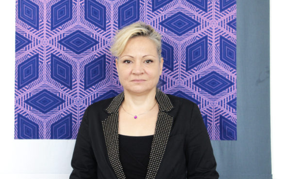
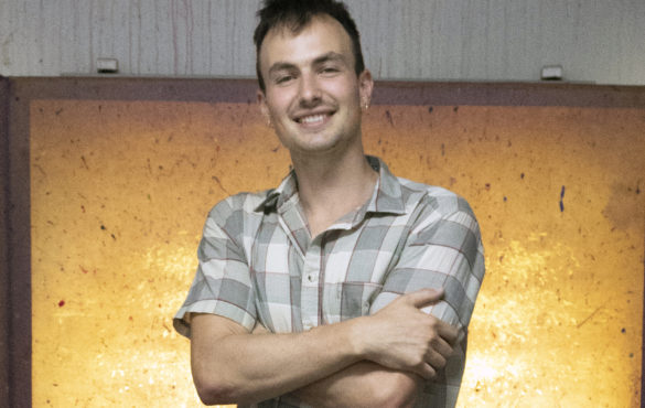
Alexandra Antoine is a Haitian-American artist and educator based out of Chicago. She received a degree in art and art education from the School of the Art Institute of Chicago in 2014. Her work focuses on her Haitian-American identity, which she investigates through language, memory, portraiture, and archival practices. Recently, she has been incorporating Haitian sequins and beadwork into portraitures as a way of holding onto and continuing an art form that is native to her culture. We invited her to Spudnik Press to share more with us about herself and her work.

M Kellman: Can you introduce your artistic practice? What kinds of things are you interested in?

Alexandra Antoine: I am primarily a printer and a painter. I love screen printing and lithography. Fell in love with lithography first time I did it. I’ve always been a painter. While I was at the School of the Art Institute of Chicago (SAIC) I figured out my style of painting. Recently I’ve been incorporating painting along with Haitian beadwork. I like seeing progression, from a beginning stage, middle stage, to the end. It keeps me excited.

I also work on two or three things at a time, so I can swap through different things and then I don’t finish anything too fast. I’ve noticed that in the past few years I really like slow processes.

MK: Are you from Chicago originally?

AA: No, I’m originally from Miami, stayed there till I was 11, then moved to Orlando. I have family all up and down the east coast of Florida. My parents are Haitian, so that’s what lead my parents to go to Florida. I love Chicago! I finished undergrad at SAIC, only planned on staying a year, but then I started meeting other artists, I started teaching and chilling out with the students, and I’m still here in 2019.

MK: Do you think you’d want to end up back in Miami or Orlando?

AA: You know, I thought about it. A lot of my inspiration comes from my culture—when I’m in Haiti, when I’m around family, when I’m listening to family talk. Now, Chicago has a Haitian community but it’s not as tight as New York and Miami cuz those are two hubs where it’s Little Haiti central. Sometimes it gets hard being here, which is why I’ll go see my family in New York often—it’s the closest if I can’t get to Florida. I need to be around the food, around the language—something about being in it helps the gears move.

MK: I notice you incorporate a lot of traditional practices into your work. Can you talk about how you learn these?

AA: I’m really into working with other artisans. Outside of my studio I like to find artists who do things that I wanna learn and learn from them.

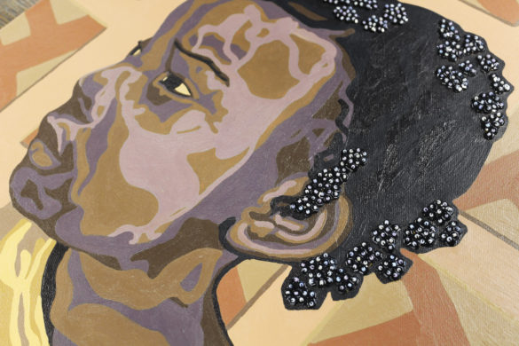
When I was in Haiti, one of my friends sat with me and taught me Haitian beadwork. And now I’m working on a piece that’s super big. It’s taking weeks, but I love the process.

And back in 2010-2011 I went to Mali, West Africa, to learn traditional sculpture. It was just me and my teacher  from like 7am to like 8 at night, just hackin’ at wood. I love this because it’s a thing he inherits through his family line. There’s not a syllabus. It’s just “Watch what I do, and you do it”. I love learning like this. The classroom is nice but when you get this one on one, right next to somebody, I like this.

A portrait of a young black girl looking to the left. Traditional Haitian beadwork and sequins decorate the girl's hair.

MK: How do you decide which skills you want to learn?

AA: It’s about reconnecting with my culture. I like to choose places within the African Diaspora in art forms that are valuable but a lot of young people aren’t running to learn it. So like my teacher in Mali, if his granddaughter doesn’t want to learn it and he passes, that’s it. Or in Haiti, some of these skills I’m seeing, a lot of older people are doing it, but when you’re gone then who takes it over? I wanna keep these things that could potentially be lost because people migrate or move around.

MK: In addition to your studio art degree, you have a degree in Art Education. Do you teach?

AA: Yes! I’m all about sharing what you know, especially when it comes to African American communities. I was teaching visual arts full time in Chicago Public Schools (CPS) when I got out of school. It’s fun introducing the students to new skills, but what I found was interesting was, when I was in Art Ed and we would go visit schools, I think I maybe saw one black art teacher, if any. And the schools that were all black usually had a white art teacher. African Americans have had a huge contribution to art but none of the students saw teaching art as a career path. I wanted to teach in an all black or predominantly black school because they gotta see that art is a career they can do. And of course when I walk in it was like, “You’re the art teacher?”.

MK: So I imagine you’re not very interested in the traditional Eurocentric art history and art education curriculum, right?

AA: Oh yeah, and that’s where the struggle was. It seems like the way Art Ed is set up in CPS is, “We want you to teach X Y and Z”. But that’s not how artists work. All artists don’t want to just do this one thing this certain way. I took art history in college and it was great learning about da Vinci and Europe and all them, but… We didn’t touch Asia, South America, nothing. And I’m not saying da Vinci and all are not great artists, but what about Faith Ringgold, or Carrie Mae Weems? What about them?

So when I was teaching, I was like, “Let’s get down on the floor”. If an artist was squatting when they do this work, let’s all squat. If they were only using their hands, let’s just use our hands, no paintbrushes, no pencils. Was it what the principal wanted me to teach? Not really. But this is how artists think about the world. We’re not here just to pump out a perfect assignment.

MK: I saw you did some work with Cook County Jail and a juvenile detention center. Does that fit your practice better than CPS?

AA: It does. Right now I’m teaching visual arts with Free Write Arts & Literacy. I came in with the same philosophy—I’m not gonna just teach the fundamentals of shading. There’s so much that the students I work with have experienced, they all come from various communities in Chicago that have their own unique aspects. We can’t just be talking about how to shade. We have to be talking about things that are relevant. And I tell my students, even if you don’t become an artist, this is a way to look at the world differently instead of how you’ve been told to look at the world.

A group of women gather in a secret back room in a bookstore to discuss their protest plans. A mural depicting famous African American women covers the walls of the room.

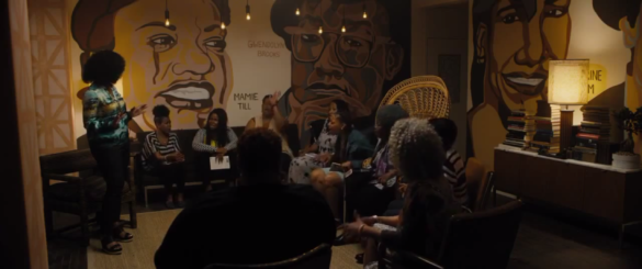
A screen capture from Chi-Raq (2015, dir. Spike Lee). Antoine’s mural can be seen on both walls. Copyright: Amazon Studios, 40 Acres and a Mule Filmworks.

MK: So, a little fangirl momentChi-Raq? You painted the mural in the bookstore scene with Angela Bassett. So cool! How did you get that job?

AA: In 2013 I was in a group show at Roman Susan gallery. Then maybe 5, 6 months after the show—I’m teaching at CPS at this point—I get an email from the art director of Spike Lee’s new movie like “Can you come down to the studio and talk about your work?”. So I went down to the space and they told me the concept and gave me some subject matter and said, these are the women we want you to focus on painting. They had me on the set of the bookstore. I was there maybe a month or a couple weeks before they would transform it. The art director let me come on set the day they were shooting in my space. I told my friends—where Angela Bassett takes them into a secret room, all of that is mine.

As an artist, you never know who’s gonna see your work and what that’s gonna lead to. My aim is not always, somebody needs to buy this. You just never know where somebody might see your work.

MK: Did you like the public art aspect of working on the movie?

AA: Yes. It was fun doing that. It was a good experience. I do like it when my work can be accessible to more people than just the art world or just gallery openings and exhibitions. Especially since I work with young people, I want y’all to see there are other ways of being artists. You don’t just have to be in the MCA or the Art Institute. Those are great, but look at your whole community.

MK: Do you have any other instances of showing your work outside a gallery setting?

AA: Yeah, similar to with Chi-Raq—maybe early last year, someone from the Haitian Embassy contacted me and said, “We saw your work at Ghetto Biennale in Haiti and wanted to know if you were interested in a group show at the Embassy in Port-au-Prince as part of the Art in Embassies Program?” Now mind you, I had the Art in Embassies photo on my vision board for the past two years, so when they called I was like, “You don’t have to tell me twice!”. There’s this idea that when people leave Haiti they don’t come back. But I want people to see that us younger Haitian Americans, we always love coming back here.

MK: Any projects on the horizon? Future directions?

AA: This summer I plan to go to Benin. Most Haitians came from Benin, the Congo, Togo, and some parts of Central Africa. There’s an arts and cultural organization in Benin that works with young people, so this summer I’m going to work with them.

In Haiti, people know we come from West Africa—but, with the way enslavement happened, there may be people, especially some of the younger people in West Africa who may not understand how Haiti plays a part in our shared history. I really wanna build relationships with some young folks there, make connections and see what comes out of that.

MK: Could you show me some of your work?

AA: A lot of the people in my work are people I know—either family members, friends, people I met through my travels, but we’ve always had conversations. That’s important for me because I’m showing Haitian culture the way I see it, so I want it to be authentic. To me it’s important to have that relationship, especially if you’re gonna be showing somebody’s image everywhere.

A print of a face in reds and oranges. The man has three lines scarred on each cheek.

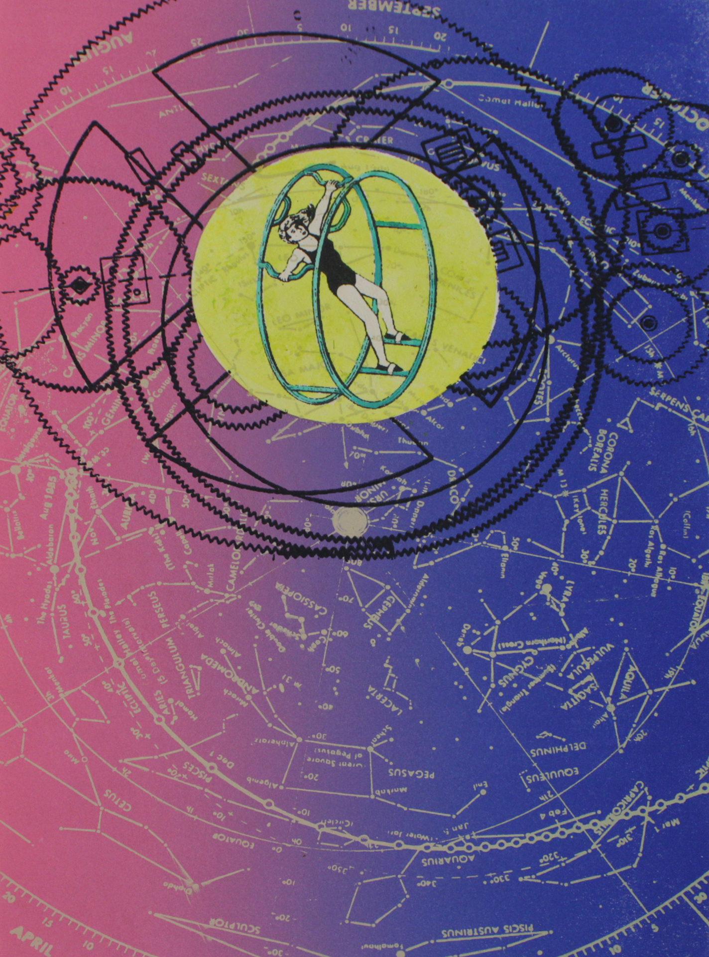
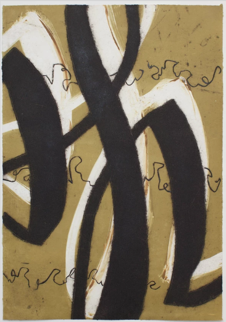
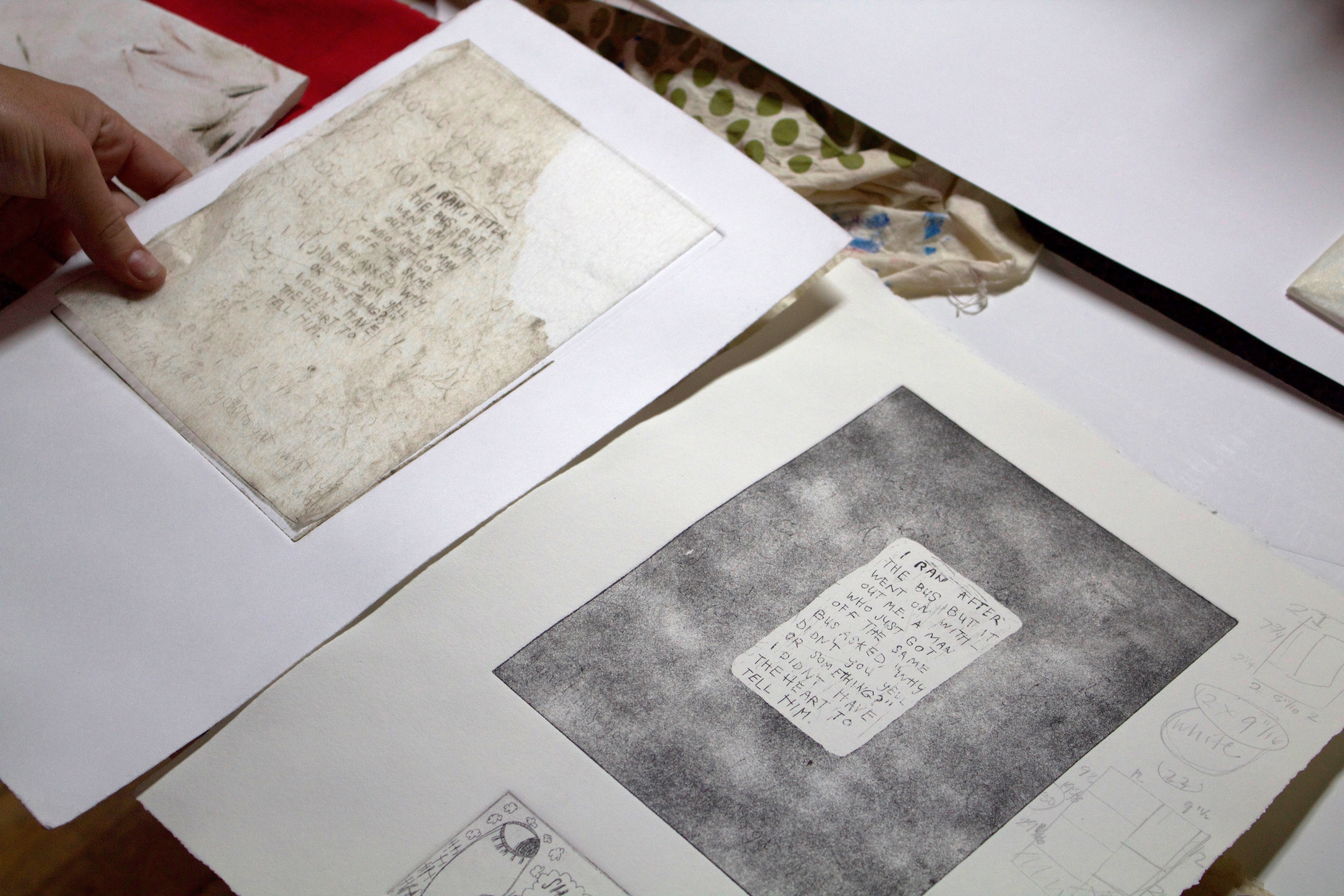
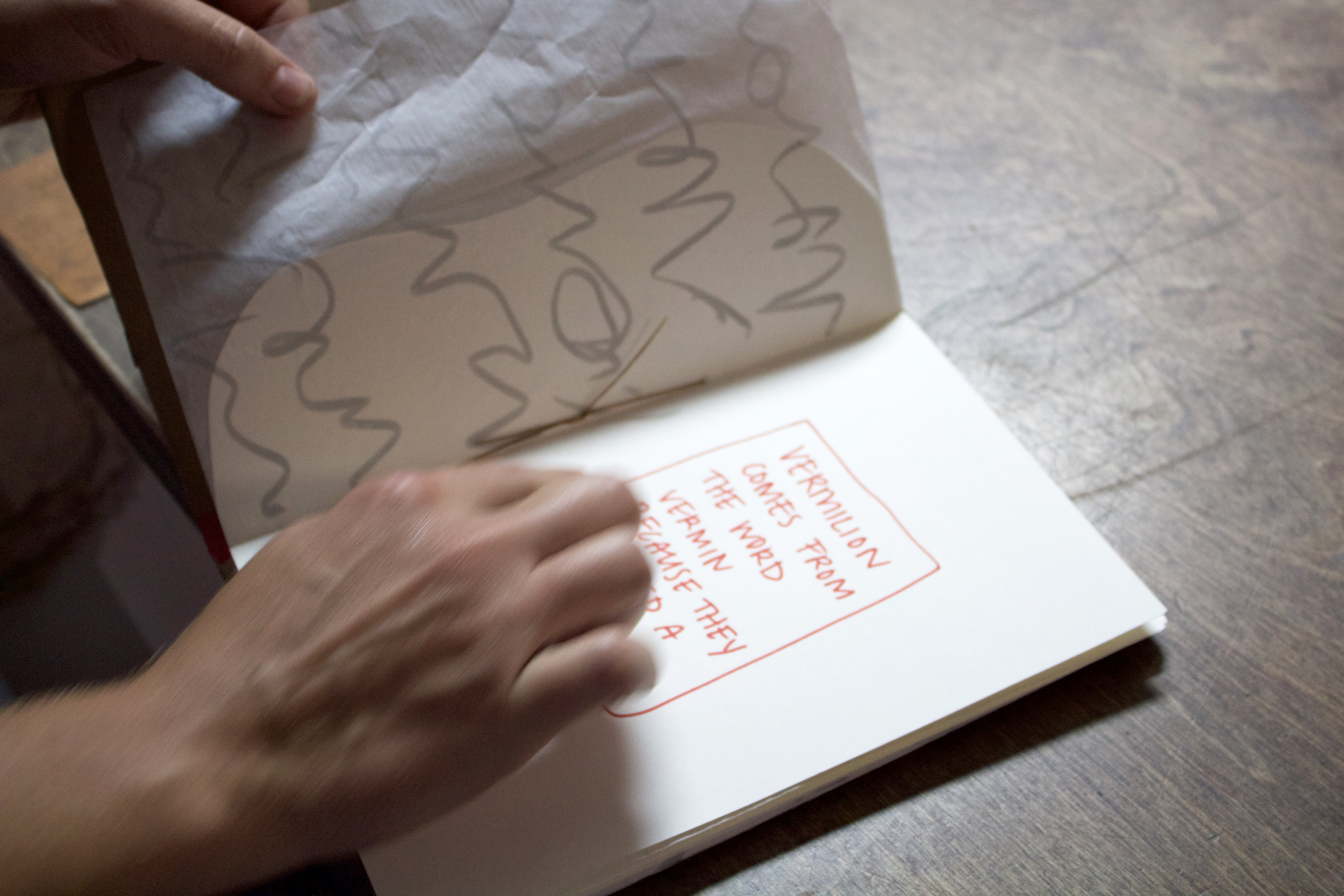
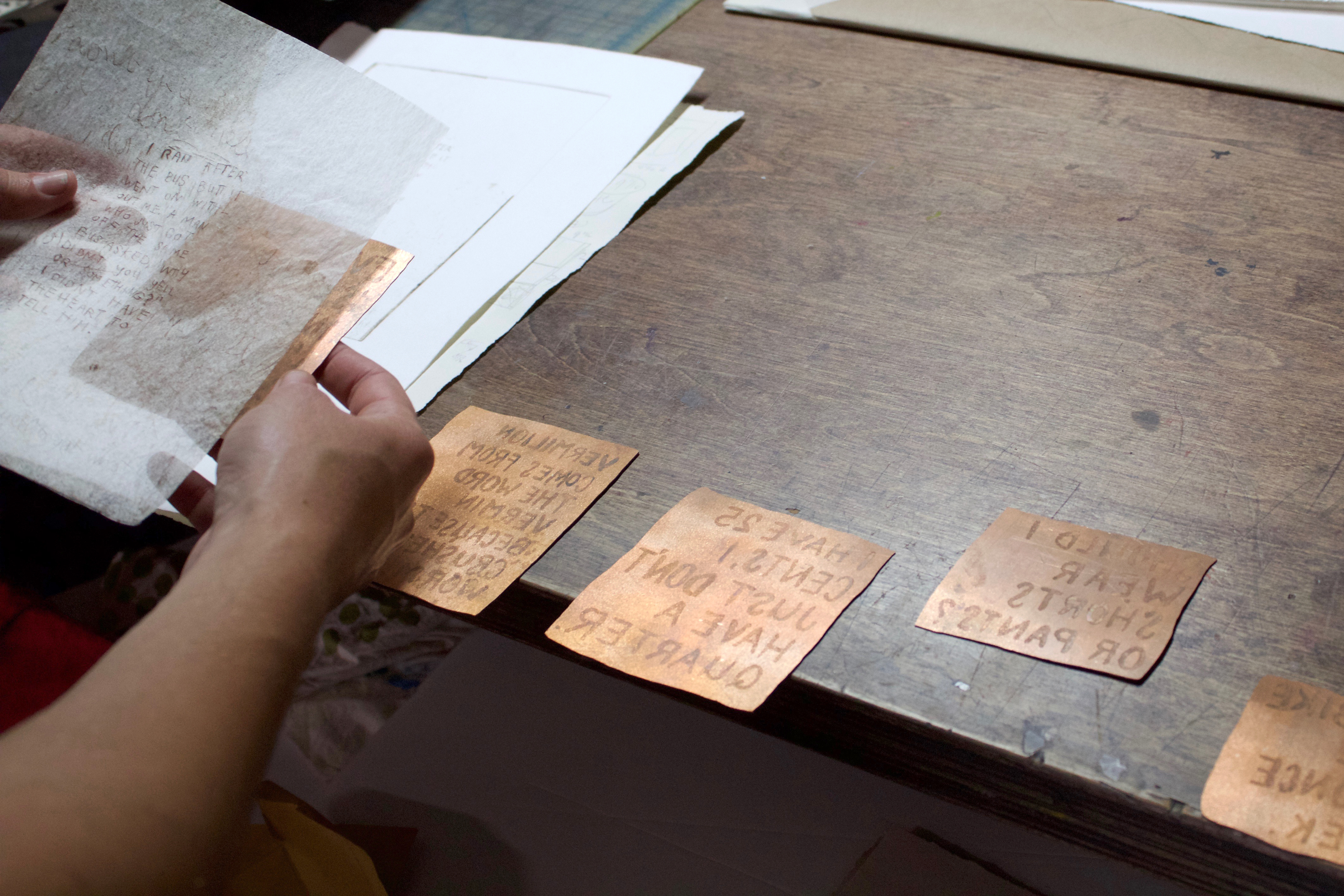
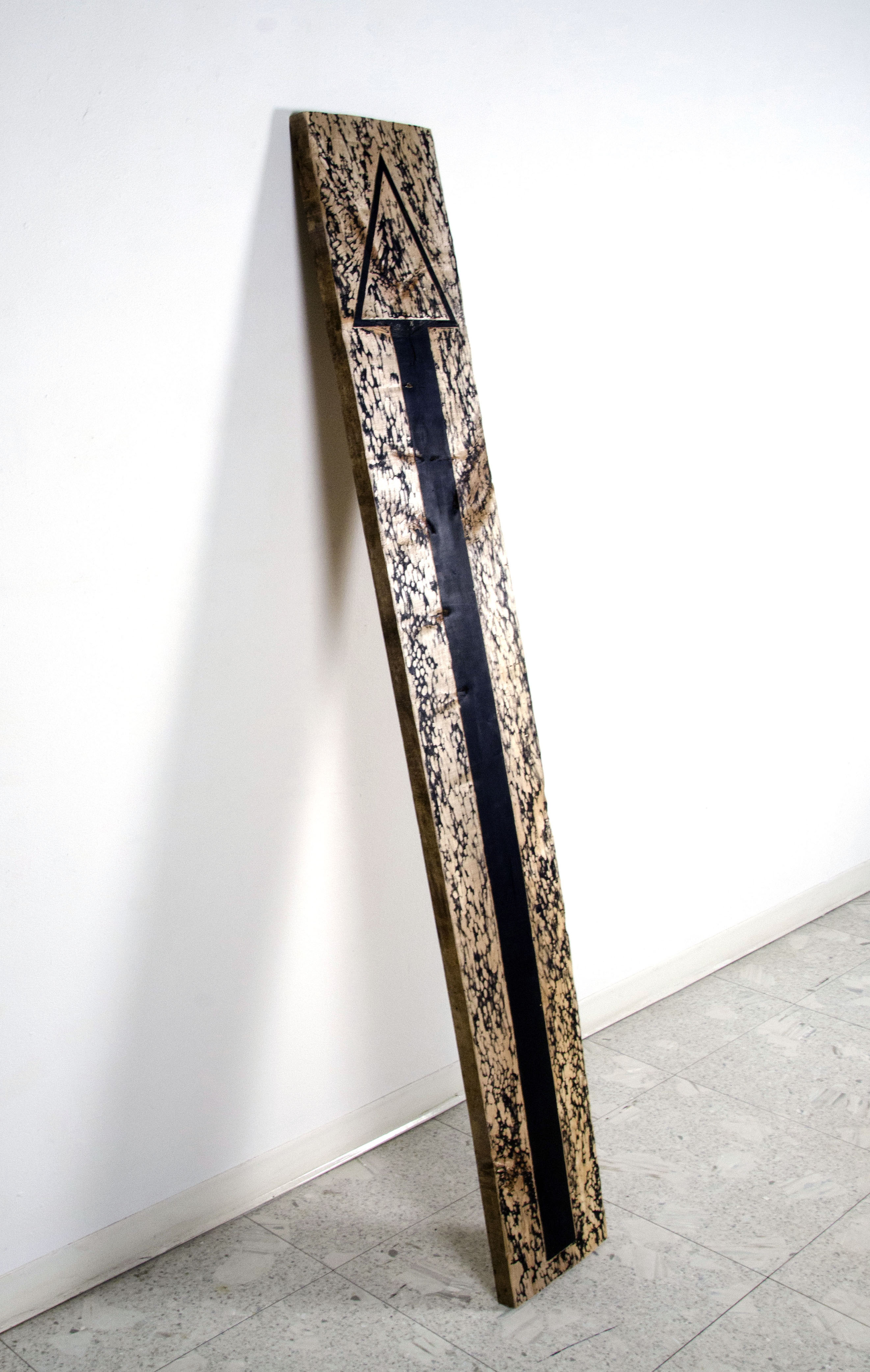
Language, symbols, nonverbal communication, that’s real big in my work. For a while, I was really into scarification practices, because that’s a way of identifying somebody, being a part of a community. When I was in West Africa, my teacher had these three lines—that’s the Bambara tribe. So I was into showing them with these prints.

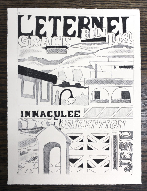
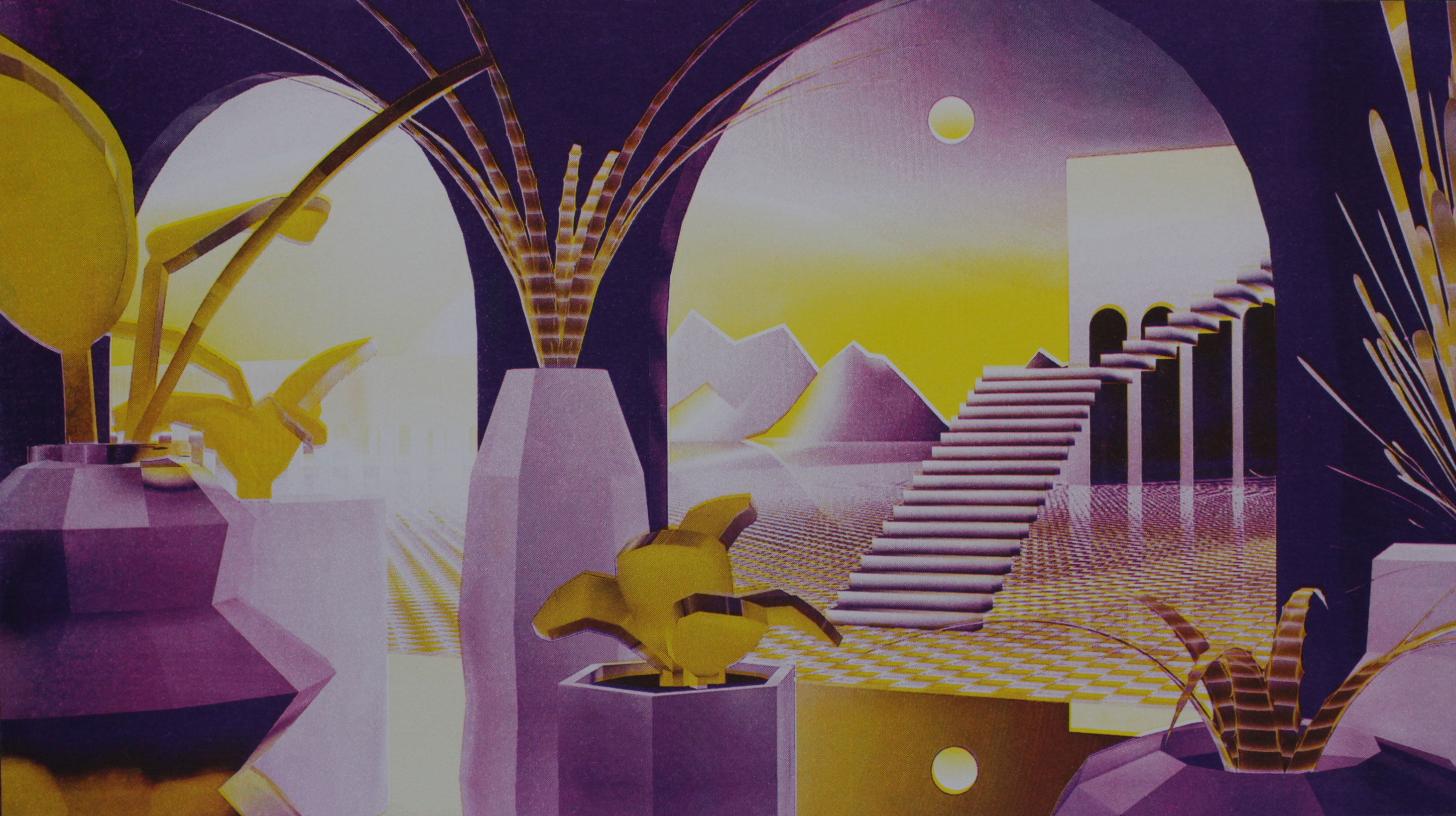
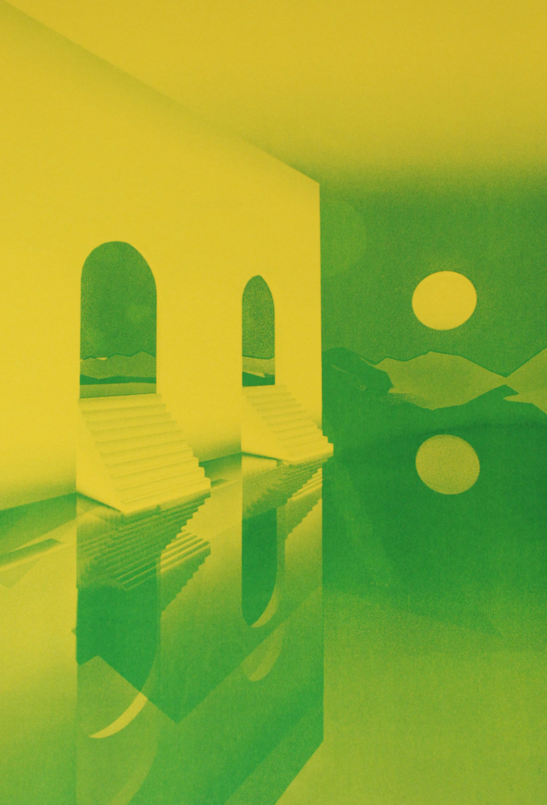
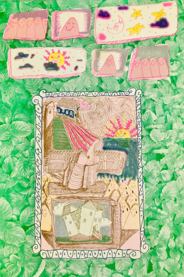
This piece is looking at the architecture in Haiti. Whenever I go to Haiti I look at the tower work, the way the houses are structured, the window sections. The window is sculpted out of the cement—all these different shapes. I find that really interesting because you don’t see these a lot everywhere. This is a distinct style.

A lithograph print showing architecture in Haiti.

MK: Do you have a favorite piece?

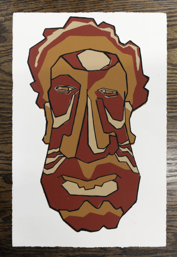
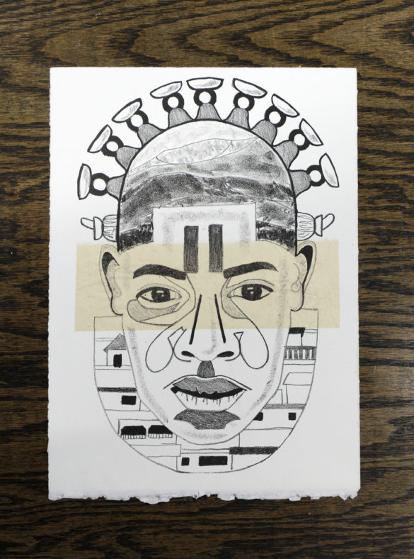
AA: I have to say this one, because it’s all the elements I love in one. This piece is a lithograph. It’s incorporating my face with a well known sculpture from Benin, the Bronze Head of Queen Idia. I also tied in Haiti—I put the mountains in there, I put the women holding the baskets, abstract, on the head, I put the architecture of the houses in there. I’m always finding a way to layer in a little bit of Haitian culture.

A lithograph of a face made of abstract designs and details showing different aspects of Haitian culture.

MK: Do you have any upcoming shows? If someone wanted to see more of your work, where should they go?

AA: I will be showing some new work at my friend’s event on the 15th of March at Stage Two in Columbia. She has a collective called Synergy, and they’re doing an album release party. It’s an all women hip hop album that she produced. I’m excited about that because, again, I get to show work outside the gallery. The way people talk and the conversations you get to have are different when you’re in different spaces.

And there’s another show in New York at Flux Factory. One of my friends is doing a show for Women’s History Month, for black and brown women. I love artists supporting each other. I’m always down for that.

MK: Is there anything you want to try that you haven’t?

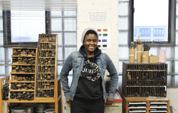
AA: I want to try letterpress, which surprisingly is the one printing technique I haven’t learned. I love words. Why haven’t I tried this? I visited Purgatory Pie Press, a letterpress studio in New York, that does artists’ books, so I was like “collaboration?” and the owners were all for it. I’m really excited. I’ve got a lot of directions, but they all connect in some way.

Chicago Print Crawl 2019: Call For Print Venues, Artist Studios, & Galleries

Registration Deadline: March 10

The Chicago Print Crawl is a self-guided tour of printmaking production, publishing, exhibition and sales venues throughout the City of Chicago, organized by Spudnik Press Cooperative.

The Chicago printmaking scene encompasses a wide range of processes and purposes and supports a huge network of artists and designers. From traditional stone lithography to screenprinted gig posters to letterpress stationary, from private art studios, to collectives, to galleries and retail venues, The Chicago Print Crawl includes an eclectic mix of one-of-a-kind spaces.

The Chicago Print Crawl is now registering venues and studios interested in participating!

The 2019 event will be held on Saturday, May 4, 2019 from 11 am-5 pm.

Eligible venues include:
• Artist’s studios engaged in on site printmaking
• Nonprofit printmaking shops, exhibition spaces or galleries showing prints
• Commercial printmaking shops, preferably also engaged in fine art production
• Commercial galleries or other for profit spaces exhibiting and selling prints.

For more information and registration, visit The Chicago Print Crawl website.

New Authorization Schedule In 2019

In our efforts to make Spudnik Press increasingly accessible, we’ve made some changes to the authorization process to introduce new artists and makers to our organization and facilities. As always, anyone interested in simply checking out the space is welcome to stop in and take a look around during any of our business hours or open studio sessions.

If you are an experienced printer looking to use our facilities, we ask that you attend an Authorization Session.

Authorization sessions include:

  • General Studio Tour
  • Overview of our programs that provide ongoing support to artists and makers
  • Discussion of prior printing experiences to determine if minimum requirements for authorization are met
  • Brief operational and safety demonstration on equipment and processes specific to the needs of the attendees

Once authorized, artists can take advantage of Open Studio or other Studio Access Programs. Artists may stay and print immediately upon completion of authorization. However, we recommend getting authorized well in advance of any project deadlines.

NEW 2019 Authorization Schedule:

Mondays: 7:00pm sharp
Fridays: 1:00pm sharp

You are welcome to drop in for authorization sessions, but it’s helpful if you RSVP to let us know that you are coming and what process(es) you want to be authorized for. Just email info@spudnikpress.org or call 312-563-0302.

Letterpress Authorizations requires scheduling a hands-on printing session with a Teaching Artist. This 3-hour session costs $125. Email info@spudnikpress.org to schedule an authorization.This requirement can occasionally be waived by providing a reference who can speak to the qualifications of the printer.

Hope to see you soon!

Member Interview: Emma Bilyeu

Emma Bilyeu is a visual artist working out of her basement studio in Humboldt Park, Chicago. As a student of printmaking and book arts she likes to incorporate paper, letter shapes, book forms, and multiples into her work. With this she is able to explore ideas of communication and storytelling. When not in the studio, Emma is cuddling her dog, reading dystopian or self-help literature, or attending a Chicago Printers Guild meeting.

[Ruby LaPorta]: What has your experience been like as a Spudnik Studio Fellow

[Emma Bilyeu]: I’ve found that it’s nice to be held accountable. Before the fellowship, I had a membership here, but only made one or two prints. The fellowship has provided the kind of community and structure that encourages me to produce more. Even though working at Spudnik comes with a built-in community, my introverted nature felt more comfortable in the structure of the fellowship, which is a very personalized way of being involved with Spudnik. Being a fellow gives me a feeling of ownership of the shop, which in turn has improved my workflow within it.

[RL]: I read your project statement regarding what you wanted to accomplish through your fellowship. Do you think you fully realized what you set out to do?

[EB]: Well, it’s not over yet! Because I have made a lot of singular artist books, I thought it would be a good idea to use the fellowship to make a large edition. However, the idea of creating so many books was keeping me from just exploring my concept. I was paralyzed by the logistics so instead, I’ve altered my plan.  I am on the path of making a book that combines both etchings and screenprints. I’m creating a single book (instead of an edition), and exploring the same concept through prints, too. 


Emma Bilyeu, Guilt, 2015.


[RL]: What drew you to Chicago? 

[EB]: So, I’m from Indiana originally. I went all around for school—I ended up in Georgia. Then I had an internship in upstate New York. After that, I thought the natural next step would be to move to New York City, but the few times I had visited I felt very alienated. At that time I knew a few people in Chicago, not necessarily in the art community, but people I could reach out to if needed. And Chicago is close to my family, which is a plus. I have really enjoyed Chicago. It’s hard to compare to other places because every other city I’ve lived in has been experienced while being in school.

[RL]: How has Chicago helped you evolve (as a person/artist)? What’s it like being a part of the Chicago printmaking community?

[EB]: It was a learning curve at first, like learning how to make friends when you’re not forced into the same environment. When I moved here, I was too shy to come to Spudnik, so I was just doing a lot of drawing and painting. However, once I mustered up the courage, I realized the people at Spudnik are just like all the other printmakers I know—super rad, friendly, and encouraging. Nothing to be afraid of! Being at Spudnik has been great, especially having the other fellows to commiserate with and to encourage each other. It’s like a little family. We all get along really well. Spudnik definitely shapes my view of Chicago in a positive way.


Emma Bilyeu, Findings of Familiarity, 2014.


[RL]: Through your website, project statement, and artist statement, I noticed you play a lot with the idea of communication and not only the forms it can take—being illegible, repetitive, or layered—but the way this language is transmitted through “book-like” objects, as you put it. Can you speak more to this thought process?

[EB]: For a while I worked strictly with ambiguous letter forms, I didn’t know what kind of statement I wanted to make in my work. The letter-ish shapes seemed comfortable and at the same time ambiguous enough to be able to hide behind them. Yet, I know these forms take on more meaning as I keep working with them. Lately, I am building layers in my work to represent the mind’s thoughts and the complexity of them. Not knowing what to think, possibly avoiding thinking, and representing that kind of mindspace visually. So, book-form feels natural, almost journalistic, private, yet public, but somewhat illegible.


Works in progress by Emma Bilyeu.


[RL]: Your current project is titled “Vermilion”—what is the significance of the color vermilion in your work?

[EB]: I am simply drawn to the color. I find myself mixing that color, buying ink pens in that color. I am just attracted to it. I was googling around to research vermilion, because the origin of pigments are interesting to me. As it turns out, vermilion comes from the word “vermin” because there was a worm that they crushed and made into this pigment.

[RL]: Oh wow, that’s fascinating!

[EB]: It is fascinating! And beyond that, I am trying to make this connection in my book between simple thoughts and how they inhabit my brain where I wish more complex thoughts would naturally develop. So the simple phrases like the pest or vermin will be foiled with a more subtle, but still legible, dialogue representing more complex thinking.


Emma’s rough draft of her fellowship project, Vermilion.


[RL]: Is there a favorite printmaking or book-making process you have?

[EB]: When it comes to printmaking, I really like etching. It has a really gritty, physical element to it. It feels like a mini sculpture or something. I’m really drawn to the technicality of it, too. I go back and forth between deciding if I’m an artist or just a craftsperson. I feel like I am pretty skilled at printing on copper, and that’s satisfying to me. And for bookbinding, I think it varies. If I’m making a sketchbook I like to use coptic stitch because I like the look of the exposed binding. But it ends up that a lot of my finished artist books are bound as accordions or some variation of it.


Emma’s etching plates.


[RL]: Do you think that it’s important for the book form to reflect the text that you put inside?

[EB]: Yeah, I mean every decision is conscious. I try to put some thought into how the structure informs the content and vice versa. But sometimes it does just feel like bulls**t, trying to make all of these connections when it could just be straightforward, simple.

[RL]: Yeah, it’s completely subjective.

[EB]: Yeah that’s true. It adds another layer for people to get lost in though, which I don’t mind! The longer they spend thinking on it is fine with me.

[RL]: Since language is such a large aspect of your work, what are some literary pieces/ writers that influence what you make?

[EB]: I’ve been really into short stories lately. I like how they are just a window of a larger story. It leaves a lot to the imagination. So you pick up in the middle, and soon it ends, and it could be a satisfying ending or you could just be left on a cliff. Recently, my favorite collection of short stories is The Withdrawal Method by Pasha Malla. I’m really impressed by his ability to write from so many perspectives. If I remember correctly, in The Withdrawal Method there are perspectives from a child, an animal, men, women. That is really inspiring to me- that he can be so brief, but yet it so complex and it works. Also, I recently read the funniest, strangest story. It’s called Tacky Goblin by a local author, T. Sean Steele. I was reading it when I had to commute on the train to a job, and it had me laughing out loud. The story is so bizarre and I think the lightness and the strangeness of that book is a good reminder that not everything I put out has to be so serious.

[RL]: Absolutely. There’s also, along with pressure to create meaningful content, a pressure to constantly be creating “really good work”.

Sadie, Emma’s dog.

[EB]: Yeah! I’ve been using Instagram stories a lot, and people tell me I’m funny. They’re just feeding my inner comedian ego. I’m trying to figure out how I can get some of that reaction in the visual work that I’m making. That’s just a thought, I haven’t explored it much. Well, I guess maybe a little. I have one etching that says “Sadie, you ate my first skateboarding scab” (Sadie is my dog). I fell, and I got a big scab on my arm and I peeled it off like any human does, and for some reason I had it sitting on my laptop and I closed it and forgot to take the (this sounds so gross) scab out of my laptop. I took my computer to my hometown and was with my parents that weekend. As I was sitting on the floor and I opened up my laptop to do some work, Sadie just waltzed over and “slurp!” ate it. I was like, “Wait I kind of wanted to keep that.” Because it was a marker of me learning [to skateboard]… but I guess not. So I have kept the memory in an etching.

[RL]: Like you said, you find Instagram stories as your “comedy” outlet.  you see yourself exploring how your practice can evolve alongside social media more? 

[EB]: I think so. Because I think when I have the gut feeling that I should open Instagram and share something with the world, it would be smart to share it in a more permanent way. I don’t think I would catalogue my stories as finished work. I don’t know if that’s a thing, if people do that. But, I guess it’s more of like a sketchbook in a way.

[RL]: What’s next for you after your Spudnik fellowship?

[EB]: Well, November is busy. I am tabling at the Chicago Printers Guild Publishers Fair and the Spudnik Fellows have an exhibition opening, Bulletin, at Fulton Street Collective that same week. I am kind of in between jobs. I have thought about returning to school, since I want to keep learning somehow. Whether that’s through a university, or getting more serious about bookbinding and starting to master that craft. I really enjoy doing publishing. I was able to work on a piece with Angee, Spudnik’s founder and director, and I did a bit of that in undergrad with visiting artists—the technical side of making art. I’m not positive, but I would like to pursue being a tech person for artists and anyone who want to make books. I am still navigating how that will come about.

[RL]: It’s definitely nice to be at a place like this where that is so accessible and it’s so easy to learn and observe. There are so many people coming in and out, it’s great to be in an environment that allows that to develop.

[EB]: It is exciting to see people get excited about printmaking, or learn new ways to make.

[RL]: Well, my last question was if you have any pets, but…

[EB]: Haha yes, I have Sadie! My boyfriend got her when she was a puppy and I met her just after she turned 2. She is the sweetest; an angel.

If you want to find out more about Emma and her work, you can visit her website or follow @emmabilyeu on Instagram.

Member Interview: Ben Garbus

Ben Garbus is an artist who hails from Western Massachusetts, but is currently living and working in Chicago, IL. He received a BA in Studio Art with a minor in Art History from Oberlin College in 2017. Garbus was a Studio Fellow with Spudnik Press in 2017-18. His practice consists of creating thought provoking, humorous images of everyday mundaneness through painting, printmaking, and sculpture.

Emma Punch: Tell us a little bit about yourself and what you do.

Ben Garbus: After finishing my undergrad I moved to Chicago and have been here for a year. During this this time, I’ve worked in a special education school, did some freelance art handling, and worked events for a photography company. I’ve learned many non-academic lessons this year, and that’s given me a lot of content for my art practice. I’ll reach some conclusion after participating in ordinary routines like when I go to work, come home, go to the supermarket, and generally relate to other people. My text work is the result of all those experiences and exchanges. Ideas get stuck in my head, and when I write my thoughts down, it helps me process them. Making prints or paintings from those notes can push the process even further. It helps me understand how I think, which helps me understand the context I live in. When I wrote my project statement for the Spudnik Studio Fellowship I was trying to theorize something that now comes more naturally for me, which is to use art to describe the ideas that might arise through ordinary circumstances. That idea seemed vague then, but for some reason, I get it now.

Ben Garbus, There’s Nothing So Sour As A Work Of Habit, 2018.

EP: In your fellowship project statement you talk about using banal phraseology in your work, how do you choose or come up with the phrases?

BG: I write notes on my iphone, mostly, and then I workshop them. I’m interested in cliches and jokes because they are often assumed as neutral, but I think there are underlying causes for this. As an artist, what you choose to latch onto can have an effect on people. It can get them to reconsider things they might otherwise overlooked. I reference cliches and jokes because they have a lot of content, but have lost their meaning. There’s a little bit of truth in every joke. Early in my practice, I was trying to directly use subjects that already exist, like a close reading of found objects or ideas. However, I wanted to shift into something that involved more writing rather than appropriation, and that gave me agency to interact with my subject matter, which seemed more creative or productive. So now I’m trying to write in the format of cliches or jokes to say something new, riffing on a given point of reference to get people to rethink it.

Ben Garbus, Optimist’s Complaint, 2018.

EP: So that’s why you came up with your own phrases?

BG: Yeah, I try to work around a preexisting concept or phrase. There is a Jenny Holzer quote that goes, “to write a quality cliché you have to come up with something new.” The way she writes is concise and she doesn’t waste words. All of her writing sits so naturally on the tongue, you don’t have to question her truisms, even though you’ve never read them before, and they are really direct. That’s super affective to see. You can engage people by tapping into their affinity for consuming language and art, and if you make something that is a little bit off within that, it can change how they think. But I’m not as good as her. I take a shortcut in my writing by riffing on existing turns of phrase, like what you might see on a poster at the doctor’s office, but rearranged. Creating something completely new asks questions of how ordinary phrases get to be ordinary. I think writing on the edge of what already exists is another way to do that, and it’s a little easier for me at this point. It can be funnier, too.

EP: What kinds of things and/or artists are influencing your work right now?

BG: I’m influenced by people who work with the visual culture around them, both in the popular realm and underground. I always saw Mike Kelley as having done that for some parts of American visuality. Jeremy Deller seemed to do that in England. I like them both. Jenny Holzer is of course an influence. There’s a sense of realism in those three artists’ work. They connect their lives to others through art and speak to a lot of different kinds of people. They imagine the role of artists as producers of new visual culture in conversation with what already exists, explicating some social narrative for their viewers. They have a good sense of the world in which they live, and it doesn’t take much effort to feel it in their stuff. They are obviously what I might strive towards; I mean they are monumental artists. Right now my work is smaller in scale and more personal than public. However, I try not to be influenced by artists as much as what I am making things about.

Ben Garbus, Existential Text Painting, 2017.

EP: I feel like your work is very David Shrigley-esque.

BG: Yeah! I think he’s funny. I think we share a dry sense of humor in our work, and I like his sculptures, particularly his life model projects. I do have a background in comics and that was how I first started drawing, but going to school for art and studying contemporary art history shook me into keeping my disciplines separate, or at least framing a single artwork into a more sturdy kind of category. I aspire to break that habit, but right now what I like about text art is that it combines word and image into one discipline. It’s about an image of a word, which is an interesting idea to me, more so than a word next to an image. Having words and images together only emphasizes their differences, which can reinforce barriers between disciplines. I only mention it because David Shrigley makes a lot of image and word paintings. So it’s not that I want to keep disciplines separate, it’s that I don’t want to pretend that putting them together alleviates their difference. I don’t think Shrigley purports to do that, but I want people to see that the walls between categories are malleable. An image of a word actually subverts the idea that they are two different things.

EP: Why is it important to you to incorporate sculpture into your printmaking and painting  practice?

BG: Sculpture can be good for helping people consider the whole work of art as part of its meaning, as opposed to just what it depicts. If you’re thinking about a print in a sculptural way then you add to its meaning a consideration of the way it was made, the paper it occupies, in what context it exists. There’s more to see. All the decisions that go into a work of art can be interpreted. With so many decisions at stake, I think making sculpture helped me to be more intentional about why I make anything. So if I’m going to make a painting, part of its conception has to be the idea that it’s a painting, or whatever that means. If you ignore that premise and only think about what the painting is of, rather than what it means as an object, you can miss a lot. Maybe that happens regardless, but if I think of myself as a painter, it’s never only about what I paint. It’s also about the making of a painting. I’ve made a painting and called it a sculpture and vice versa. 

Ben Garbus, This Side Up, 2017.

EP: What is your favorite medium to work in right now and why?

BG: I’ve been drawing and sometimes that leads to an idea, which will become something, but I never really show my drawings.

EP: What are your drawings usually of?

BG: They’re a lot of cartoons and intuitive things I don’t want to put out there. I don’t feel obligated to let everything I make roam. If I’m going to put something out to the public or consider it my work, I have to challenge it before I can let it go. Maybe I’ll grow out of that. While they help me pass the time, thoughtless drawings aren’t what I want to contribute to the world. I’m torn about what I want my aesthetic to be or how to make categories of art for myself, but I do know that I want my work to be thoughtful and careful. I like people, whether or not they’re artists, who do a lot of different things, and you can tell they did it because of the sense of humor in it or a specific logic to it or it shows a particular drive. I don’t like that some artists have to market themselves based on how the work looks.

EP: Is aesthetic really important to you in your work?

BG: Visually, I don’t like to do the same thing over and over again. I’m not very perseverant in that way. I like inventing. It can be good to follow through with a certain image or process, but I think it’s more productive to contribute a way of thinking to the world than to manufacture the same aesthetic over and over. That might be my short attention span talking, but it also has to do with what I value. Although, maybe those influence each other. I am falling into the habit of making work in a consistent style, which could be an improvement for me in the long run, but right now it only contradicts how I’ve figured out to best rationalize my inconsistency.

EP: What is something you want people to take away when they see your art?

BG: I want people to chuckle but also to think more about everyday life and to use art as a means to tap into their own thoughtfulness or mindfulness. Most art you could say is functional in making people content with being alive, or as being life affirming, and I do want my art to be life affirming, but that’s kind of a dark thing to sell to your viewers and a low standard to set for yourself. For me it’s important to connect to people at eye level, so I try to offer small poetic ideas that might stick with them.

Ben Garbus, Exactly What it Says, 2018.

EP: How has printmaking influenced other parts of your art practice?

BG: For me, printmaking has established a process of experimentation that’s been relevant to many other things. Patience and deference for structure is a lesson I learned from printmaking, but also knowing when to break free of that. That said, I’ve been trying to make printmaking less about how elaborate its process is, so I’ve been making these one-colored prints to make them as simple as possible while still being prints. I want my work to be concise both materially and conceptually.

EP: What do you think is the most important thing you learned as a fellow at Spudnik?

BG: Being a fellow was a really positive experience. It was a great opportunity to work on an artist talk, because I hadn’t done a public talk like that before. I learned how to take myself more seriously, which can be a challenge. To get artist opportunities you really have to seem like you believe in yourself, which Spudnik helped me with. It was valuable to have Marcela, Spudnik’s Program Director, around to nudge me along. It’s great to have other people keep you on track with making things. It can get exhausting when it’s all on your own.

EP: What are some recent, upcoming, or current projects you are working on?

BG: My most recent obsession is drawing varsity lettering. That’s the kind of American visual culture I’m interested in.

EP: Now for a fun question, what was the last song you listened to?

BG: In the car on the way over I was listening to Kuff by Shelley Thunder.

If you want to find out more about Ben and his work you can visit his website or follow gwiebus on Instagram.