Posts Categorized: Member Interviews

Member Interview: David Alvarado

David Alvarado is an illustrator and cartoonist who grew up in the suburbs of Chicago. A graduate from Columbia College, Chicago, David works primarily with screenprinting and risography to bring his illustrations and comics to life. His comics are characterized by dense illustrations, bright colors, and vast amounts of detail. In addition to making prints, self-publishing zines and comic books, he is also the artist behind “Life is Beautiful,” a comic series that runs on the back pages of Newcity, Chicago.

Manisha: How would you describe your work? 

David: When working on a publishing project I usually provide illustrations for editorial articles, cover illustrations, and comics for data reports. The content for my work stems from looking at the density of different environments, such as thick forests, cityscapes with overlapping buildings, and bodegas. I also like to create work with a touch of humor using silly concepts. I make goofy faces and characters because I love the idea of having the creative freedom to make a comic or character that I can place in embarrassing situations. My more serious work tends to be emotional and based on personal stories.

Manisha: How did you get into printmaking?

David: I was introduced to printmaking in high school. I took a block printing class where I worked mostly with woodblocks and linocuts. This really lent itself to my graphic style, which makes use of line art, thick lines, and solid colors.

Manisha: I see that in some of your print work you use heavy borders.

David: Yeah, it just made sense. I like the look of it and I like the crisp lines. So throughout college I continued to take block printing and screenprinting classes.

Clockwise: David’s cap, Plant Head, 2017 and 4 Rooms, 2017.

Manisha: What is your designing process like?

David: About ninety percent of my drawings and sketches are done by hand. But I do some of the sketching and all of the coloring digitally.

Manisha: When did you get involved with risograph printing?

David: I discovered the riso years after Columbia. I remember seeing it online. There was a lot of buzz around it at the time because it was being used to print mini-comics and zines. And then when I met Matt Davis at Spudnik I began to work on projects with him using the risograph.

Dirty Hands, Volume 4, 2014.

Manisha: Can you tell me more about a recent project that you’ve been working on?

David: I’m working on a mini-comic. It’s going to be roughly 30 pages. Half of the comic was made five years ago when I was still at Columbia. I screenprinted the cover and pages inside. The story was really short, only about 12 to 15 pages.

For the most part, the comic has retained its original look. It is green with blue and purple line art, and the story picks up where I last left off. Except this time, I decided to print it with the risograph because I didn’t want to do all that large-scale screenprinting again. The prints are slightly off-register but that is intentional.

A sneak peek of Today, Today, Better, Better, Second Reprint, 2017, David’s current project.

Manisha: What do you do when you’re not making art?

David: I have a full time job. I like thrifting and I run when I can.

Manisha: So what would be your top three thrift store recommendations?

David: The best one, in my opinion, is in the suburbs because everyone donates to this one spot. It’s a huge Salvation Army in Niles. That’s the one to go to. Then there is Family Thrift in Logan Square, which is pretty big. It has two floors and I’ve found some good stuff there, too. And then there is Village Discount on Montrose.

Manisha: Do you focus on something in particular when you are on a thrifting adventure?

David: I mostly look for clothing, weird art and books. I got a faded purple crew neck sweater recently. It’s so big and comfortable.

Manisha: What would be your dream project?

David: My dream project would be to work on a large illustrated accordion book. I was very inspired by Micah Lidberg‘s Rise and Fall. It’s a beautiful book about dinosaurs and was done entirely using the offset press.

Manisha: So does that make Lidberg your dream collaborator?

David: No, that’s just my dream project. I would love to work with Sammy Harkham. He is a cartoonist who does dense illustrations. I think his comics make really good use of space.

Manisha: Let’s end with a fun question. What is your favorite flavor of ice cream?

David: Peanut butter and chocolate. I always get that. You know, I feel bad for all those kids who have peanut allergies. It’s like a whole generation of them.


If you want to find out more about David and his work, visit his website or follow tuffasaurus on Instagram. He will also be an exhibitor at Comic Arts LA  later this month.

Member Interview: David Krzeminski

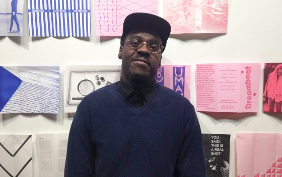
David Krzeminski is an artist and designer that has lived in the Chicago area his entire life. He received his BFA in Visual Communications from Northern Illinois University. His current body of work consists of black and white abstract drawings, that he then transforms into vibrant, optical illusion screen prints.

Tell us a little bit about yourself; what you do and who you are.

Well, I’ve been into artwork since I was a kid. I always knew I wanted to do something with it. I always felt like I was going to be drawing, but when it comes to jobs, graphic design has a bit more leeway. I currently work for a trade show company doing graphic layout; displays and graphics for conventions, trade shows, and what have you. That pays the bills and the drawing keeps me sane because offices can get a little… they can wear on you. I need to do something a little funky sometimes to get out of the rut of very monotonous work.

Having lived in the Chicago area your whole life—growing up in Palatine and going to NIU in DeKalb—do you feel you’re a part of the greater Chicago artist community, or are you simply an artist living in Chicago?

I think as of recently I’m feeling more like I’m part of the art community. Spudnik actually has a big part in that. This is because I’ve been meeting more and more people that also use the space at Spudnik who then introduce me to other kinds of events and art movements. I’ve also been more and more active with my artwork as well. It wasn’t until I was creating more regularly that I felt like I was a part of the community as opposed to just an artist doing my own thing. Now I try to work at least a little bit every day.

Do you want to talk a little about the work you’ve brought with you; give us a peak inside your sketchbook?

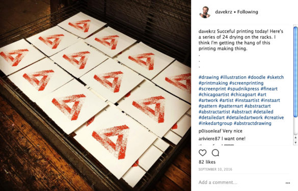
Sure. This is actually one of my first prints from when I started printing at Spudnik. It’s one of those impossible triangles with my abstract, squiggle pattern. This was while I was still trying to figure out how to screenprint correctly. I was basically reteaching myself because I hadn’t printed at this point for four years.

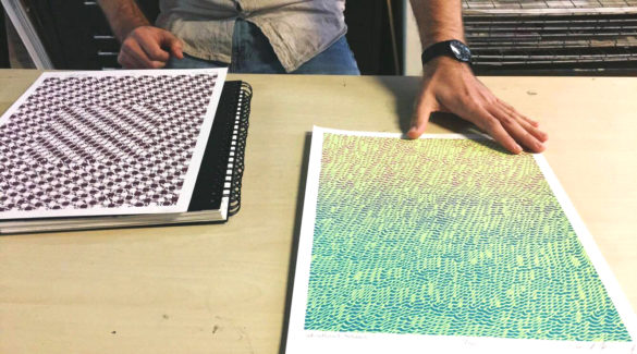
These are two of my most recent prints. A few of my first prints had a lot of streaks through them or the ink wasn’t quite as opaque as I’d like it to be. It was just a lot of trial and error. I figured out a lot was because of the paper or the squeegee I was using. I was like, “Oh they’re all the same” until one day I realized, “Oh, I’m getting streaks because I picked the same squeegee all the time.” Now I’m figuring out how to print correctly.

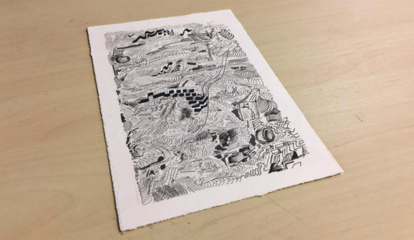
And this one is just fun. Whenever I’m using drafting pens I have a scratch paper just to keep the ink flowing, and sometimes they turn out kind of cool. I’ve got a thing full of those that I kept that I haven’t thrown away just because they turn out to be…

Kind of a piece within themselves?

Yeah. They have little interesting patterns. They’re just kind of a mess. Maybe one day I can do something with them. I just can’t bring myself to throw them all away. But some of them I can definitely recognize are garbage. [laughs]

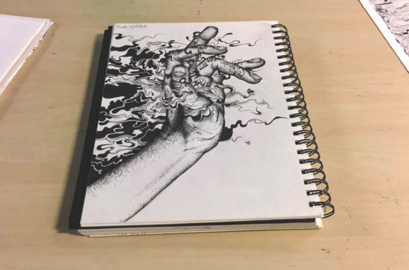
Unfortunately I don’t really use sketchbooks as often as I’d like to. [flipping through pages] I like this one. The abstract doesn’t really have any dimensions so I’m not really quite sure how it works with the realistic stuff yet, or if I can make it work somehow. This is one where I felt it worked pretty well, though.

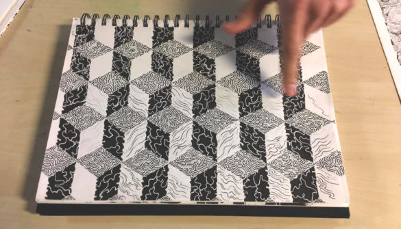
Here’s an actual concept done in a sketchbook where I was trying out patterns. I did it wrong actually, because the black squares are supposed to be opposite of each other; they’re supposed to go diagonal. But then I realized this plays with your eyes a bit because you want it to follow that pattern where each diagonal one is black, but it isn’t. That made me think I should make it bigger.

When you sit at your workspace to create something new, do you have a playlist you like to turn on or anything else to create the right atmosphere for your art making?

It depends. Sometimes I’ll put on a TV show or a documentary just as background noise. But, especially when I do my abstract stuff, sometimes I’ll make it a point to not turn anything on, and to just sit and do it by myself in silence. I don’t want to say it’s therapeutic, but the method I use to make the abstract shapes and whatnot is almost equivalent to brainstorming or freeform thinking. I have some set rules and some basic things that I repeat, but other than that, I never really plan the drawing out ahead of time. Sometimes I’ll work in silence to start a drawing, and then once I have a feel for how it’s coming together then I’ll put on some distractions; just kind of go on autopilot with something in the background.

Where does the inspiration for your work typically come from, and what kinds of things are influencing your work right now?

I’ve been really into optical illusions lately. That’s always been a big influence for sure. One of the big name artists I’ve always liked is M.C. Escher because I feel like he’s the master of illusion. He not only understood the illusion, but had the ability to execute it as well. His work is just super clean, super high contrast, which is huge for illusions. Then, I wouldn’t say I’m going too deep into it, but I’ve been reading some philosophy books. And that’s where I got my idea that if I’m going to be drawing, I need to almost think of it as a meditation. Let my mind go blank. Because I’ve repeated these patterns so much I can let myself do that. I probably wouldn’t have come up with that idea if it weren’t for the book Man and His Symbols by Carl Jung. (Which is a good read. I would definitely recommend it because it’s interesting and not too preachy.) It’s more an overview of a few of Jung’s ideas. There are five different authors and they all touch base on how they think the mind works.

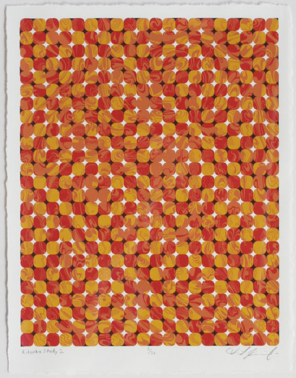
Then there’s one guy in particular from Japan who created the pattern I used for the piece that was in the Spudnik Press benefit show. His name is Akiyoshi Kitaoka. He’s a psychologist that specializes in how vision is interpreted by the brain. He started pumping out this huge series of optical illusions that he created and put them up on his website for people to use. I put his name in the title of my pieces that use his images since it’s his base that makes the illusion work. Then I use my own color scheme and patterns. Kitaoka’s thing is based on high-contrast, vibrant colors creating a vibrating illusion that tricks your brain into switching back and forth between what it focuses on.

Do you start a drawing intending to make a print of it, or do you just create something first and make that decision later?

I think maybe only a couple of times I’ve done something with the intent of printing it as well. Even the pieces I wanted to print, I was also making as drawings that could stand by themselves. I’ll go through my collection every now and again with a certain pattern in mind, or an idea of a color scheme that I really want to try out. Then I’ll see which of my drawings is going to fit that best.

Since you like drawing in black and white, why do you use such radioactive colors in your prints?

With my drawings I’ve always been pulled to using black and white. Very rarely do I draw with color, or add paint to a drawing. So when it comes to screen printing, why don’t I just do the complete opposite and go extremely vibrant? Which also goes hand in hand with trying to create illusions. The extremely vibrant, high-contrast colors mess with your eyes the most. That’s why I like using them. I like it when a piece is almost difficult to look at.

What do you want people to take away from your work when they see it?

I’d like people who see my work to take away that life is messy. Even if you do it the same way every time it’s going to turn out different. Like whenever I do a piece of just the abstract stuff—no pattern, no shapes involved—even if I start drawing the same way it’s a little bit different by the end. Also, I don’t know how easily it comes across, but I’d like to make the world a better place. Not to get too cheesy. [laughs] Basically, you need to keep an open mind that maybe what you’re seeing at first glance isn’t quite what’s there. So many people, especially nowadays, are too quick to think they understand something after just a quick glance. No. Look a little closer. Get your face right up to it and actually look really deep at what you’re seeing because it might evoke something different or spark a thought you’ve never had before. Where if you look from across the room, it’s just a couple black spots on a page. That’s what I want people to take away. Just, think abstractly sometimes. Things aren’t so set in stone.

What are you currently working on?

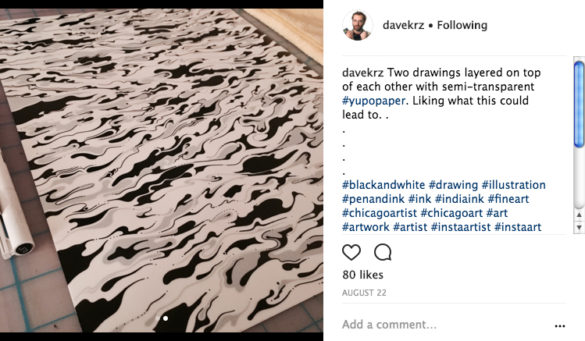
I’m working on a couple of things. Right now I’ve got a three-color print I’m going to do. It’s another pattern by Kitaoka that I’ve done before, but the illusion didn’t really work because the colors weren’t bouncing off each other that well. For drawing, I’m working with layers. I do an abstract base drawing, and then I have an almost translucent Yupo paper that I put on top. Then I’ll draw on top of that to get a two-tone abstract drawing. That’s definitely a new, recent revelation that was actually inspired by screen printing.

And where should people go to see your work?

I have two pieces in the Spudnik Press member show. Then Hope for the Day, a suicide prevention and awareness organization, is opening a new coffee shop/community center. They’re having a benefit art auction for that on December 2nd at WeWork (20 W. Kinzie St.). I donated a couple of pieces to that. There’s also my website as well as Instagram where I post finished pieces and works in progress regularly.

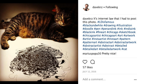
Just to close on a fun note, would you say your cat, LD, is a furrvent (pun intended) supporter of your work?

Probably? She usually leaves my drawing table alone—especially when there’s a drawing on it—unless she really wants my attention because something is bugging her. [laughs] She knows she can get a reaction out of me if there’s a drawing on the table and she jumps onto it. So I don’t know if she’s a fan of the art, but she definitely knows it’s important to me.


If you want to find out more about David and his work, check out his website or visit @davekrz on Instagram.

Member Interview: Sula Medovoy

Sula Medovoy is a recent graduate of Ohio University with BFA’S in Graphic Design and Print Making. She currently is working as a graphic designer.

Tell us about yourself and what you do?

I’m Sula. I am a printmaker and graphic designer from Cleveland, Ohio. I’ve been in Chicago for one year, and am currently working as a graphic designer with a focus on packaging and branding.

When did you know you wanted to pursue a career of art making?

I spent most of my life categorically against a career in art. My mother is a painter and my older sister is a graphic designer, so I wanted to defy that path and do something else. I was always an avid doodler, but avoided getting into any serious art-making until right before I had to apply to college. I realized then any other field would make me want to jump off a bridge after five years.

What is your favorite printing process and how were you introduced to it?

Screenprinting, by far. I saw it for the first time at university. I was primarily studying graphic design, and I didn’t know anything at all about printmaking. I ended up in the screen shop one evening, saw someone pull a print, and thought it looked like actual witchcraft. I decided I also wanted to be a witch.

It seems as though some of your art has some visual similarities to Western European post soviet illustrations. Has this influenced you at all?

Hugely. My parents are immigrants from the Soviet Union, so I grew up surrounded by Russian animations, children’s books, posters, etc. There’s a very specific but subtle visual humor in Western European art and media that I try to infuse into most of my work.

Your portfolio is very well rounded in the way it included fine art as well as more design oriented art. Do you prefer fine art or design oriented commissions? Why?

I’m drawn to design because I like visual problem solving. Even my “fine art” pieces are usually informed by some form of graphic challenge. I like what I can do with limitations.

You illustrate many goofy little characters, in your mind do all these characters live on the same planet in your mind or are they in separate entities?

All of my creatures exist in separate but comparable universes. Their paths will never cross.

Has the art community in Chicago had any affect on your success and the way you create art?

Living in Chicago has been a huge shift in my creative process. I studied art and design in Athens, Ohio, so I learned to eliminate trends and outside influences when thinking about art because it’s a more isolated area. Going from that to working in a big hip city gave me the best of both worlds, where now I can see how design functions in the world and think about my work in that context.

Are there any places in Chicago you find yourself going to when you are in need of inspiration?

I’m often drawn to the lake at night when I need to have a good thinking session. I enjoy a complete mental vacuum for coming up with ideas. Day to day, I look at branding and restaurant design around the city. I’ve also been talking to printmakers at various art festivals, seeing what their work set-up is like. I’m trying to build my own studio in a few years so I can lock down a hermit lifestyle.

What fun things do you find yourself getting into when you are not creating art?

I like biking around the city, and I’m also a bit of a pianist.

If you could have dinner with three artist who would they be?

I’ll try to choose artists that I’d imagine would be compatible with each other, so the conversation at the table isn’t awkward. Parra illustrates a bunch of voluptuous naked bird people. His work is sharp-witted, clean, and he is really good at contorting bodies.  Olga Capdevila’s work is very cozy and hilarious. Her style is colorful and nostalgic. Yoon Miwon makes deliciously clever hand-painted loop animations.

Who would you want to collaborate with after dinner?

Olga. She’s the sort of artist that isn’t so concerned with perfectionism, and is more interested in trying as many techniques as she can. I think it’d be neat to do a mural or a series of animations with her.

Are there any exciting projects you are working on now that we can expect to see in the near future? And if so where can we check them out?

I’m working on a huge lobster print right now. That should be ready in a little bit. I’ve also been developing my animation skills. Everything will eventually make its way to my website, sula.medovoy.com.

If you want to see more about Sula and her art. Visit her instagram, @sulaissula, or website , http://sula.medovoy.com/site/ .


Member Interview: Jenna Blazevich

Jenna Blazevich is a Chicago-based product & branding designer, calligraphy instructor, and feminist artist. She also owns a company called Vichcraft that creates and sells a variety of calligraphy and print-based work.

So just to get started, where are you from?

I’m from here. My parents are from the south side of Chicago.

Has living in Chicago impacted your art practice?

Definitely. I think it affects the way that I’m able to make art, and the way that I’m able to access certain things and learn from certain people and teach people. I make it a point to share the craft that I’m interested in and it affects the subjects that I’m creating as well. Being in a really big and in some ways problematic city, it is inspiring even though sometimes [the inspiration] is coming from a place of frustration and confusion. I don’t think that would be the case if I were from somewhere else, so I’d say in a lot of ways it does impact my art.

Do you consider Chicago to be your city?

It’s the city that I’ve felt is the most aligned with my internal pace. I’ve lived a few places where I felt like I was operating on a different wavelength than my surroundings, which is frustrating and leaves you without an ability to find your place. I think Chicago is that sweet spot in between a smaller city that’s a little less progressive and something like New York where it’s really hard to find your place. It’s been the best option for me of any city I’ve lived in, and as a pace to start my business. The cost of living isn’t insane and I have communicated with people who I can work with and be inspired by, but I’m not a “Chicago for life!” person. It’s a fine way to be but I know that other cities are great and I’m very biased. But that’s being a human.

What got you interested in printmaking?

I was very big into gig posters in high school. I wanted to learn to screenprint until I learned that while it is not necessarily labor intensive, it requires a lot of specific tools and spaces. The first time I went to Pitchfork Music Fest when I was around fifteen was when I first found out about people making gig poster art as a specialty. I bought my first print there. From then on I was obsessed with googling and researching all about them. It wasn’t until maybe four years later that I actually learned how to [print]. The first design job that I had where I learned how to screenprint was at a gig poster shop in between my first and second year in college.

What are some of your current influences? (Cultural, personal, etc.)

Instagram seems to be the consistent source of inspiration and information. I use instagram a lot to follow certain accounts that I think keep white feminists on their toes. This is something that I really try to be mindful of, and not fall into. It’s a common and easy thing, in some ways, to make things all about you and the way that you experience the world. I also go to a feminist book club every month that aims to highlight intersectional feminist voices, which is really great because every month I get to have at least one major discussion with a lot of different female-identifying people that are bringing their own perspective on topics which generally aren’t highlighted in traditional literature classes. There’s a lot of room to fill those holes.

In your member profile you are noted as being a feminist artist. Why is that important to you?

Well, [being a feminist artist] is super important to me because it’s something that I feel was one of the first activist things that I was able to really connect with and create from. It affects my and so many people’s lives in so many different ways. I wish that I would have known about feminism earlier on because maybe it would have affected the jobs that I’ve taken on or the things that I’ve done. Once I did find a groove where I could understand things from a personal perspective and let myself take off in that direction it really started to affect me personally in the way that I view the world. The way that I create work, and Vichcraft, has always been very tied to me personally because it’s only me. It’s been important for a long time and it’s been a part of Vichcraft since the inception of it. The reason that I wanted to start my own thing is tied in to sexism in graphic design as an industry. Obviously, once Trump won, I feel like there was a shift from creating this work for more personal and introspective reasons to sort of deciding if [Vichcraft] wants to be a feminist product store.

On a lighter note, what’s your favorite type of dog?

I’m really bad about remembering the names of different kinds of dogs, but my parents have a Vizsla. She’s really pretty and I love her. She’s the perfect size and very playful. Her name’s Seneca. I don’t have a dog of my own but I like to hang out with her when I’m home at my parent’s house.

What do you think dogs do when their humans aren’t home?

Well, she sleeps a lot when my parents aren’t there. She’s grown to love sleeping because she’s an empty nester dog. They got her after all my sisters and I all moved out, which is a bummer. Sometimes I bring her to the city and she just loves to smell all the different things and smell all the different dogs. But she does a lot of sleeping.

If you want to find out more about Jenna, or see more of her work check her out on social media: Instagram, or on her website.


Member Interview: Matt Davis

Matt Davis is a printmaker and occasional cartoonist, illustrator, and designer. He rents one of the six private studio at Spudnik Press, where he runs a small but vibrant risograph print shop called Perfectly Acceptable. He graduated from Oberlin College with a BA in Russian Language.

How did you get started in risography?

I got started in risograph printing when I was in college. I ran a student group, the Oberlin Comics Collective, that published a semesterly anthology of student work. For our first few publications, we printed with the school’s print shop – and were often disappointed with the results. We were aware of risographs as they were starting to become popular with alternative cartoonists, who were using them to print their comic books and minis. To our luck, we noticed one sitting in the back corner of the local UPS store, and were able to buy it for a low, low price. I totally fell in love with it (I wasn’t an art student) and suddenly I had unfettered access to a cheap and immediately gratifying means of printing anything I wanted to.

What led you to establishing Perfectly Acceptable Press?

It’s hard to say exactly when or what led me to establish Perfectly Acceptable. When I moved to Chicago I bought a risograph pretty much immediately, as it was a staple of my art practice in college. Word soon got out and I started getting emails from people asking if I would be able to print their projects. Though I don’t think I intended to become a regular commission printer, at the time I definitely needed the money. Business became more and more regular, so I thought I’d put a name to my services–Perfectly Acceptable.

What does Perfectly Acceptable Press do?

I continued doing commission printing from then on. Later, to keep myself occupied and “have fun” I started publishing books as well. So, rather than printing a book for someone for cash, I would work with an artist to develop a book, acting as an editor and designer, and then we would print it, and both sell the finished edition. This remains the two main branches of Perfectly Acceptable to date. We (royal we) also co-host a reading series called Zine Not Dead with our friends (royal friends) at Bred Press, Brad Rohloff.

Hotel Rompo by Talya Modlin

What is your favorite kind of work to make (art prints, comics, wedding invites, etc.) and why?

I’ve found that the clients for comic printing jobs are usually the most fun to work with, and that makes the whole experience better. I love comics, so I can really connect with the finished product.

Who are your current artistic influences?

My friends and people I know who also print with risograph always impress me. To name a few big influences: my friend George Weitor of Issue Press in Grand Rapids, Michigan. Colour Code Printing in Toronto, Canada. Knust Press in the Netherlands. A lot of the artistic use of Risograph printing started in the Netherlands.

What cartoon character do you most identify with, and why?

I don’t think I identify with any cartoon characters… I read a lot of Calvin and Hobbes growing up, and I guess I related to Calvin since I’m an only child.

Eg: Sausage Delivery Man by Matt Davis


What advice would you give to a new artist who is interested in learning more about risography?

You just have to find a risograph, get your hands on it, and play around with it! Risography is still pretty new as an art form, so the community is super unpretentious and approachable. It makes it easy to jump right in.

Gaylord Phoenix #7 by Edie Fake

How often do you create work for yourself (not something for a client at Perfectly Acceptable)?

I don’t do a lot of personal projects any more, since I’m printing for clients so much. I have found that the design element of publishing projects is more enjoyable than it used to be.

The Meaning of Life by Anja Wicki

Do you have any warm-up activities or rituals?

Not really. I try to go in relaxed and with low expectations. The riso machine can sense fear, and it’ll mess up more if it knows you’re putting a lot of pressure on it.

What is your favorite neighborhood in Chicago?

It changes as I discover more, but I recently moved to Bridgeport and I love the quiet and self-contained vibe there. It feels like a summer camp!

What do you do in your free time or when you need a break from creating?

I don’t really ever take breaks, to be honest. But I really like hiking, so whatever hiking I can do in Chicago. I like to find paths through parks to walk around.

To see more of Matt Davis’ work, follow him on instagram at @PerfectlyAcceptable , or visit his website!

Member Interview: George Porteus

On Election Day 2016, I sprinted up to the Press to meet with Spudnik Press member and cartoonist George Porteus. I had the opportunity to meet George when he was a guest artist at School of the Art Institute of Chicago, in Kaylee Wyatt’s class. George greeted me with a large smile and his long bouncy hair, saying he was more than happy to be here at Spudnik to be interviewed. Wearing his, as he calls it, “iconic Grimace purple jacket”, George also kindly complimented the modest comic I gave him upon our last meeting.

Former Maryland resident and MICA graduate, 32 year old George Porteus packed up his drawing supplies and moved to Chicago, Illinois four years ago. Upon sitting down in Spudnik’s Annex, he brought up how crazy it was that four years prior he was voting in the 2012 election. Although George was a practicing printmaker and cartoonist before moving, he attributes a lot of his success to the opportunity-filled midwestern city in which he now lives. Despite the fact he has had a rough few past months trying to get to the press to print, George has in the past year debuted Enter to Exit at CAKE 2016 and is currently involved with many collectives within the city such as Zine Not Dead and Trubble Club.

nmr_12

With an understanding of how financially, being an artist is always taking a risk, especially within publishing, George has a undeniable passion for making. Comics and self-publishing became his calling upon moving to Chicago. He credits Brain Frame performative comix reading for allowing him to be involved and truly understand how close knit we all are in Chicago.

Porteus: Brain Frame [was] place full of people where I felt where I belonged a little more than the outside world. My practice has been good ever since. It sorta oriented me in the right direction. Before that, artistically, I was um, I’ll say, unfocused with my efforts. I was drawing a lot but for no particular reason. So comics provided a really great context that requires very little, you know, prerequisite.

Howell: Totally!

Porteus: You don’t really need a degree. You don’t need anything more than a pen and paper and soon you wont even need that. Just an iPad pro or something like that.

Howell: What kinds of things are influencing your current body of work?


jagoff

Porteus: Well, since starting to do comics in earnest maybe four years ago, I had a very fixed idea of narrative things I wanted to explore with comics. I have been honoring that, getting a little more ambitious each year with the lengths of the stories and how complicated or involved they are. And also the dialogue; the first few one-page narrative pieces I did for Lumpen [Magazine] were more or less one-sided so it was like a monologue, or silent, devoid of dialogue. [I have been] trying to improve my story telling abilities with a representational straightforward comic style. [This style of comics] interested me before starting to make comics myself. [Comics] where the story, um, does not alienate people. Like I think about the Simpsons. It’s a high bar to reach! Its funny, it goes down easy, but there is typically something a little more to it than that! The ability to appeal to a general audience and not alienate them, while still being subversive is kind of the magic trick. That is a though that I have had for a long time, since high school. Parallel to that is the practice I have observed within the comics community in Chicago. Comics work that [is trying] to bend everything I have just talked about as far as narrative art.

Howell: Your work speaks on behalf of a more highbrow art form in my opinion. You use beautiful techniques you don’t see often in comics now a day.

oldschooltrolls-01

Porteus:  Actually it’s interesting because, you’re right, you don’t see that these days so often, but the technique I use I completely ripped off from Her Block and political newspaper cartoonist predating World War II. Bill Mauldin who was a cartoonist for Stars and Stripes; you look back and it was all ink and crayon, which is all I use. It echoes the lithographic feel, which is something I was always into. It clicked to start using a crayon because I could better refine pieces but it’s still very much from the cartooning well. I was very excited. It opened up a lot to me. Prior to that I was a compulsive cross-hatcher, and it just took up too much time. I was going to get arthritis very soon. It didn’t excite people or myself. It was very easy to ruin a drawing by cross-hatching. The fact that it took twice the time to ruin a drawing by cross-hatching made it a easy decision [to use a crayon].

Howell: I’m aware you a member of Trubble Club, Lumpen, and have worked for Newcity, so how has being in publications around the city influenced your work?

Poretus: Trubble club was a great. I lucked out encountering them early on. I started publishing in a bi-monthly publication that ran for two years called Landline. I picked up the first issue while I was a Pilsen kid in the scene and noticed every artist and musician I knew was in it. The first issue had an open call so I submitted some work, and they rejected it. I added in my submission if they needed any editorial illustration work for articles I would like that opportunity. They gave me an article to illustrate and it was published in the second issue. Grant Reynolds was included in the issue. He was a great voice for getting me involved with Trubble Club. Also, my good friend Ben Marcus vouched for me and opened the door for me to get involved, not like its the mafia or anything, since you must be invited to join. I got to meet Joe Tallerico who edits the Lumpen comic section, and does a fantastic job, and that’s how I became apart of that. Aaron Renier put me in his Infinite Corpse project within meeting him twice. These are incredibly generous people with these types of opportunities. The first pager I did for Joe was the first comic I had published anywhere. It was a big deal for me. It felt good to see my work in print. The backend path of cartooning has always been the struggle. Everything that happens with the art when you’re done making it is an uphill battle. I have always been grateful and blown away to see my stuff in print, in a real newspaper, like Lumpen. Getting over the fear of putting something [in the public eye] that felt unfinished or less than what I thought it should be was paramount to moving on with my life and career. I’m thankful for everyone who has published me at this point. I have read that no matter how big you are, it’s nice if people can look at the progression of your work.

Howell: Let’s talk more about community. Spudnik is a big co-op where people come to create and there are tons of cartoonist that are actively involve. Do you feel a specific draw to working within these essentially collaborative environments?

letstalk

Porteus: It was weird finding Brain Frame, walking into that room, because [collaboration] was not a need I had consciously recognized yet. I more or less put a premium on working in a bubble. Prior to that, I was not socializing with anyone doing anything related to what I was trying to do. In that way I never received useful or critical feedback. It was a vacuum. At that time I thought, “Oh I won’t be corrupted by other people or blended out by others style,” but I think now that was bullshit. I was rationalizing the position I was in. Once I found groups I could join, I was faced with the fact I couldn’t do anything without them. I really have benefited from people who are better at championing other sorts of art and other ways of working. Max Morris has just this massive comics library and private collection. He used to have parties where there was basically a giant pile of comics on the floor and we would spend a few hours talking, reading, and living comics. If you wanted to make comics, which was the absolute best place you could be. It was really easy to meet and talk to people that way. It’s a collegiate atmosphere and that is important! As much as you think, “I don’t need those things,” you absolutely do

Howell: Who are some printmakers who you are reading and looking at currently?

Porteus: A lot of local artist. Occasionally national artist will break through to me. As is in keeping with a lot of my other interest, I look into the past a lot for influence. Previously, I brought up Her Block. Newspaper cartoonists from between WWI and WWII also influence me, but also pre Comic Code and pulps stuff is a huge influence on me. I also really love jazz music and record covers, which is very cliché for comic artist these days. I’ve been looking at Blue Note record covers from the 70’s. I’ve been into things that have been flattening the cartoonist library and trying to mess with that so it’s no longer about conveyance, but something more. Local people like Jessica Campbell. She just released a new book…

Howell: I adore Jessica!

Porteus: Her work is always operating on many levels. Andy Burkholder remains a guy who I’m always impressed with, especially in terms of messing with vocabulary. That dissonance is what I’m very attracted to. The Zine Not Dead guys, Bred Press and Perfectly Acceptable. They are picking up the Brain Frame torch. You need to bring people together. It’s very important.

Howell: I feel like there is this missing step between people who make a living from comics and us. There is a dissonance I have been struggling with upon entering this world of comics. Everyone is very loving and open to give feedback, as long as said feedback is never negative towards the artist. Why is everything seemingly so unspoken?

Porteus: Both Chris Ware and Art Spiegelman are quick to say, “Oh I never expected to make a living off comics and I don’t recommend it” as they recoup many befits from having done what they say is completely impossible. Part of the nepotism within the upper crust of alternative comics is caused by the tiny patch of land that a lot people are fighting over. People are very nice while also extremely competitive. I remember fondly the second time I met Anya Davidson. She told me “I checked out your stuff,” and that was it. There was a conspicuous missing second part to that sentence, and that says she’s really good! I thought that was really cool. She’s not putting her opinion out there she will later regret. Now I’m hungry to impress Anya Davidson.

Howell: What is advice you would give to people just beginning to self-publish?

Porteus: Don’t be afraid to really put work out there, but always be honest with yourself about what you’re putting into it. It will always take more than it gives back, but most artists I know wear this as a point of pride. I’m all about self-righteousness. Work really hard! [laughs] Have that be enough. It won’t matter what happens externally because you will be proud of the work you have done. In my mind that is my fail-safe. At the same time, never be afraid to show people. I think the only way to improving visibly is by doing.

You can find George printing at Spudnik and selling work at Quimby’s, CAKE, and other various zine fest and comic events around the city.


Member Interview: Kevin Brouillette

Kevin Brouillette is a recent Columbia graduate and native Chicagoan who flies by the seat of his bicycle. He’s an entrepreneurial graphic designer who focuses on print and web design.

Spudnik Press Cooperative (SPC): Tell us a little bit about yourself and what you do.

In general, what I do is a mix of print and web media. I’ve been trying to focus a lot on print lately­–which has been really good. What I do most of my days is work on designing service industry/restaurant materials that will help promote the café environment, from menus and signage to things that are graphic for the inside of a café.

(SPC): What do you do when you’re not working or designing?

I try to volunteer with charities if I can. I helped out with Food & Water Watch for a while. I like coffee culture and going out for cocktails. I bike a lot. I bike almost everywhere I go and just carry all my stuff with me. I kind of have a mobile workflow so I’m always on the move.

packaging

(SPC): How do you feel that being on the go constantly has affected your design practice?

I’ll have a day where I feel like I’ve done something very substantial. That is what drives me and motivates me to do more. Each day I like to get something solid done. Being on the go gives me the flexibility to jump from place to place whenever I feel like–which is really nice. It’s stimulating and helps me keep my mind and environment fresh.

(SPC): Tell me a little about Limitless (LMTLSS) Branding.

That was my original thing I started back in 2009. I worked with my friend Eric Youngberg to collaborate. Limitless was a brand name for us. I did the whole design concept for it and Eric did all of the back end coding and development aspects. We made a handful of websites together. Another aspect of Limitless is that we used to screen print t-shirts with my friend Clare Byrne who does illustration. Right now Eric and I are working on a brand new site for Dollop- but we don’t call that Limitless since I work for Dollop Coffee now.

limitless

(SPC): How do you approach print design vs. web design?

I think the approach is similar. With print I do a little more work with creating concept boards. With web I find a few ideas or concepts generally that I like in different websites that I see online and then start taking those ideas and apply them to what I’m working on. I usually start with a clearer end goal for web as opposed to a print project. I’m very pre-meditated due to the level of collaboration.

(SPC): What kinds of things are influencing your work right now?

A lot of time when I’m given a project I try to do some research to find some things to make references to. For a recent project, I started out researching old bakeries around Chicago with archival photos to use as reference points as how a bakery in Chicago looks- then and now. I look online a lot for influences. Particularly how other people are using type. Typography is something that I focus on a lot­–collecting and finding typefaces that I like.

(SPC): What’s your favorite thing about Chicago?

Chicago has a really strong design community. I try to go to different events because I really thrive off of inspiration from other artists. Everyone is very supportive of each other, which is something that I really appreciate. It’s a collaborative effort when you really get down to it.

coffeemarriage

(SPC): How did you get into designing for coffee brands? Do you think you’d be in a similar line of work if you lived elsewhere?

I don’t think so. It’s a very fun story how I got into working on coffee brands specifically. My whole time in Chicago has been cohesive with all of this. Back when I was 16 I started working in a café out in the burbs where I grew up. They serve Metropolis Coffee there. I developed a very strong brand loyalty to the Metropolis brand because I liked their design work and I liked their coffee. I worked for them for about 3 years and then started going to Columbia so I moved to the city to be closer to school. During that time I was looking for a new job but knew I wanted to work somewhere with Metropolis coffee. I had visited Dollop in Streeterville, which is our main location. While I was there I just happened to meet this guy named Dan Weiss, who is the owner of Dollop Coffee. About 6 months later I sent him an email and we got in touch to start working there. Everything worked out exactly how I wanted it. I did café work with Dan for about 2 years at Dollop. Dan slowly started shooting ideas my way since he knew I was interested in design. We started collaborating from there and started doing more and more. Firebelly Designs is a really great design firm that created the initial branding for Dollop back in 2012. I really look up to them. So now I fill in the gap and make things that stem from what that they created as the Dollop brand has become more established.

(SPC): Since you are rooted in the web world and branding, how do you feel about social media as a marketing tool for designers and printmakers?

I’m more inclined to follow a designer on social media that posts more about their day-to-day life and things they’re doing as well. Things that they interact with day-to-day influence their work in some way or another. I think design relies so heavily on culture, so for a designer to only post their designs seems less authentic.

dollop

(SPC): What are some recent, upcoming or current projects you are working on?

Most of the past four months has been spent designing identities for new Dollop cafes as they expand. We try to design them around the neighborhood so that they shift with the audience. Right now my big thing is working on the new location for Dollop in Hyde Park. It’s on the University of Chicago’s campus. It is very graphic and interior design oriented. This project has been weeks in the making but we are now finally scoping out the space to decide what we want to do with it. Everything I design for the shop has to play off of contractor/ designer, Paul Leissen, as he builds and designs all the furniture and interiors. Basically I collaborate with him and take some of the colors and things that he’s doing and we work together to make it a well-rounded project. For example, we are doing a really cool wall installation that is going to be typography and illustration mixed together that will span across many walls. We are also building a potentially screen printed wall menu structure, as well as whole walls with graphics that were once on my computer screen. It’s pretty cool to see that blossom.

(SPC): If people want to see your work where should they go?

There are a few things that I’m working on for Metropolis that will be popping up across the U.S. in Metropolis carrying cafes. The Dollop café on Monroe is a great shop to see stuff we’ve been working on. I helped create the marquee sign and all of the wall graphics there, as well as menus.

A photo posted by Kevin Brouillette (@kevinbrou) on

To see more of Kevin Brouillette’s work, follow him on instagram at @kevinbrou, or visit his website www.kevinbrouillette.com!

Member Interview: Jake Saunders

Jake Saunders is an artist working and living in Chicago. He received his Masters in Fine Art at the University of Connecticut. He also received a Masters in Art, as well as his Bachelors in Fine Art at Ball State. Jake’s 2016 Exhibitions include work being shown at Jennifer Ford Art Gallery in association with the Wunderkammer Company  in Fort Wayne, IN. He has previously shown work at Blue House Gallery (Columbus OH), the Auxiliary Art Center (Chicago, IL), along with many other notable spaces.

Spudnik Press Cooperative (SPC): Tell us a little bit about yourself and what you do when you’re not working on art?

I’m a printmaker: mostly etching, woodcuts, and linocuts. I screen-print for a living. For free-lance, I do graphic design for screen-printing, web design, coding, and stuff like that. I watch a lot of movies and hang out with my girlfriend and the cat.

(SPC): So I see that you work in different mediums- how did you come to printmaking as a medium?

Printmaking is just like an extension of drawing for me. While drawing is all fine and good–I love drawing, and I love seeing drawing–I think a lot of people who are drawers tend to want to have a way to refine their drawings. I think a lot of people gravitate towards painting for that reason–at least in my experience. Printmaking suited me because of what I was interested in as a kid. I got into printmaking when I was 17 or 18. It appealed to me because it looked like Frank Miller and some other comic book illustrators.

linoleum plates

(SPC): What kind of things are influencing your work right now?

Right now I’ve gotten really into Romantic period art work, like Goya. I’m a big fan of Caravaggio, Dürer, and German Expressionists like Käthe Kollwitz. I’m also big on living people like William Kentridge and Kara Walker. I just saw the Carrie James Marshall show–that was pretty amazing. Contemporary writers like Paul Auster and Salmon Rushdie are big ones for me right now. I think more than anybody, Salmon Rushdie has been really on my mind a lot lately.

(SPC): If you could own a piece of art from one living artist, what would it be or who’s would it be?

I don’t know of anything specific that I would absolutely need but I’d love to have one of those cut paper pieces of Kara Walker’s. I love those things; I would love to have one of her pieces.

various prints

(SPC): Are you a pre-meditated maker or do you just dive right into your work?

I believe that you could be a really terrible painter, drawer, printmaker, or whatever–but if you can compose then it’s going to be good. So I spend a lot of time doing that. Preparation is huge for me–I take a lot of photographs, and do a lot of studies. What I usually do is take a lot of photographs and collage it all in Photoshop. I do a lot of Photoshop collage work before I even put a pencil on anything. It’s a big process for me but it’s very regimented.

(SPC): For your personal art practice, when and how do you decide to take the next step to print and how do you decide which method you are going to use?

I think that the narrative dictates the media, for me. For the last few years when I’ve been doing these pictures based in religious narratives with religious symbolism. I just automatically went for Dürer, and renaissance and medieval prints. So if I am going to approach a new subject like I am thinking about [doing] now, that narrative has to inform the look and therefore the media used. That might be whenever the narrative took place or it could be like art historical references, or just the general flavor of the story that could inform those things. Also there are just the practical things. I didn’t have access to a press for a long time so if I was going to do printmaking I had to be able to do it on a table at home. So it was like- spoons!

Sodom and Gamora , Linocut on paper, 2016


(SPC): Has your imagery always been rooted in graphic narratives or has it evolved to this?

I think the short answer is yeah–I think it’s been rooted in narrative and always, for the most part, been figurative. It’s always been heavy on the craftsmanship and graphic stuff. I was a comic book nerd as a kid so it’s what I’ve always gravitated towards.

(SPC): When did you start using religious references in your work and how do you merge these themes with modern day imagery?

When I was young and growing up in Indiana I was inundated with religious stuff all of the time. I kind of have a love-hate relationship with it but I love the narratives and I love the imagery. I know it inside and out so it was always something that was a good reference point for me. So I started doing it right off the bat and it’s like a ready made visual vocabulary that I can use. It’s more or less [something] you can use it for almost anything. There’s an analogy in these stories that you can use for anything that happens in your life–love, heartbreak, and death, birth. Anything–it’s all there. I use narratives as a foil. So I use those images of two-three thousand year old narratives to talk about things that happened to me yesterday.


Pieta , Linocut on paper, 2015

(SPC): What are some recent, current, or upcoming projects that you’re working on?

I’ve been working on a series for a few years of Judeo Christian narratives. That’s kind of wrapping up right now. I’m starting to use more contemporary narratives and there’s one in particular that I’m toying around with right now about a woman named Eva Rausing–a British story from a couple of years back.

(SPC): How has living in Chicago as opposed to other cities affected your art practice?

It’s made it more difficult in some ways and easier in others. There’s a lack of space or a yard to use power tools where it was more accessible when I lived in more rural areas. There’s a lot more opportunities but it’s also a little bit overwhelming sometimes. I think being exposed to a lot of stuff here and the opportunity to have a bit more community is a big plus.

(SPC): Are there any processes or methods that you’re looking into or excited about using/learning at Spudnik Press?

It’s been a long time since I’ve done etching or intaglio at all. It’s been intermittent since I got out of my MFA so I’m just really pumped to be jumping right back into that and getting really good at again. It was something I did all of the time when I was in school. I’m really excited to put that back into my repertoire. I’ve also been playing around with cyan-red 3D stuff. I’m not sure where that’s going to go yet.


Finally finishing a few editions at spudnik today. #printmaking #print #linocut #art #chicago #spudnik

A photo posted by Jake Saunders (@jake_saunders_art_design) on

Magdalene Waiting at the Tomb , Linocut on paper, 2016


To see more of Jake Saunder’s work, follow him on instagram at @jake_saunders_art_design, or visit his website jakesaunders.net!

Member Interview Series: Tara Zanzig

Tara Zanzig is an artist working and living in Chicago. She received her Bachelor of Fine Arts  from The School Of The Art Institute Of Chicago in 2001. You can find many of her murals throughout the city of Chicago. Tara has recently exhibited at Beauty & Brawn Art Gallery (Chicago, IL).

Tell us a little bit about yourself and what you do.

I grew up in Jupiter, Florida and moved to Chicago in 1998. I have an older brother, Blair, and a younger brother, Blake. Yellow and pink are my favorite colors. Im pretty straightforward. Not really interested in fancy things. What I do is try to make a sustainable life through art and its practice. For me this means allowing opportunity and experiences to feed my work and support my livelihood. In turn, I hope to contribute to this human experience and provide something to engage in. I feel I’m best able to connect with people through art – making, showing, viewing, collaborating, teaching…

Screen shot 2016-04-27 at 12.01.42 PM

What are some recent, upcoming or current projects you are working on?

I’m pretty excited to be designing and printing the posters and ephemera for Girls Rock! Chicago this year. I’m also working on getting some murals outside of Chicago.

IMG_0597 IMG_0715

What kinds of things are influencing your work right now?

Scale. Juxtaposition. Capitalism. Peace.

What artists are you interested in right now?

Ruben Aguirre (likes_1) and Greve (knowtrespassing). They’re both Chicago artists. My perception and appreciation of what they do isn’t just what’s on the wall.

Can you share one of the best or worst reactions you have gotten as a result of your work?

Worst: Some one told me, “You can’t pull it off. You need to practice and learn some manners.”

Best: Whenever some one purchases the work to hang in their environment.

.

IMG_0330

If you could own a piece of art by any living artist, what would it be (or whose)?

I own plenty of art by living artists. Living Chicago artists at that, but I know you mean the unattainable kind so it would be The Physical Impossibility of Death In The Mind Of Someone Living by Damien Hirst. It’s the epitome of conceptual art. And irreverant.


What’s your favorite thing about your city?

Chicago style pizza

What do you do when you’re not working on art?

Hah. Sleeping?! Jk Tasting beers with my boyfriend Andy.

If people want to see your work where should they go?

You can find my work at popular street art spots from Bridgeport to Logan. However, the best stuff is off the beaten path or where you wouldn’t expect. I most recently completed a 3250 square foot mural on the corner of Wabash and 11th. I’ve hung in museums and galleries around Chicago and the midwest. Follow my IG (@tararchy) or friend me on FB to find new work and exhibitions.

A video posted by tararchy (@tararchy) on

Member Interview Series: Darian Longmire

Darian Longmire is an artist working and living in Chicago. He received his Bachelors specializing in Art and Design at Illinois State University in 2013. Darian recently has exhibited at the Four Rivers Print Biennial at Southern Illinois Printworks (Carbondale IL). He has also exhibited at Jan Brandt Gallery (Bloomington IL), Transpace Gallery (Normal, IL), Illinois State University, (Bloomington IL), Limerick Portfolio Showcase (Ireland).

Spudnik Press Cooperative (SPC): Tell us a little bit about yourself and what you do

I am your typical 20 something, working and living in Chicago. I spend my time trying to make challenging art while balancing a full time job. I have recently decided to pursue my MFA to dedicate more intensive, uninterrupted time to making art.

(SPC): What kinds of things are influencing your work right now?

American Abstraction and its history are the bigger context for my work. Specifically, I am working with research about physics, the origin of the universe and philosophy when I start images. Artists like, David Shapiro and Robert Mangold come to mind. I also am really enjoying the prints produced by Robert Mangold, published through Pace Prints. They really explore minimalist forms and color through printmaking quite successfully.


2-2016


(SPC):
What are some recent, upcoming or current projects you are working on?

Recently, I finished some larger prints at Spudnik where I combined relief techniques with screenprinting. The outcome helped me grasp using screen prints for imagery more thoroughly and also really allowed me to continue to make open and spontaneous works while in the studio.

LOngmire-005-800x600


(SPC): What artists are you interested in right now?

(Fundamental) Painting is a blog ran by Neil Clements, a UK based artist I follow on Tumblr. I have been really enjoying the catalog of great american and international abstract artists represented there.

IMG_6725


(SPC): If you could own a piece of art by any living artist, what would it be (or whose)?

I would love to own a print by Robert Mangold. His use of color and repeated simplified forms is innovative.

(SPC): How has being born and raised in Chicago affected your art practice?
I grew up on the west side in a mostly low-income area. I think that I am attracted to community based efforts for making art because I only got a few opportunities to encounter fine art growing up. I have really appreciated my time at Spudnik press in that it has given me time to create and interact with a whole community of local artists in Chicago.

IMG_6724

(SPC): What do you do when you’re not working on art?

When not making art I work at a coffee shop, brewing magic.

(SPC):What do you think dogs dream about?

Getting free barbecue.

(SPC): If people want to see your work where should they go?

I will have print-based work in a few upcoming exhibitions in the Chicago area. One of those is with the Donnelley Foundation in the mid summer.  All of the info and images of my recent work are on my website: darianln.com

Please check out Darian’s upcoming Gelli Print Community Workshop on May 18th at Spudnik Press!