Posts Categorized: Member Interviews

Member Interview Series: Lisa Glenn Armstrong

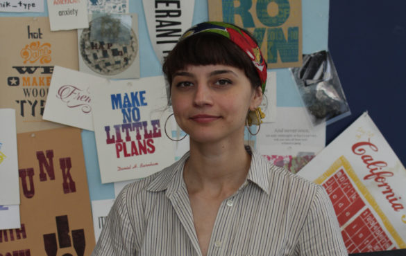
Lisa Glenn Armstrong is a multi-disciplinary designer, artist, and educator living in the Humboldt Park neighborhood in Chicago. She received her MFA in Motion Graphic Design from California Institute of the Arts in 2018 and her BFA in Graphic Design from DePaul University in 2012. Her work focuses on themes of movement, time, and the tensions between artificial and emotional intelligence. She currently teaches motion graphics in the School of Cinematic Arts at DePaul University and is part of an electronic music ensemble called Chandeliers. She was also recently a Spudnik fellow.

Kirsten Holland: How did you get into printmaking?

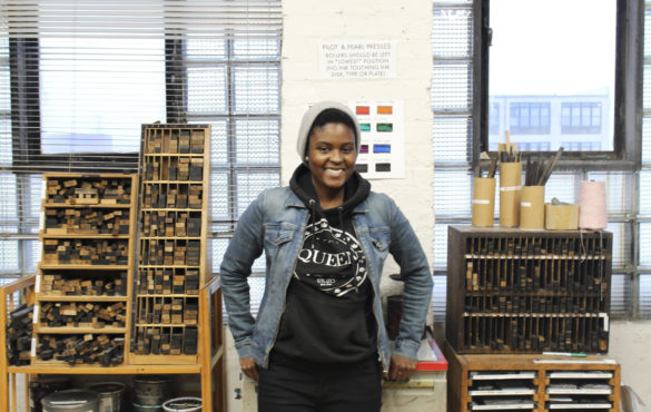
Lisa Glenn Armstrong: Well, I studied graphic design in undergrad and grad school, and I got really into screenprinting at CalArts (California Institute of the Arts), which is where I went to grad school. They have this long history of printmaking in their program, and this kind of beautiful, but a little decrepit, print shop. I just kind of fell in love with working in there. It changed the way that I worked and thought about designing things.

KH: How do you feel it changed the way you worked and thought?

LA: I think a lot of times, things are really kind of hands off in design schools today. In my undergraduate experience, we didn’t do any screenprinting. We did digital printing for posters, but even then we weren’t always required to print them. So being able to pick out the inks, design within constraints for silkscreen, and then actually physically print it—something that you designed—yourself was this sort of empowering feeling. It can be frustrating and time-consuming at times, but it’s a very rewarding process. And, since it’s actually made by hand, you get a very different look and feel that I think people now really appreciate. You can see the mistakes and the texture. There’s more of a human touch that’s evident that is lacking when I print things digitally.

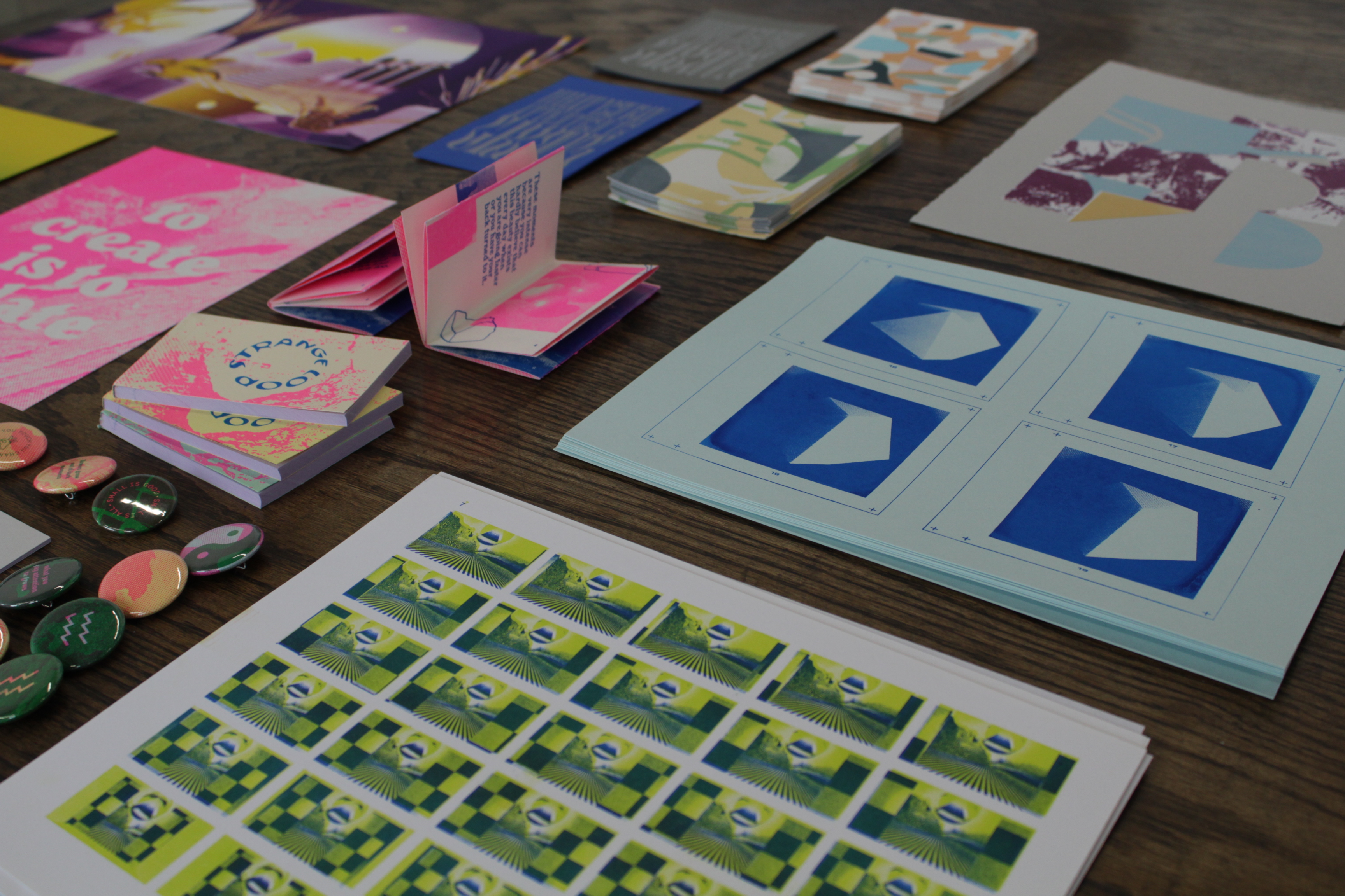
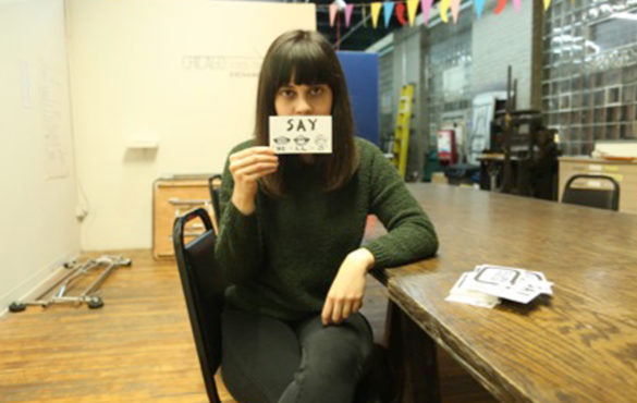
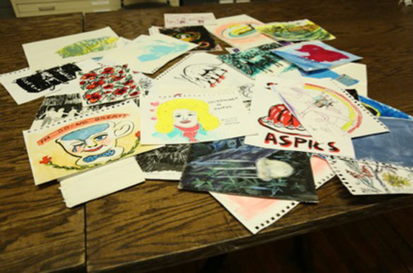
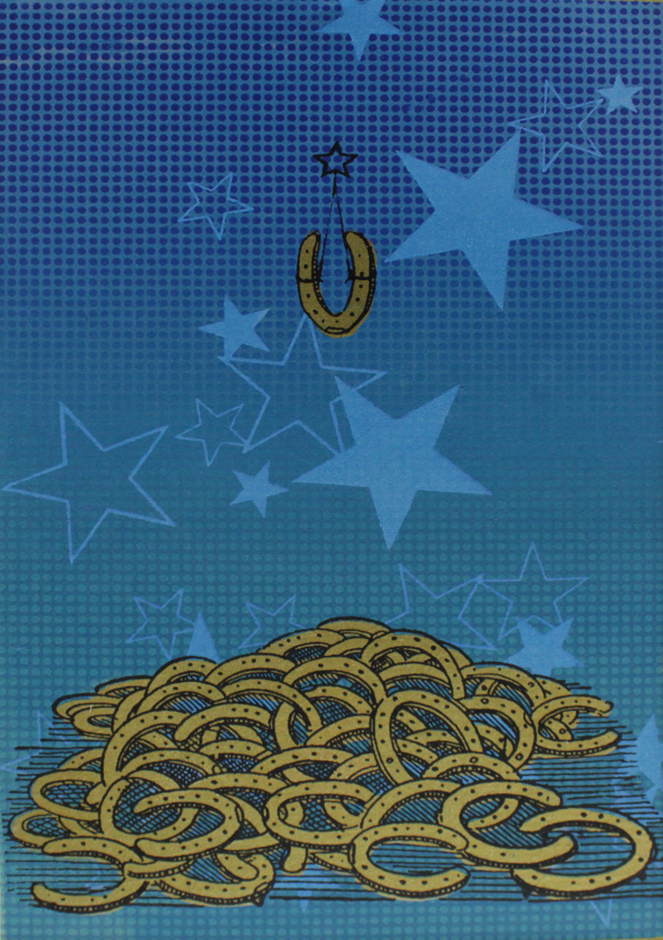
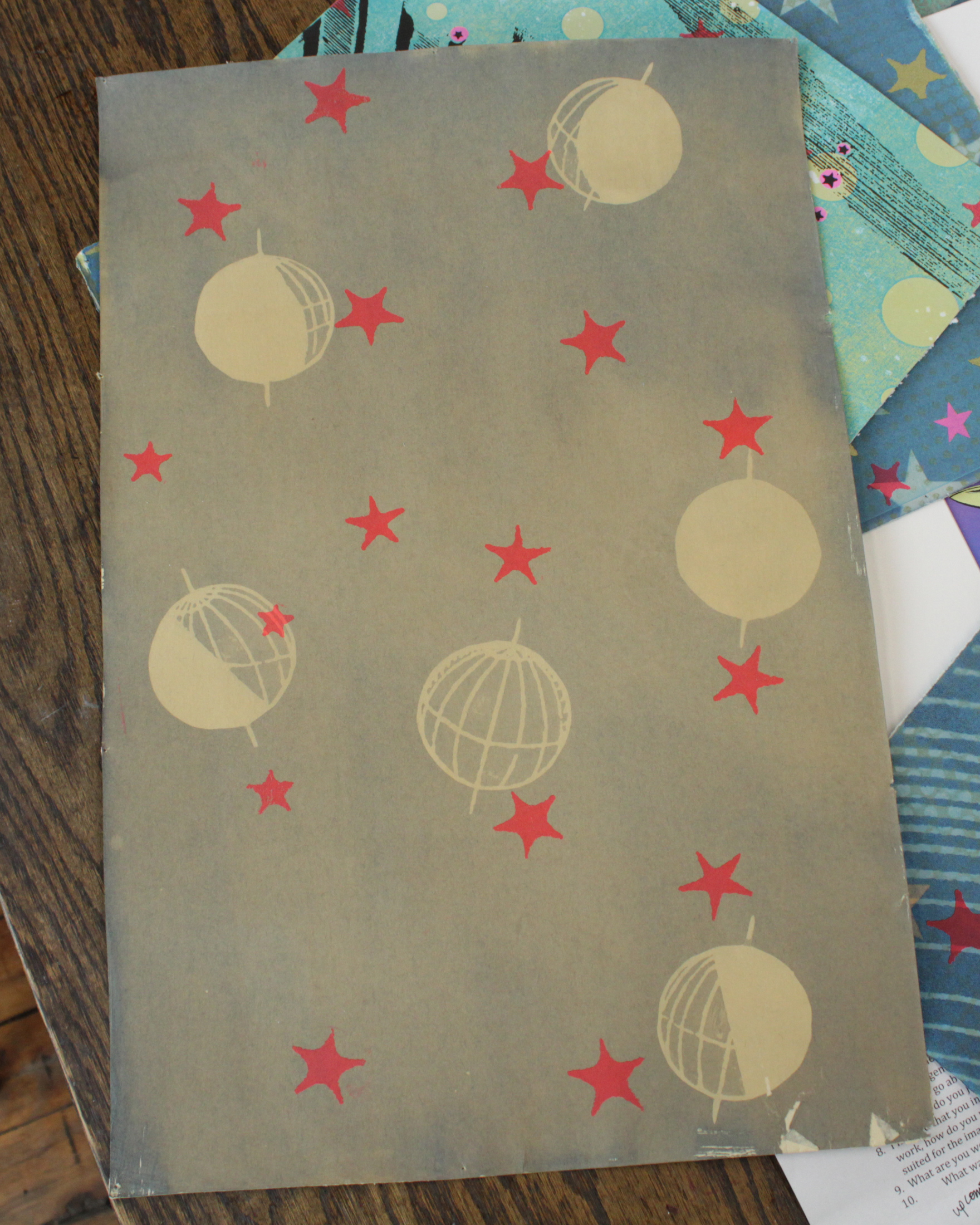
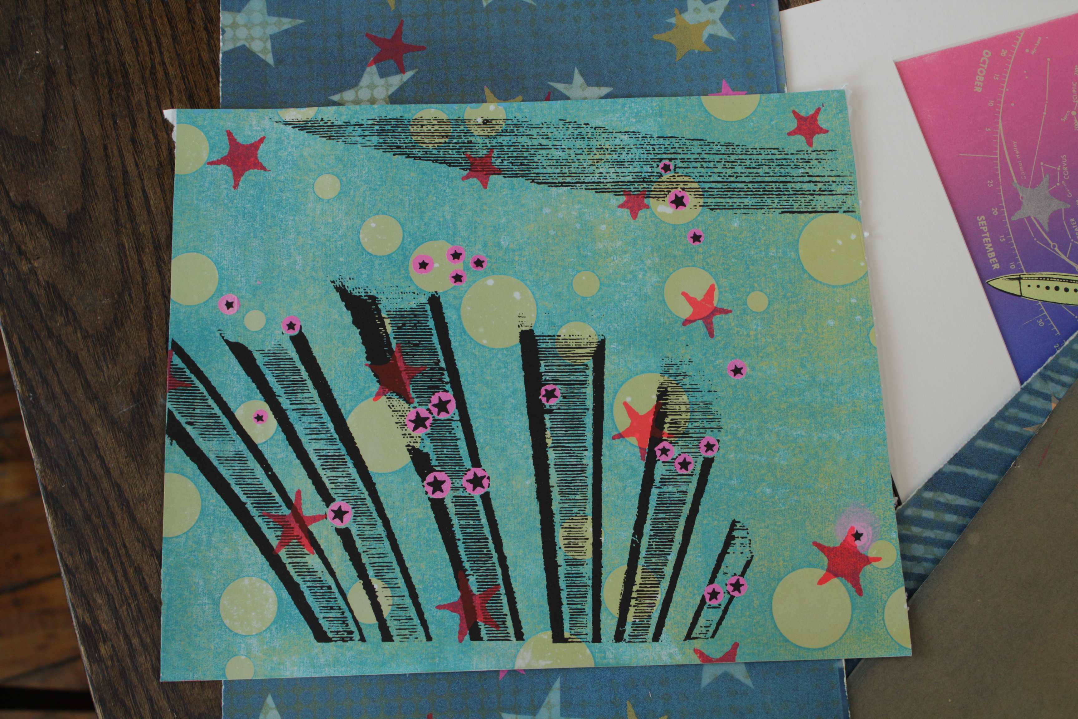
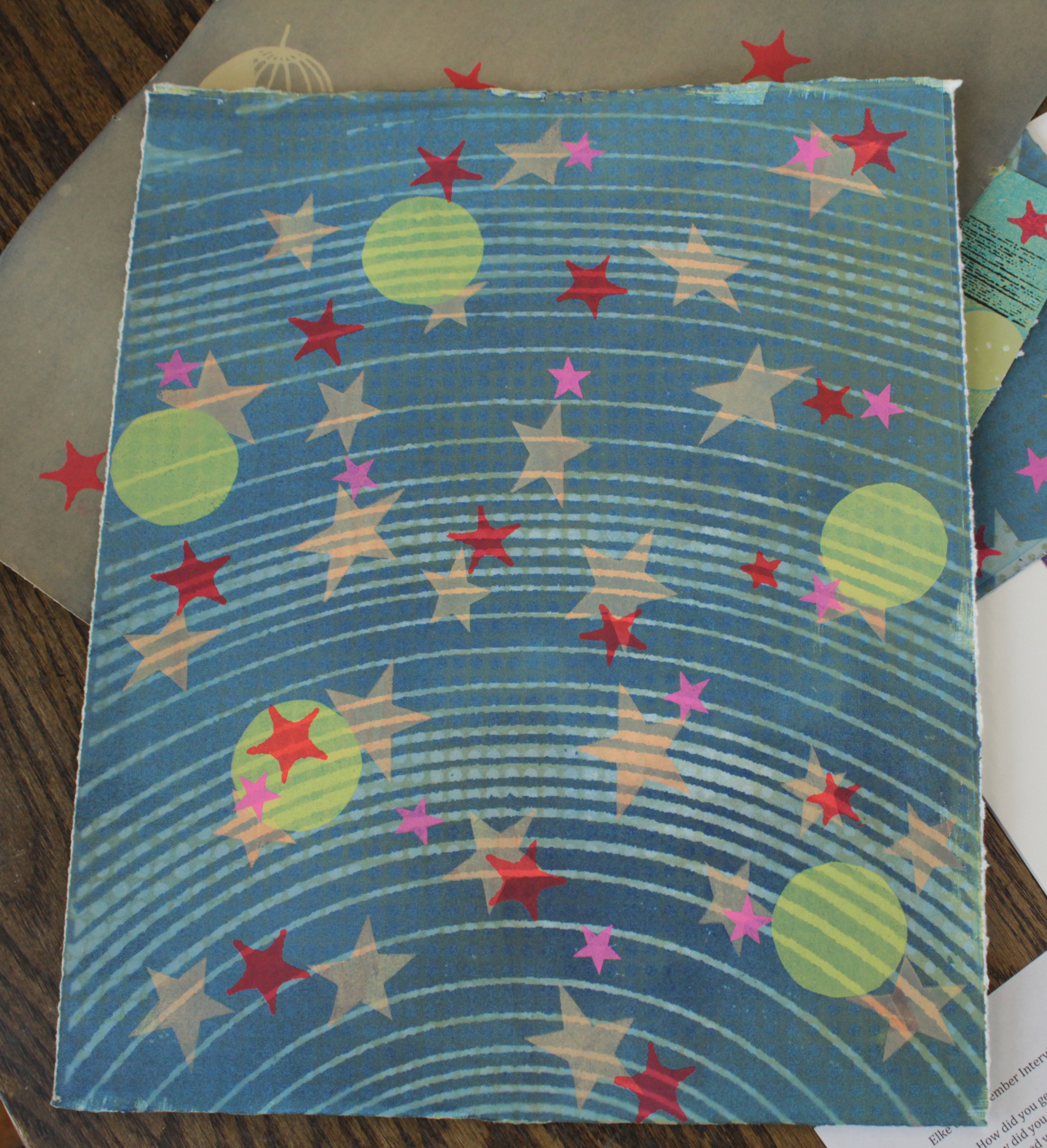
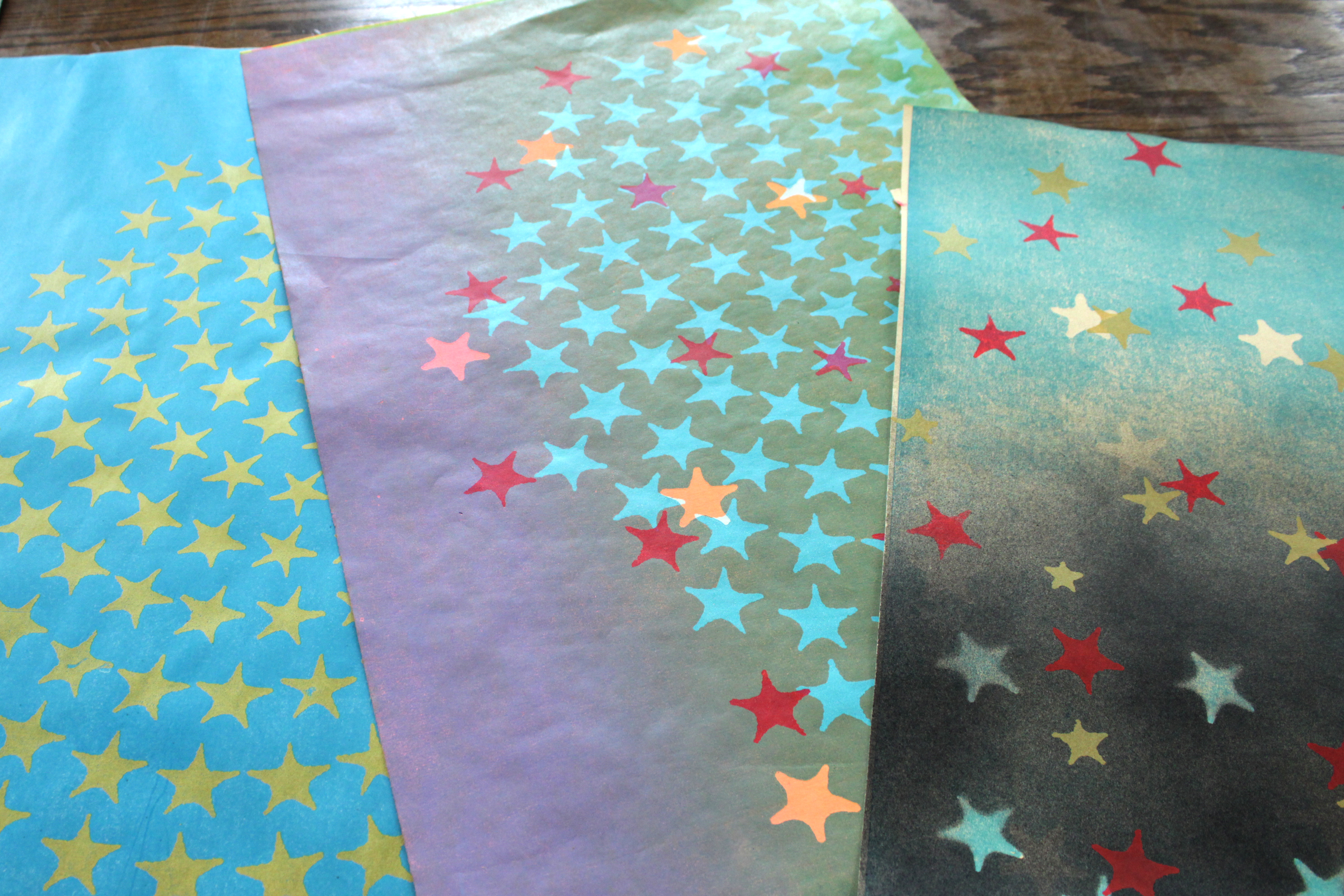
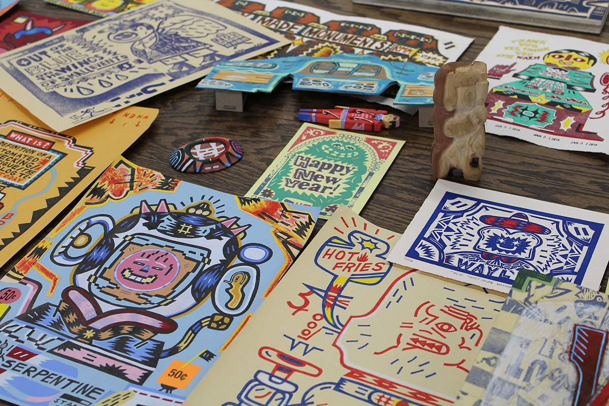
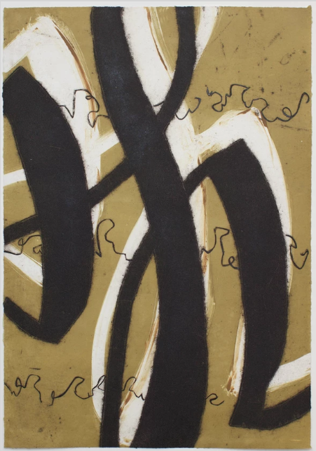
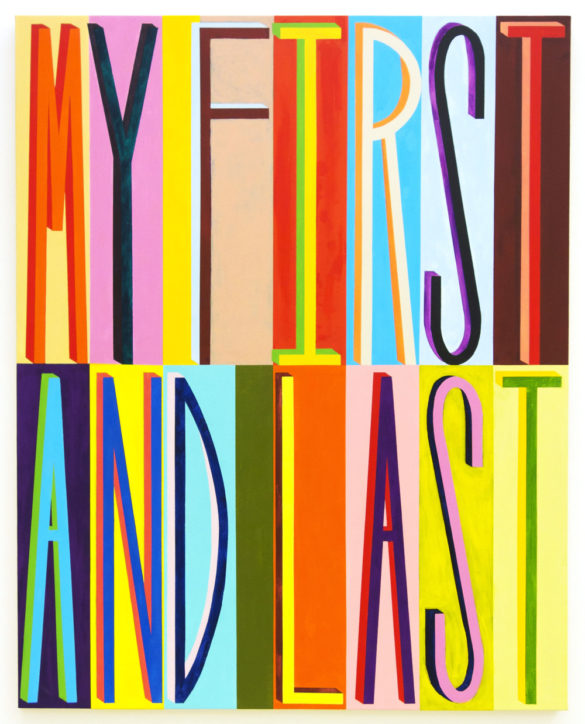
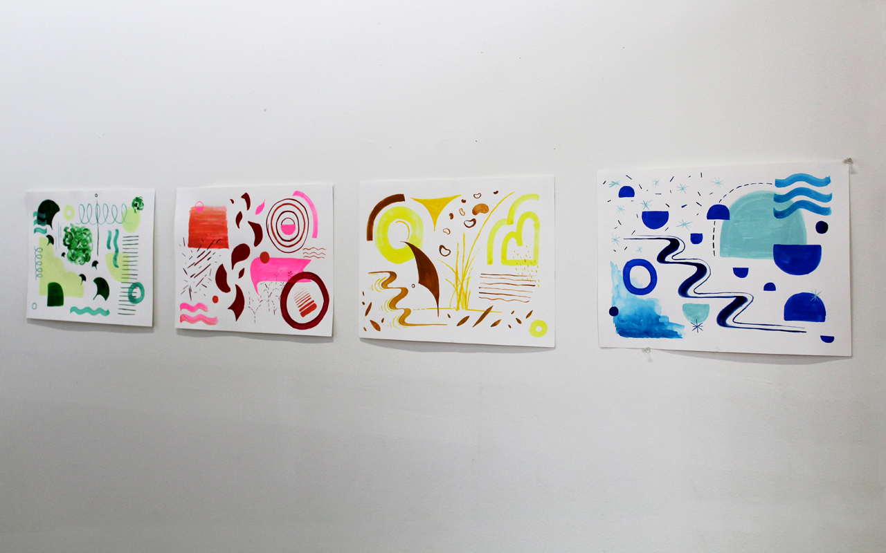
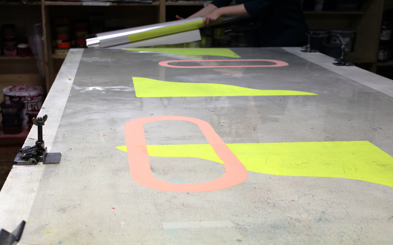
A collection of Lisa’s prints.

KH: Do you have any favorite mediums that you’ve tried so far?

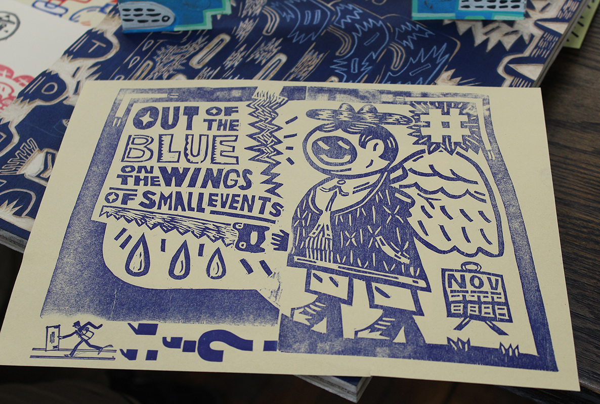
LA: I mostly work in silkscreen and risography, but I’ve also done some relief printing. I don’t have a favorite necessarily, but I would say that I do silkscreen and risography the most. And there are different things that I like about those two. Risography is the cheapest form of printing. You get those amazing fluorescent colors that are harder to achieve and retain with silkscreen. So, it’s a great way to produce things quickly and cheaply. And, silkscreen… it’s just fun (laughs). It’s just fun to do. If I haven’t done it in a while, I feel like I am missing out and I’m not working that part of my brain. But I also carved a lino block recently, and it was really satisfying to spend a couple of hours carving away at something. So it just kind of depends. I would love to get into etching at some point; I haven’t done anything with that. And letterpress is really high on my list of things that I want to try next.

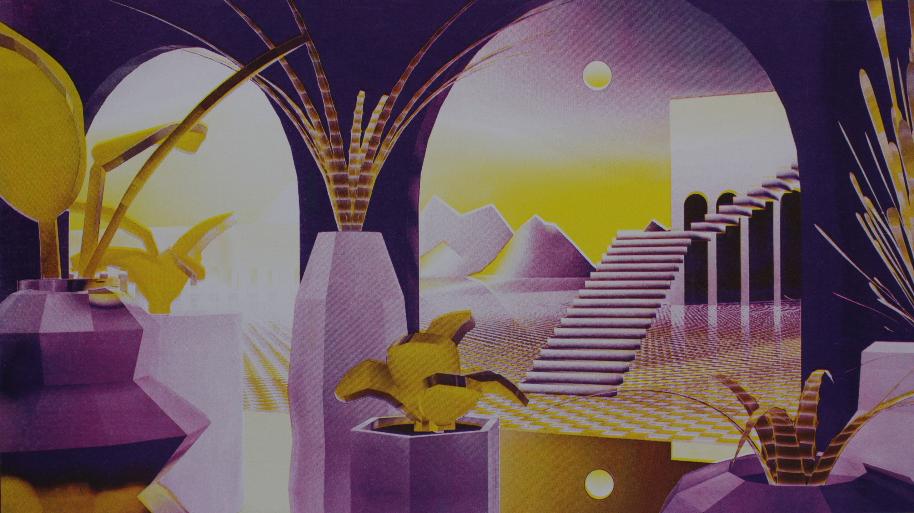
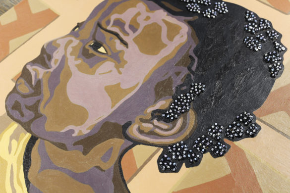
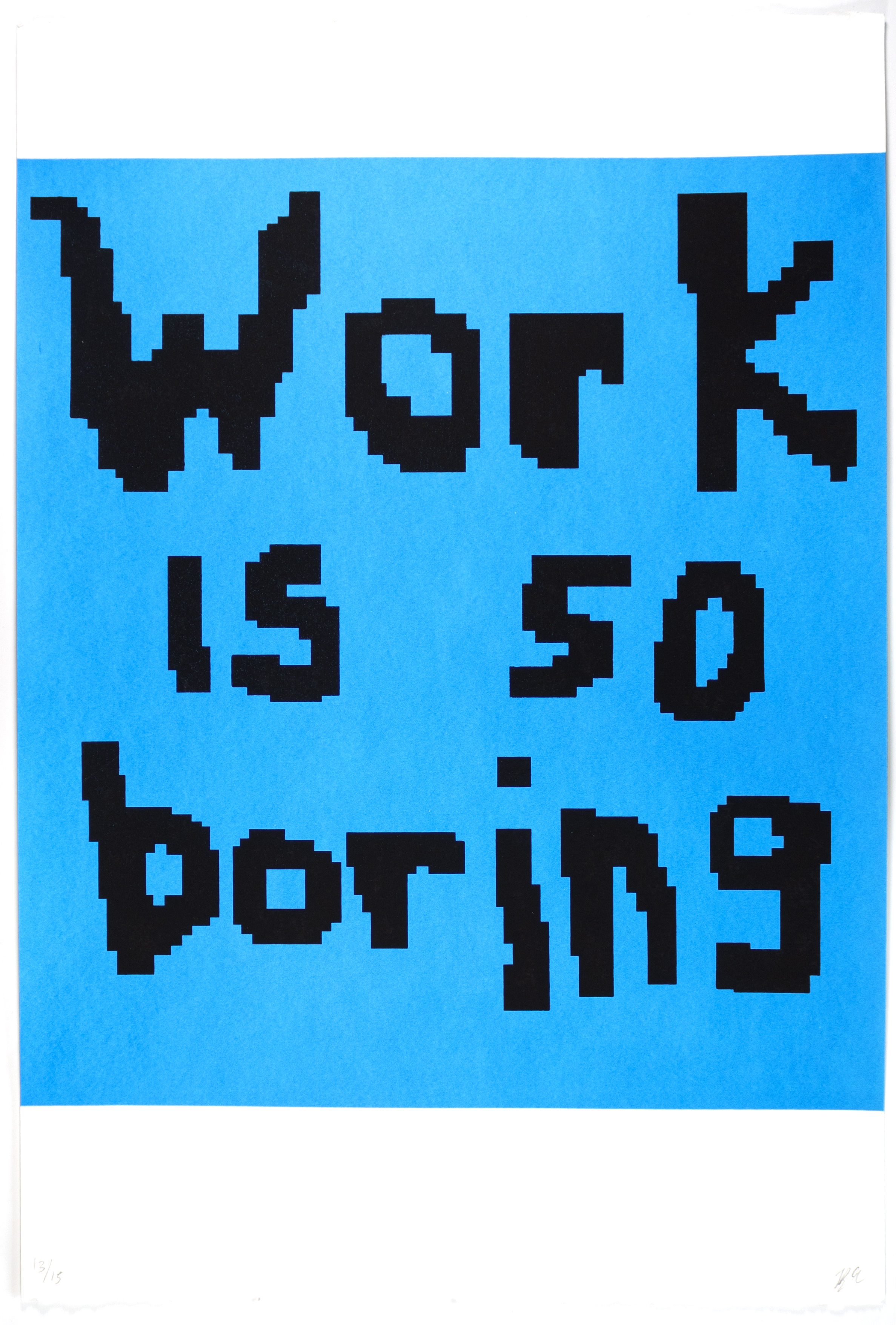
Einfühlung I, risograph print, 2019.

KH: We already touched on this a little bit, but how do you feel your work in print relates to your more digital work in design and motion graphics? Do you feel that they inform each other or intermix at all?

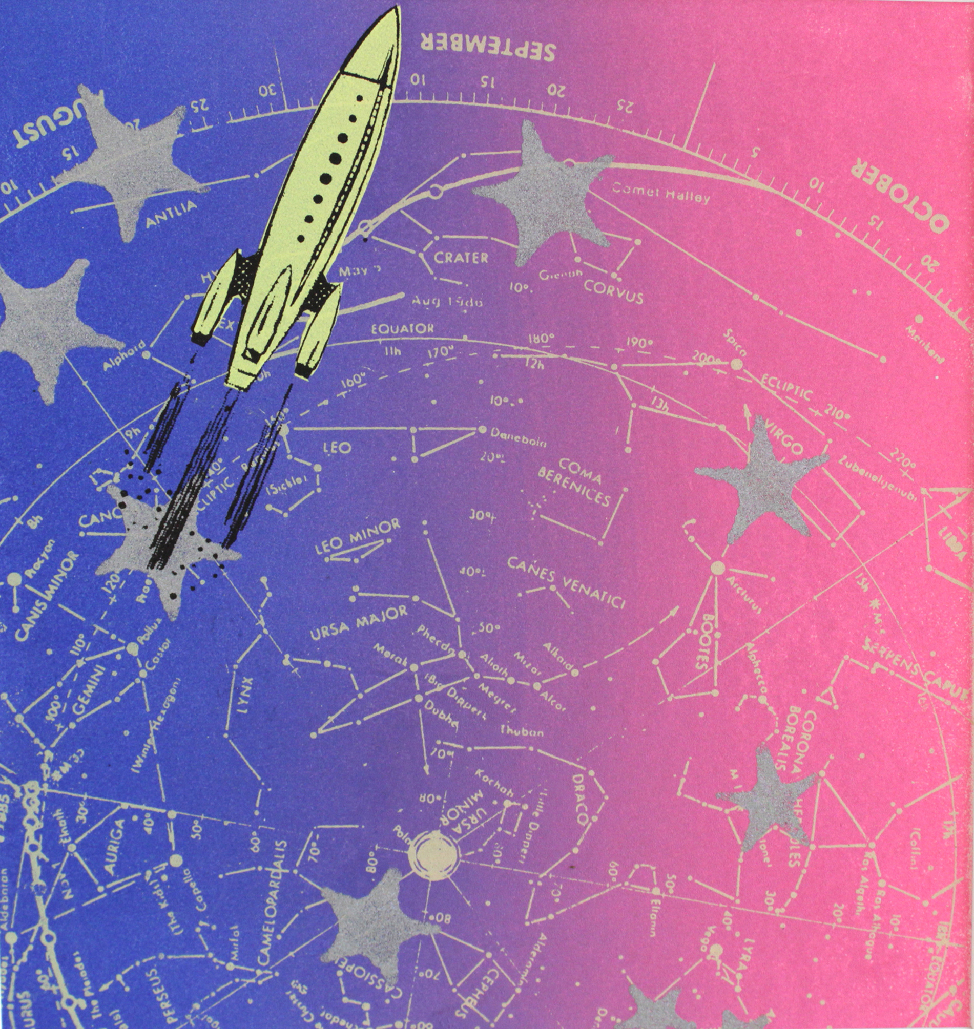
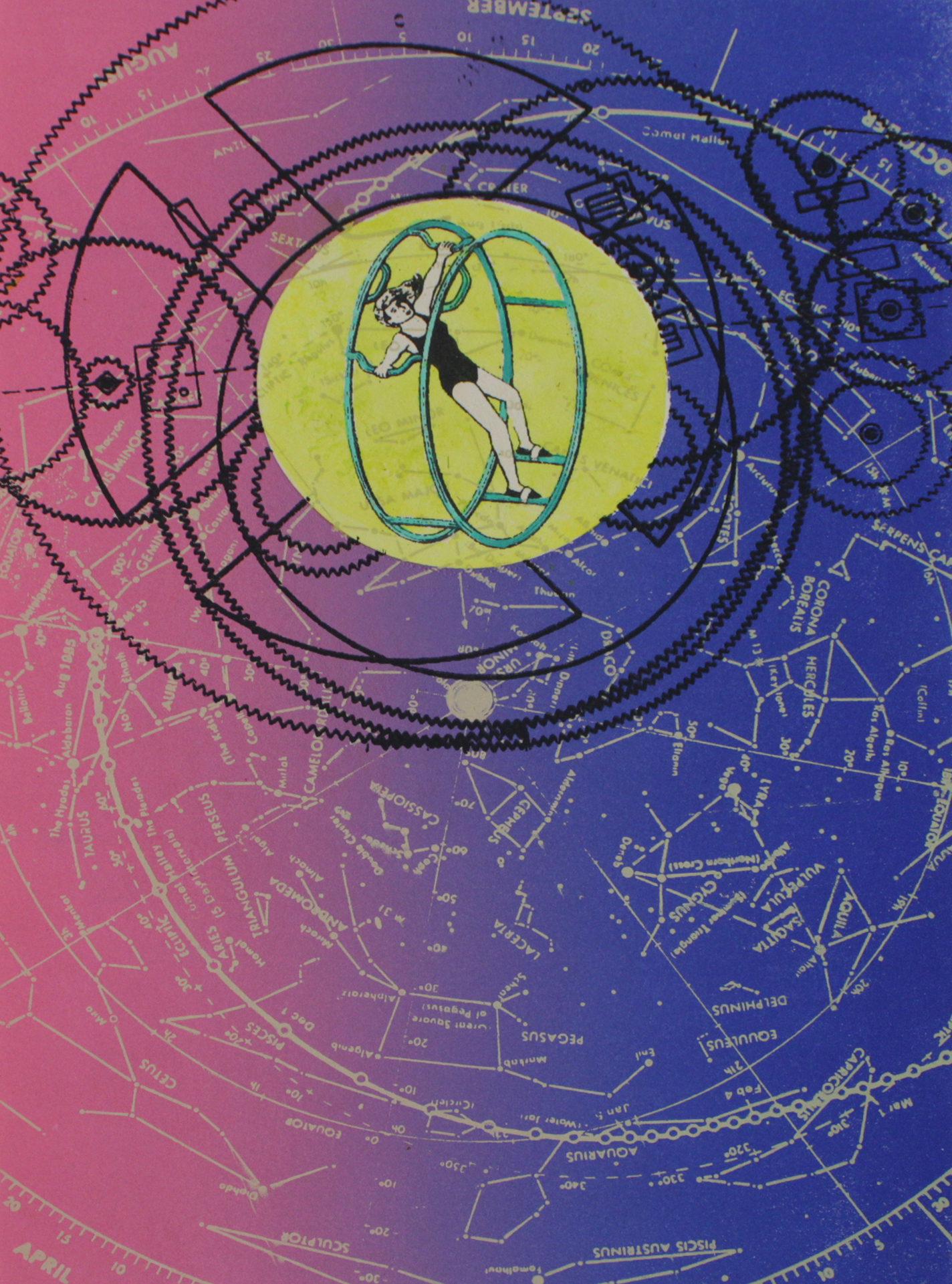
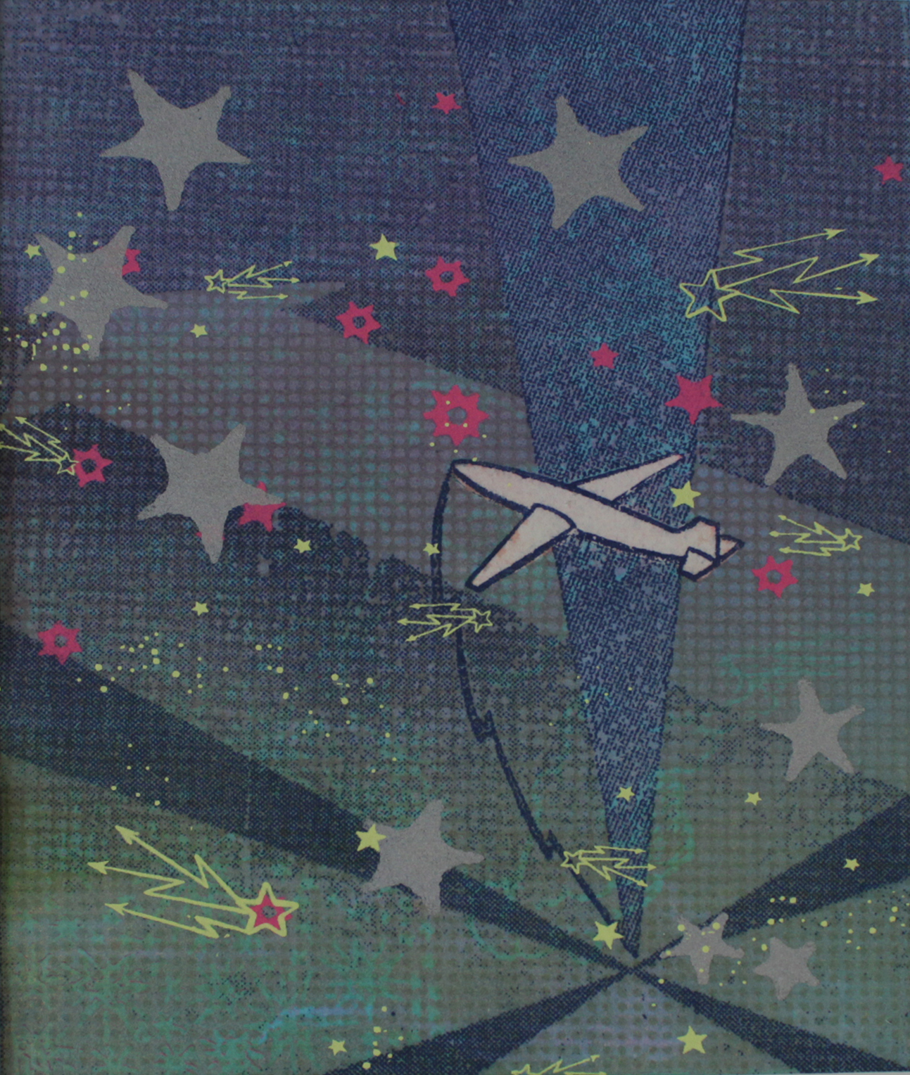
LA: Yeah, I’ve been working on this short animated film about that pretty much since the start of the fellowship. It was a response partially to teaching motion graphics at DePaul. I was also just thinking about how much time I spend on the computer for my own work, and how much ownership I can claim over that work versus an algorithm. So, I decided that I wanted to take these things that I was designing and building (digitally) in 3-D and translate them into print, and then bring them back into the computer so that there’s kind of this feedback loop between the digital and the analog and back again. A lot of that is just sort of trying to bring some of the humanity back into the work, because when I look at 3-D rendered work it sometimes feels cold or austere. And, there’s something that happens when it goes through the riso that gives it this sort of like warm, grainy, tactile feel to it, almost like 16 mm film. And of course, there are mistakes that happen along the way. So, a lot of it has been kind of experimenting with the mediums to see what happens. Now I’m trying to organize it and put it all together into a finished thing.

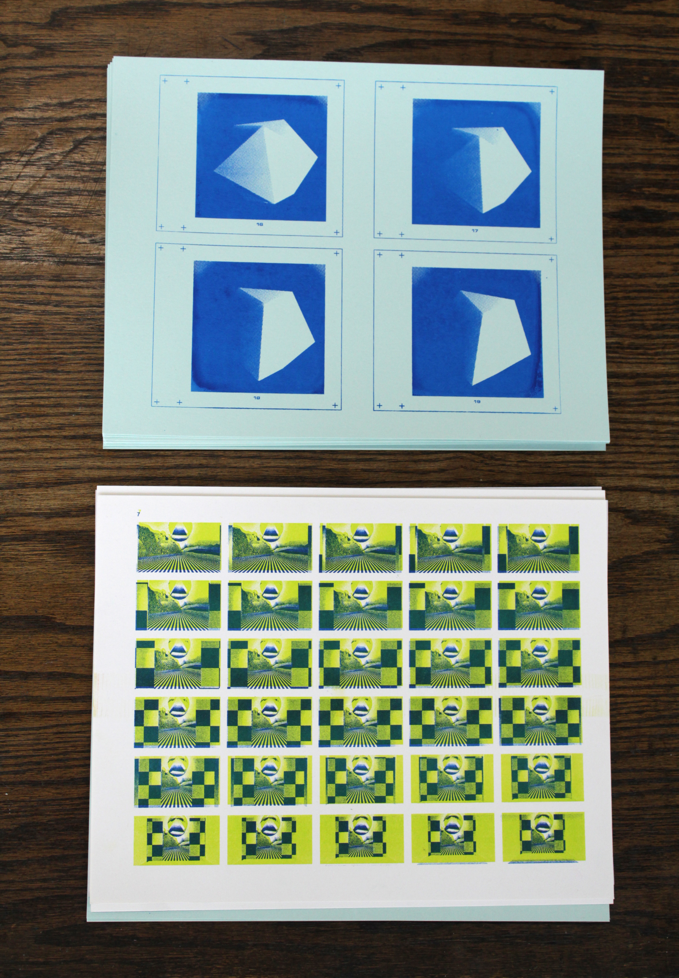
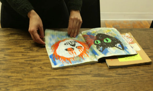
Frames from risograph-printed animations, 2019.

KH: Do you have any other current projects on the horizon besides that one?

LA: That’s pretty high on the list, but I also started making a book last week when I was in California with some of my friends from grad school, and it’s inspired by Sister Corita Kent. We were looking through her book, Learning by Heart, which is something that has informed a lot of my work, and so has her teaching and her work in general. We decided to create these assignments based off of her book, and make a book of those assignments that we followed through ourselves and then documented, showing the outcome of what you could do with it. So that’s being pieced together and hopefully printed soon. I also want to do a curated artist’s book. I would put out an open call for submissions, loosely around ideas of the paranormal and metaphysics, and get people to contribute their alien encounters or ghost stories. Then the plan is to donate whatever proceeds are made from it to the ACLU. I’m still kind of working out the prompt and everything, but I think it will be a risograph printed book. There’s a lot of aliens and sci-fi throughout what I do.

KH: Would you say that you are inspired by aliens and sci-fi? Or how is that integrated throughout your work other than the curated book you just talked about?

LA: In a lot of my work, I take inspiration from books and text, like how I mentioned Sister Corita Kent. I read a lot of kind of new-age-y, almost self-help stuff, but also a ton of science fiction, especially feminist science fiction. So, I love Octavia Butler and Ursula K. Le Guin. I love science fiction as a tool for thinking critically about the conditions of the world that we’re living in now. It gives us this critical distance and space to think about what else might be possible. Or, if we continue down on the road that we’re going on now, where will that lead us? As a designer that is interesting to me, to think of how you can structure or think about designing for the future. There’s definitely an interest in asking questions, thinking about the unknown, and thinking of things as fluid and relative rather than binary and black and white. A lot of the text in my cards and things that I was printing came from Octavia Butler and another writer named Adrienne Maree Brown, who basically researches Octavia Butler’s work and writes about it too. There are a lot of interesting ideas specifically in Octavia Butler’s work about adaptation and social change, and those are all interests of mine.

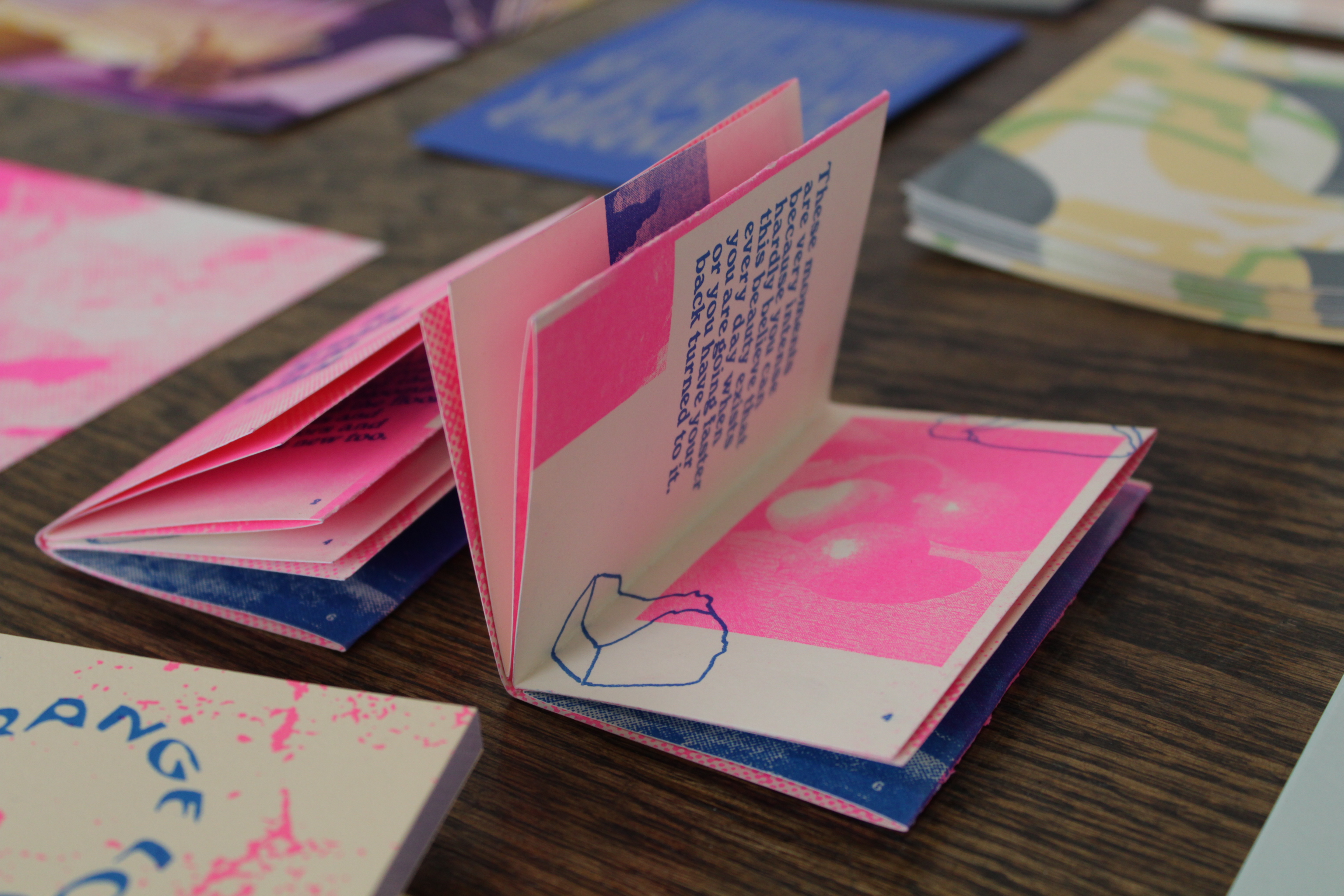
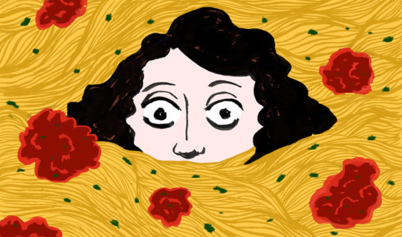
To Create is to Relate, risograph-printed miniature poster and artist book, 2019.

KH: Switching gears a little bit, what sort of directions to you see your work going in the future? Or do you have a particular direction you want to head in?

LA: I want to just try to remain open and adaptive to whatever comes my way. I try not to get too set in working in one particular way. The nature of working in design especially is constantly changing, so just being able to be open to either working in a time-based medium, or print, or something else is really important. I’d also like to do more teaching, and use that as a way to complement my practice too. There are also just a lot of things I want to learn how to do. I want to copper plate etching, but I also want to learn 3-D sculpting software. So I have interests in very different realms, but I’m interested in how those might inform each other.

KH: You’ve talked a little bit about how you also teach at DePaul, and want to teach more as a part of your practice. What has your experience teaching been like, and how does it inform you?

LA: It’s been great, and challenging, but I feel like in the back of my mind I always knew I wanted to be a teacher. All of the sudden, I just decided, “Okay, I’m going to do that thing.” So it feels right, I guess. I’m happy in that role, and I love that my job is to be excited about something and get other people excited about it. And, it could be, you know, changing a tire or something. I’m just happy to be in that kind of environment, sharing ideas and getting people to think about what they’re interested in. It’s inspiring to see what people are making, what they’re thinking about, and to see the kinds of patterns across too. The common themes are interesting. This is also my first year teaching, and so, it’s been good.

KH: You also recently finished your fellowship at Spudnik Press. What was that experience like?

LA: It was really nice. Because I had just moved back here from California a couple months before starting, I was really looking for a place and a community of other creative individuals to fall into. I think I was really lucky with the group that we had too. We all just clicked really well, and had similar interests. I think my favorite thing was the public program we did. We did a workshop called Paper Trail, where people came and tried out different printmaking techniques, and it was just a lot of fun to do. All of the planning leading up to it and working with the three other fellows was really nice. It’s also just been good to have access to the studio and be around other artists, to see what they’re doing and get feedback on what I’m working on. It’s a motivating environment where you encourage each other. So yeah, that’s been really nice.

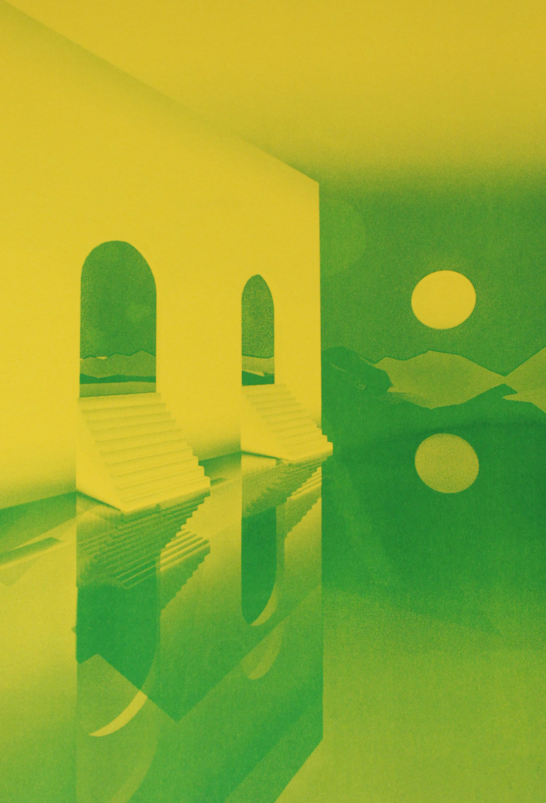
Einfühlung II, risograph print, 2019.

KH: We’ve been talking a lot about your work, so I have one more question that’s more just for fun. What do you do when you’re not making art or designing? Do you have any other hobbies or interests?

LA: Yeah. I like to ride my bike. I like to watch sci-fi movies, and read sci-fi books, and just watch lots of movies in general. I’m also just trying to get outside as much as possible, and enjoying that it’s not ten degrees outside right now. I think moving around is how I get ideas and work through things, too. I like to try and travel if I can. I have family in North Carolina and two little nieces, and I like to go visit them every once in a while. And go to art shows, museums, and galleries, and stuff like that. And I play in an electronic synth band too.

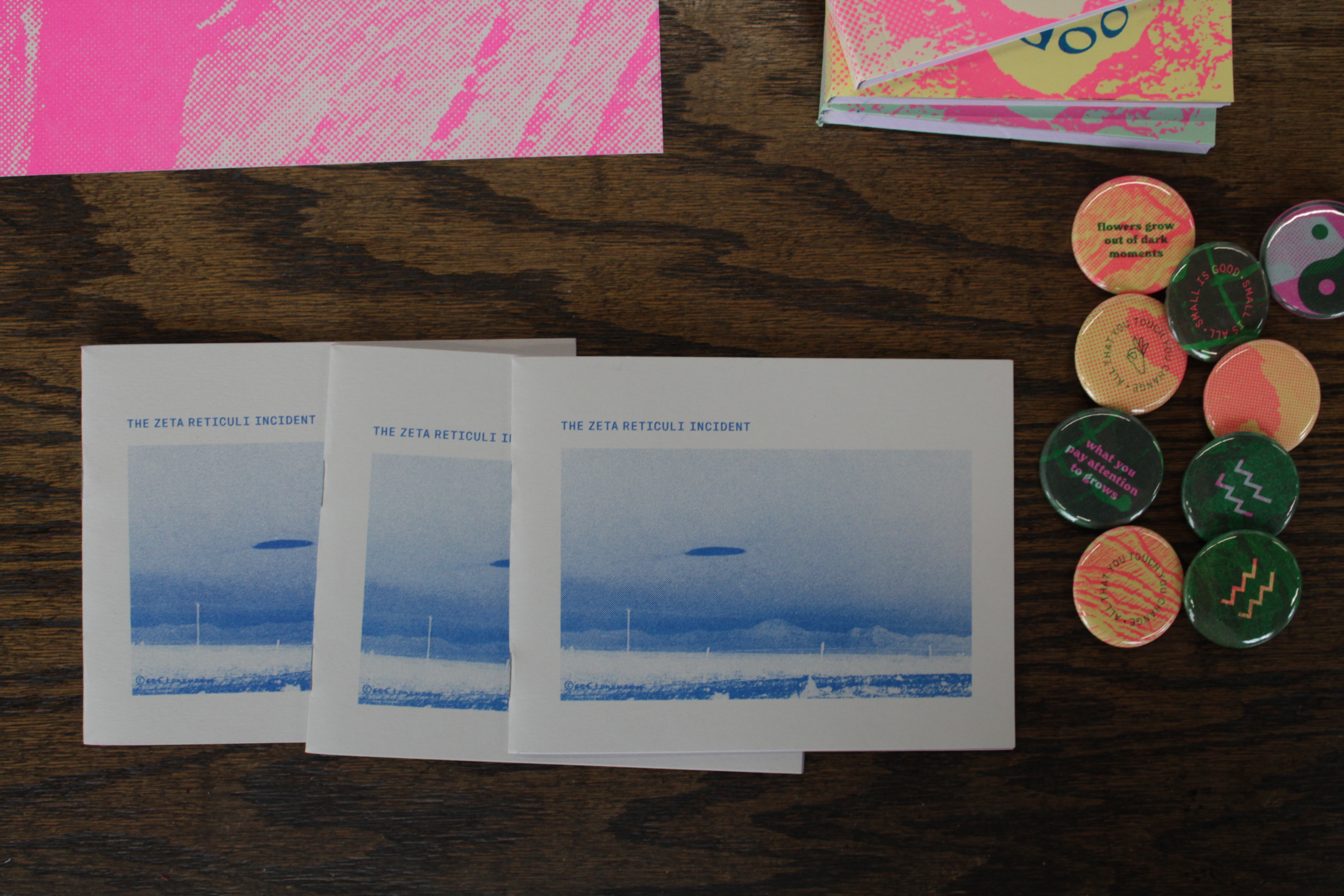
Zeta Reticuli Incident, risograph-printed artist book about Barney and Betty Hill’s 1961 alleged UFO abduction, 2019.

To learn more about Lisa and see more of her work, you can follow her instagram @liselefteye or check out her website.

Member Interview Series: Elke Claus

Elke Claus’s career began at Rutgers University in New Jersey, where she worked in a professional print studio, The Rutgers Center for Innovative Printmaking. There, she collaborated with New York City artists in the creation of lithography editions. At the same time, she was an intern at the infamous Franklin Furnace, an avant-garde art space in Tribeca. During those years it housed the country’s largest collection of artist’s books, which she helped organize. These two formative influences have left her with a deep love for technical craftsmanship and the daring of non-conventional, contemporary artworks. After moving to Chicago, Claus became a teaching assistant at the School of the Art Institute of Chicago. She has taught printmaking at Lillstreet Art Center and The Hyde Park Art Center (both in Chicago).

Reevah Agarwaal: How did you get interested in printmaking?

Elke Clause: I’ve been interested in it since I was a kid. Back then I would take pieces of scrap wood out of our garage and cut into it with razor blades, making my first woodcuts. Later, I was lucky enough to go to Rutgers University for college and major in art with a concentration in printmaking. It was just kind of a natural thing; something I just fell in love with immediately. I ‘ve been a printmaker ever since.I came to Chicago to go SAIC (School of the Art Institute of Chicago), I also had a concentration in printmaking when I went there.

RA: How did you decide to come to SAIC?

EC: Because I wanted to expand my horizons and live somewhere else. I knew about the history of art in Chicago. I was really impressed with the tradition of non-conventional printmakers: people like Nancy Spero and Jim Nutt, both of whom went to the SAIC, so I was honored to be accepted.

RA: Do you think living in Chicago has impacted your practice?

EC: Yeah, especially Anchor Graphics and The Center for Book and Paper Arts at Columbia College. There are some opportunities here and a pretty big community of printmakers, but it’s not always the best place for artists. We don’t get the same kind of financial support or publicity here that we do in other cities. It seems like almost every artist I know who leaves Chicago is much better off for it. Still, there are an impressive number of printmakers here. During the Print Crawl in May, we saw an amazing diversity of people, a variety of artists and print shops. The bar of quality was just excellent. I don’t know any other city in the Midwest that has that.

RA: In your bio I read that you worked at the Franklin Furnace for a little bit…

EC: Yeah, that was a long time ago, that was the late 80s.

RA: How was that experience for you?

E: That was a great experience, it was a lot of fun, it was great too see how an alternative gallery space is run and this was at a time when they were a big deal and they were also in the news a lot for being controversial. There was a lot of discussion about censorship and the right to free speech that was constantly coming up because people were doing things like trying to shut down exhibits at the gallery. So, it was dramatic for sure. A lot of really interesting characters went through there because it was also a performance space, and a lot of the more avant-garde performance artists were really committed to promoting the kind of artwork that pushes boundaries and defies convention, and my work is not that unconventional but I’m so glad I had that experience because I learned so much.

RA: I think your work is quite unconventional, I feel like haven’t seen a lot of work like this around.

EC: It comes out of this tradition of pop artists and people like Rauschenberg and Lichtenstein and how they used printmaking to make products that in the end were more like paintings. They were so thickly layered, they were almost always one of a kind and things were not planned as meticulously as they are in a traditional print. I feel like nothing I do is a perfect edition and it really is more about the kind of issues that painters think about, creating depth and using layers and colors to create space, it’s very formal but the purpose is purely aesthetic.

Yellow Rocket, Screenprint, 2015

RA: I noticed that there are a lot of references to science and space exploration in your work, can you tell me a little bit more about them?

EC: I work with this imagery for a couple different reasons. First, the image of the sky is the most universal thing imaginable. There’s no cultural baggage with a star or a cloud. I’ve taken classes in astronomy at the Adler Planetarium and have researched and photographed art from their collection. I also collect old science textbooks. They have these illustrations that attempt to make visible the invisible. I find these images so fascinating, so sublime. They are a huge influence. Secondly, every surface I work on is an attempt to create depth; not a conventional perspective-based depth, but a cosmic type of depth. I want to evoke something like strata of atmosphere or the scene in the Flammarion engraving, which represents mystical space.

Celestial Cartwheel, Screenprint, 2014

RA: What are some other things that influence your practice?

EC: My love of printmaking, there is something about the technique that can be incredibly satisfying. The teaching I have done has informed my practice. I have always had interesting students, I feel like I learn as much from them as they learn from me. I’m inspired when I watch the struggle and the joy that they experience when they are creating

RA: Where did you teach?

EC: I taught one class here, which was a fantastic experience. It was the very first youth-based class they had at Spudnik, and Angee and I did everything from the ground up. We did a lot of research on grants and where to get money for the class, we were getting in touch with all the high schools in this area to help recruit students and let people in the area know that we’re here. It was a lot of preparation to get this class off the ground. It was a single class on Saturdays that went for ten weeks, we had about eight students and it was fantastic. I also taught at Lill Street, and the Hyde Park Art Center for nine years, that’s probably where I have worked the most consistently. I did teach one class, a really long long time ago at SAIC. I’ve taught workshops at a place in New Jersey called the New Jersey Center for Printmaking which is now called Frontline Arts and that was a really great experience too.

RA: How do you go about making your work? Are you a meticulous planner or do you go more by intuition?

EC: More off of intuition but there is a lot of revision in my work. I use printmaking not so much to create an edition but as an editing tool. I constantly revise whatever stencil or block I have and use different color combinations to get what I want. I think like a painter when I am printing. It’s all about constant addition and subtraction and just working with the canvas or paper until it looks right.

Plane with Radar, Screenprint with lithography, 2016

RA: I noticed that you integrate a lot of techniques in your work, how do you make decisions about what technique to use for what image or part of your print?

EC: That’s a good question, I layer oil-based and water-based inks in my work. This doesn’t always work but after some experimentation I found success. Basically it creates depth when the softness and transparency of oil-based inks form a background and the sharp, flat look of silkscreen is used in the foreground. I also experiment with cyanotype. It’s interesting how cyanotypes and gum prints are easily combined with silk screen, lithography and relief. I’m really surprised more people don’t do it, it looks fantastic.. There is just something about working with the chemistry of these alternative photographic processes that feels like alchemy, and the results seem magical sometimes.

Lucky U, Screenprint, 2017

RA: Do you have an example of the cyanotype?

EC: Yeah! This is a cyanotype right here. The stars were cut out of rubilyth and then I did a cyanotype over it, so all of the dark parts are cyanotype. It gave these really crazy crisp edges and fine detail. This is a gum print, all of the background stuff here where there are the little specs of white on this yellow-green color. Gum prints are a little bit fuzzier and not as dramatic in color but with a gum print you can choose any color you want even though they tend to be a little less intense than the cyanotypes, much softer. I love playing around with both of them. This is a cyanotype but unfortunately this is on paper that is not the best quality so it turns more gray than blue. I love cyanotypes because no matter what you do with them it’s a sky color. If you’re doing something that is a landscape or has a sky in it, cyanotypes just create a very realistic looking sky tone that works nicely for creating depth specially.

Example of a Cyanotype in progress

Work in Progress

RA: Your use of color is cohesive because there are a lot of common elements across your work like the pink and blue, is there a reason you’re drawn to these colors?

EC: I think that’s just something subconscious, I think there’s just something going on in the art world in general where people are really embracing color, and when you go to art fairs or flip through an art magazine a lot of the new artists are using a lot of really bright and intense color. In the 90s when I was going to art school it was exactly the opposite, very few people would have used a palette like this, everything was shades of ochre and lots of black and white. So I think I am subconsciously being affected by trends in the art world but a lot of it also has to do with my love of silk screen, and one of the things that’s very inherent in working with silkscreen is that you can get these amazingly bright colors. You can’t really get that bold, vivid color so easily in any other medium. You can’t get this fluorescent red in oil paint if you go to the art store, you can’t find it, it just doesn’t exist, whereas when you go to the silk screen aisle there is tons of day glow colors and they’re fun to work with. I also like, in this one, the vintage circus poster-look that using fluorescent colors gives a work of art. It’s something that is inherent in the world of silk screen, you can use these intense colors and they always look so good so might as well have fun with it!

Work in progress

RA: Can you tell me a little about these works in progress?

EC: They’re about aesthetics, so I focus on formal qualities. It’s about creating depth and using balance, harmony, colors and layers to create a sense of vastness within a space that is actually flat and limited. I’m just trying to create a place of depth and mystery that elicits some sense of joy and wonder. I also want to celebrate all that is unique about printmaking. Everything originates from the hand of a printmaker, but is easily accessible to the viewer. I’m not making a message or trying to tell my life story. I just want these things to be beautiful. When somebody looks at my artwork, I want them to feel like they just heard a really good song on the radio. Art should offer that kind of simple pleasure.

Works in progress

RA: That definitely comes across, they’re very visually striking and beautiful to look at. Are these going to be in an upcoming show?

EC: No, I have an exhibit now that’s up for a couple more weeks. I’m just continuing to work on these. These prints are almost done but they need a little something to anchor them, give them focus and balance; but they’re pretty close to done.

RA: Where is your current show up?

EC: It’s at Morpho Gallery, 5216 N Damen.

RA: Great! What’s the best platform to keep up with your new artworks?

EC: Instagram! @elkeworks.art


Member Interview Series: Atlan Arceo-Witzl

Atlan Arceo-Witzl is a Mexican-American visual artist and creator whose work is concerned with everyday rituals, icons, symbols, objects, and language. He is a recent graduate of Skidmore College with a BS in Studio Art, concentrating in relief printmaking, sculpture and drawing. He lives outside of Chicago in Oak Park, IL pursuing a career in the arts and enjoying the fascinating human game of communication. He is currently a Studio Fellow at Spudnik Press.

Cat Chen: How did you get into printmaking?

AAW: So my dad went to The School of the Art Institute in the 80’s, and he studied printmaking there. I grew up with printmaking in the house. Our basement had printing press and all the ink, so I was kind of raised with it. In middle school I was exposed to things like linoleum, and then from there I knew I wanted to pursue art in higher education. I started with an intro class, and really kind of dove into it. I got to experiment with lithography, relief, woodcut, and intaglio, just like a good mix of different processes. After a while of trying a bunch of different mediums I think woodcut was the one that stuck the most.

CC: What is it about woodcut that interests you?

AAW: That’s a good question. What I’ve been exploring for the past year and some change has been the quality of the wood block as a storied object. I enjoy how tactile the surface of the woodblock is because things like intaglio are pretty subtle. Screenprint too is something that you can see what’s happening but you can’t touch it and say, “Oh I see this is where something’s going to pick up and print and this is where we’re not touching paper and so nothing’s gonna happen.” There’s a lot of character you can put into a woodblock. Also nothing looks like a woodblock cut! You work with the natural qualities of the material and turn them into whatever you want to get out of it.

CC: I read in your artist statement that your work has to do with “everyday rituals.” Can you talk about what that means?

AAW: When I was working on thesis, I discovered that I enjoy things that are mundane and part of everyday life. There’s a piece I did in my lithography class that was a mug that was kind of being morphed upside down into a reflection of itself.

Jarra Bolteado, aluminium plate lithograph, 2016

And it elicited the most response of any piece I had done in that class and I was like, “What about it is doing that?” When I started to talk to people about it I found that the piece is grounded in the everyday, but elevating it to a level that you can appreciate. It’s also a little bit comical! 

This print is about readymade monuments for things that you use everyday.

Ready Made Monuments, reductive woodcut, 2019

It depicts a clothes pin, a mug, a comb, and a telephone—but not like an iPhone—like an old house phone kind of deal-io. The tactile nature of doing everyday tasks and having a structure to your day often revolves around objects that you use. I carry a comb with me everyday. I think it kind of grounds me. I’m prone to mechanical distraction so having something to do with my hands is very much a thing that I enjoy. That ties back into this idea I really enjoy that’s, “You’re ancient now, the things you do are ancient now.” When you go back to the records of what people did everyday—they used this kettle to cook their meals and they did it in this pot, or they went up these stairs and put that incense there on this altar—in a way that was very normal. 

CC: I know a lot of your work comes from the visual language of Mesoamerican and Indigenous cultures. You also mentioned the United States Post Office as one of the traditions you draw from. What are your personal connections to these traditions?

AAW: The Mesoamerican part of it comes from the house that I grew up living in. My dad is from Mexico, and he and my mom did a lot of traveling around Mexico. My dad worked for what’s now called the National Museum of Mexican Art in Pilsen. So I know my background is half-Mexican and half German-English on my mom’s side. Besides that, I think the visual language of Indigenous peoples is very evocative and is also reflecting things that are happening in the everyday. Using the Postal Service became a funny thing about analog communication in our information era. I think the postal iconography too was something that really struck me. 

CC: What do you mean by that?

AAW: The postal service is a keystone for communication, but is also an organization. I think organizing is a thing that we like to do as humans. “We have this mission and we’re trying to do this,” and then making an image or approach that matches the mission of that group. It’s a really…diverse but quirky practice in a way that sometimes works and sometimes doesn’t. I think accessibility is an interesting thing for the postal service too, because it allows anyone to send a message to wherever. Nowadays you can do that on your phone, but it’s a relaxing practice to take stock of what you’re trying to say to someone in a tactile form and it shows that you care a little bit more. 

CC: Do you mail things still?

AAW: Yeah, so I started this project a little bit before Spudnik. I heard this phrase at the print studio one day, “What About Yesterday’s Lunch?” I have these moments sometimes where I hear a phrase and I liked the way they sound so I wanna record them. The project became a kind of funny thing but also meant to be a check-in question with friends after school. I did a little booklet to start off with, and I did a little prompt for people to make their own post cards that will be compiled into a booklet. I’m still waiting to see if I get any more responses.

CC: You talked a bit about the text you got from just overhearing things…is that usually how you get an idea for what to put in a work?

AAW: [The artist] Lesley Dill came to visit at Skidmore, and she was talking about how much she records passing ideas. If it’s something you think will be valuable later, you have to write it down in the moment. Because if it’s not important we’re not gonna remember it, and it’s hard to tell what’s important without giving it a chance. I think the way that I process information sometimes comes in these little instances or little phrases of words that get grouped together somewhere. The first print that I did at Spudnik included the phrase, “Out of the blue, on the wings of small events.” I love the idea, because that’s how we live our everyday lives. Things aren’t just magically happening. The phrase itself comes from a Union Pacific Railroads safety video that was meant to prevent injury for railroad workers. It just popped up in the middle of a video I was watching. That’s another silly thing I like to do: just browse through the internet for instructional videos and what used to be considered documentaries.

Out of the Blue, On the Wings of Small Events, letterpress printed woodcut, 2019

CC: Is your process usually hearing the words first and then the image comes after?

AAW: Sometimes they’re kind of co-evolving, and sometimes an image gets punched in my brain. I have a lot of those shower moments where I’m shampooing my hair and I close my eyes for a split second and my brain’s like, “Hey! Look at this picture that I just made up!” and they’re often very vague shapes, geometries, sometimes they’re more explicit. It’s just like a constant filter of going in one ear and bouncing around like a pinball machine in my head and then it comes out the other side. 

CC: I see that you use a lot of disposable, cheap, and easily available materials. Is that a practical thing or is it more of a conceptual choice that ties into your practice or both?

AAW: I think a lot of the times it’s a matter of what’s around because it makes it easier. Once you start stewing in an idea for long enough then you just melt into the possibilities of what could happen. I think it became a way to streamline and also utilize the things that are a part of my everyday or things that I collected because they resonated with me. Lately I like using China markers, but then you have to peel them. Those have started finding their way into being collaged on paper. I started thinking about using refuse but the refuse is also something that you made. Here at Spudnik I printed “Out of the blue, on the wings of small events,” and I made a bunch of them so that I could use them as a collaging material.

A collection of Atlan’s prints, drawings, paintings, and sculptures

CC: I’m curious about your experience as a Spudnik fellow? How long have you been at Spudnik?

AAW: We’re five months in. I think as a printmaker it’s been a fun thing because leaving school I was really looking for a community in the arts. After four years you leave that place and it’s so important to have other creative individuals in proximity to you to bounce ideas off of or to collaborate with. I think being a part of the fellowship here at Spudnik satisfied all those hankerings. Also the professional development that we do has been helpful, as a young artist not necessarily knowing what I should be doing with the thing I love to do everyday. 

CC: Do you have an idea of which direction you want to go?

AAW: I haven’t made any real decisions about what kind of avenue I want to go down. I’m leaning towards proposing shows and working on bodies of work that could potentially be in some kind of space but I’m also interested in collaboration. Tabling at events has been appealing. I’ve been doing an album cover here and there, or event posters. I’ve started volunteering graphic design with Compound Yellow, which is a space in Oak Park that’s artist-run and does cool programming. Art education is something I’m starting to get more into. Here at Spudnik I’ve been helping with the letterpress class on Saturdays and that’s been a really rewarding experience. I’m working with YOUMedia, which is a program through the Chicago Public Library Foundation that’s after-school for tweens and teens. The promise of doing arts education is something that has been looming over my shoulder for a long time because my family is made of educators. 

CC: We’ve been talking a lot about art. What do you do when you’re not making art?

AAW: I like to listen to music. I like to make music. I play the drums. I used to play the euphonium, which is a miniature tuba, in elementary and middle school. I have a bunch of various instruments. The collaborative portion of music making really caught my attention but also the act of creating is something that I gravitate towards. I dunno…I like to make things…that’s like, the thing. *laughs* I’ve been trying to get out to nature more. I want to do more sightseeing and investigating the communities of Chicago. That’s another thing, just exploring the community that I’m now back in and reengaging it in a new way. I guess that’s not really a hobby…

CC: It’s a thing to do!

AAW: *laughs* I like to go places, sometimes.

CC: Last question: if people want to see more of your work, where should they go?

AAW: They can go to my website, Instagram, and Facebook.

Member Interview: Emma Punch

Emma Punch is a multimedia artist from Richmond, Virginia living in Chicago. She is currently attaining her BFA in Studio art at the School of the Art Institute of Chicago. Her work is largely based in print and animation, however she has recently been exploring paper making and pulp painting.

Kaelyn Becker: Let’s start with what you do. Could you give me an overview of your practice?

Emma Punch: I started at SAIC in painting, then I became more interested in sculpture. I’m drawn to representational and narrative works, and started making comics. I ended up in a comics class on accident but ended up really enjoying it. From there I was making a lot of comics, printmaking, and animation. This semester I’m in a papermaking class.

‘Untitled’, Paper Pulp, Fruit Net, Thread, 2019

KB: Yeah, your work covers a lot of ground with animation, drawing, printing and sculpture. Do you think those mediums influence the way you work? For example, do you think about the way animation or print will affect your drawings as you’re making them?

EP: I feel like a lot of the prints that I do on the risograph machine are just doodles I have in my sketchbook that I photoshop together into something. I really like instant gratification. I don’t think about much, and it’s a lot more of just making. If I think I’ll get too into my head I won’t do it. For a lot of sculptures I make, people have told me that they look just like something that I would draw. I guess they are-they’re just three dimensional.

KB: Do you prefer certain mediums over others?

EP: I really like the risograph machine because I like multiples. Like I said, I like the instant gratification, but I’m in a drawing class right now with Gladys Nilsson which is very cool. I like drawing a lot because it’s just immediate and it’s done, and I can just have it.

KB: Your work is very whimsical and playful. Is there anything that you’re trying to communicate with that or is it just an aesthetic choice?

EP: I think I just want people to enjoy looking at them, so I think that plays into it. You’re the third person who’s told me that recently-Gladys Nilsson also told me that.

KB: It’s true though! You have a lot of characters and faces. For example, you’ll put a face on a mountain and it makes your work come off as very fun and lighthearted.

EP: I think that’s aesthetic that I’ve kind of fallen into, I like it and so I keep doing it.

KB: Everything you make is really colorful as well. Do you tend to gravitate towards certain color palettes or do you like to experiment with colors?

EP: I do have favorite colors. My favorite color is pink, if you go on my website it’s all pink. It’s like a default color. I think it’s beginning to be a really popular color, especially with the risograph. People love the hot pink on the risograph machine. And then I like greens and blues too.

KB: I love the zine you made with the flowers on the cover, the leaves and the hot pink. (‘Love Flower’ – 2018)

EP: Yeah thanks!

‘Love Flower’ , Risograph, 2018

KB: And then, the music video that you just did for The Slaps, that was great! Do you find it difficult to find commission work as a student?

EP: I actually approached them. They’re my friends and I said, “Let me make this for you!” And then from that I’ve had more friends in bands who have asked if I can make an animated video for them as well. And I’ve gotten Instagram commissions, but I don’t take a lot of them because animation is hard to be paid for because it’s so much more work and everyone that’s our age has no money, so I would just be underpaid for the amount of work I’m doing. But my mom told me I can’t put a price on exposure.

Still from ‘Song For a Friend’ by The Slaps – animated and edited by Emma Punch, 2019

KB: In the same light, is it hard to balance work you do outside of school with your practice within school? Or do you find that they tend to correlate with each other?

EP: Last semester I tried to make that video for The Slaps my final project for my animation class, and my teacher wouldn’t let me. At one point in time I was working on about three different animations which was wild, and I can’t believe I did that. I feel like the ideas in them really go together. For commissions I always tell people it’s going to take me a lot of time because school is my priority right now.

KB: Do you see your work as going more in the direction of exhibition spaces or distribution?

EP: I do like galleries, I just took SAIC’s study trip in New York about Art and Criticism. Most of what we did was go to galleries and do studio visits. We got to meet with a lot of the curators. It was an awesome opportunity.  Also, I worked in SAIC’s Sullivan Gallery, so I do think about how I would present my work in that context a lot. I don’t know, I like both of them and hopefully I don’t have to choose. I think that as a job once I graduate I’d like to be in animation for a career, so it wouldn’t have to be either.

‘Untitled’ , Paper Pulp, Fruit Net, Thread, 2019

KB: I was going to ask; do you think you have to pick between the two or do you think that you
can do both?

EP: I think I can do both.

KB: Especially with your work, I mean having sculpture which is conventionally thought of as
more of an “exhibition space” medium.

EP: Yeah, I’ve been talking with different groups of people about doing shows together, and applying for
things. So maybe!

KB: Have you participated or are you interested in participating in local zine fests like the
Chicago Artist Books Fair?

EP: I did volunteer at the Chicago Artist Books Fair, and when you volunteer they let you put some work
in the show. I sold out of the Love, Flower comics I brought! I only brought five or six, but it’s still a really
nice feeling to know people enjoy what you make enough to bu it.

KB: Since you just finished up that music video I want to ask, is there any music that’s been
inspiring you recently?

EP: Yes! I was listening to this song on repeat the whole way here, it’s called Full Circle by The Pom-
Poms.

‘Diary Entry #37’ , Risograph, 2018

If you would like to learn more about Emma and stay up-to-date with her artistic pursuits, you can follow her instagram  @officialembutt or check out her website www.emmapunch.online.


Member Interview: Alexandra Antoine

Alexandra Antoine is a Haitian-American artist and educator based out of Chicago. She received a degree in art and art education from the School of the Art Institute of Chicago in 2014. Her work focuses on her Haitian-American identity, which she investigates through language, memory, portraiture, and archival practices. Recently, she has been incorporating Haitian sequins and beadwork into portraitures as a way of holding onto and continuing an art form that is native to her culture. We invited her to Spudnik Press to share more with us about herself and her work.

M Kellman: Can you introduce your artistic practice? What kinds of things are you interested in?

Alexandra Antoine: I am primarily a printer and a painter. I love screen printing and lithography. Fell in love with lithography first time I did it. I’ve always been a painter. While I was at the School of the Art Institute of Chicago (SAIC) I figured out my style of painting. Recently I’ve been incorporating painting along with Haitian beadwork. I like seeing progression, from a beginning stage, middle stage, to the end. It keeps me excited.

I also work on two or three things at a time, so I can swap through different things and then I don’t finish anything too fast. I’ve noticed that in the past few years I really like slow processes.

MK: Are you from Chicago originally?

AA: No, I’m originally from Miami, stayed there till I was 11, then moved to Orlando. I have family all up and down the east coast of Florida. My parents are Haitian, so that’s what lead my parents to go to Florida. I love Chicago! I finished undergrad at SAIC, only planned on staying a year, but then I started meeting other artists, I started teaching and chilling out with the students, and I’m still here in 2019.

MK: Do you think you’d want to end up back in Miami or Orlando?

AA: You know, I thought about it. A lot of my inspiration comes from my culture—when I’m in Haiti, when I’m around family, when I’m listening to family talk. Now, Chicago has a Haitian community but it’s not as tight as New York and Miami cuz those are two hubs where it’s Little Haiti central. Sometimes it gets hard being here, which is why I’ll go see my family in New York often—it’s the closest if I can’t get to Florida. I need to be around the food, around the language—something about being in it helps the gears move.

MK: I notice you incorporate a lot of traditional practices into your work. Can you talk about how you learn these?

AA: I’m really into working with other artisans. Outside of my studio I like to find artists who do things that I wanna learn and learn from them.

When I was in Haiti, one of my friends sat with me and taught me Haitian beadwork. And now I’m working on a piece that’s super big. It’s taking weeks, but I love the process.

And back in 2010-2011 I went to Mali, West Africa, to learn traditional sculpture. It was just me and my teacher  from like 7am to like 8 at night, just hackin’ at wood. I love this because it’s a thing he inherits through his family line. There’s not a syllabus. It’s just “Watch what I do, and you do it”. I love learning like this. The classroom is nice but when you get this one on one, right next to somebody, I like this.

A portrait of a young black girl looking to the left. Traditional Haitian beadwork and sequins decorate the girl's hair.

MK: How do you decide which skills you want to learn?

AA: It’s about reconnecting with my culture. I like to choose places within the African Diaspora in art forms that are valuable but a lot of young people aren’t running to learn it. So like my teacher in Mali, if his granddaughter doesn’t want to learn it and he passes, that’s it. Or in Haiti, some of these skills I’m seeing, a lot of older people are doing it, but when you’re gone then who takes it over? I wanna keep these things that could potentially be lost because people migrate or move around.

MK: In addition to your studio art degree, you have a degree in Art Education. Do you teach?

AA: Yes! I’m all about sharing what you know, especially when it comes to African American communities. I was teaching visual arts full time in Chicago Public Schools (CPS) when I got out of school. It’s fun introducing the students to new skills, but what I found was interesting was, when I was in Art Ed and we would go visit schools, I think I maybe saw one black art teacher, if any. And the schools that were all black usually had a white art teacher. African Americans have had a huge contribution to art but none of the students saw teaching art as a career path. I wanted to teach in an all black or predominantly black school because they gotta see that art is a career they can do. And of course when I walk in it was like, “You’re the art teacher?”.

MK: So I imagine you’re not very interested in the traditional Eurocentric art history and art education curriculum, right?

AA: Oh yeah, and that’s where the struggle was. It seems like the way Art Ed is set up in CPS is, “We want you to teach X Y and Z”. But that’s not how artists work. All artists don’t want to just do this one thing this certain way. I took art history in college and it was great learning about da Vinci and Europe and all them, but… We didn’t touch Asia, South America, nothing. And I’m not saying da Vinci and all are not great artists, but what about Faith Ringgold, or Carrie Mae Weems? What about them?

So when I was teaching, I was like, “Let’s get down on the floor”. If an artist was squatting when they do this work, let’s all squat. If they were only using their hands, let’s just use our hands, no paintbrushes, no pencils. Was it what the principal wanted me to teach? Not really. But this is how artists think about the world. We’re not here just to pump out a perfect assignment.

MK: I saw you did some work with Cook County Jail and a juvenile detention center. Does that fit your practice better than CPS?

AA: It does. Right now I’m teaching visual arts with Free Write Arts & Literacy. I came in with the same philosophy—I’m not gonna just teach the fundamentals of shading. There’s so much that the students I work with have experienced, they all come from various communities in Chicago that have their own unique aspects. We can’t just be talking about how to shade. We have to be talking about things that are relevant. And I tell my students, even if you don’t become an artist, this is a way to look at the world differently instead of how you’ve been told to look at the world.

A group of women gather in a secret back room in a bookstore to discuss their protest plans. A mural depicting famous African American women covers the walls of the room.

A screen capture from Chi-Raq (2015, dir. Spike Lee). Antoine’s mural can be seen on both walls. Copyright: Amazon Studios, 40 Acres and a Mule Filmworks.

MK: So, a little fangirl momentChi-Raq? You painted the mural in the bookstore scene with Angela Bassett. So cool! How did you get that job?

AA: In 2013 I was in a group show at Roman Susan gallery. Then maybe 5, 6 months after the show—I’m teaching at CPS at this point—I get an email from the art director of Spike Lee’s new movie like “Can you come down to the studio and talk about your work?”. So I went down to the space and they told me the concept and gave me some subject matter and said, these are the women we want you to focus on painting. They had me on the set of the bookstore. I was there maybe a month or a couple weeks before they would transform it. The art director let me come on set the day they were shooting in my space. I told my friends—where Angela Bassett takes them into a secret room, all of that is mine.

As an artist, you never know who’s gonna see your work and what that’s gonna lead to. My aim is not always, somebody needs to buy this. You just never know where somebody might see your work.

MK: Did you like the public art aspect of working on the movie?

AA: Yes. It was fun doing that. It was a good experience. I do like it when my work can be accessible to more people than just the art world or just gallery openings and exhibitions. Especially since I work with young people, I want y’all to see there are other ways of being artists. You don’t just have to be in the MCA or the Art Institute. Those are great, but look at your whole community.

MK: Do you have any other instances of showing your work outside a gallery setting?

AA: Yeah, similar to with Chi-Raq—maybe early last year, someone from the Haitian Embassy contacted me and said, “We saw your work at Ghetto Biennale in Haiti and wanted to know if you were interested in a group show at the Embassy in Port-au-Prince as part of the Art in Embassies Program?” Now mind you, I had the Art in Embassies photo on my vision board for the past two years, so when they called I was like, “You don’t have to tell me twice!”. There’s this idea that when people leave Haiti they don’t come back. But I want people to see that us younger Haitian Americans, we always love coming back here.

MK: Any projects on the horizon? Future directions?

AA: This summer I plan to go to Benin. Most Haitians came from Benin, the Congo, Togo, and some parts of Central Africa. There’s an arts and cultural organization in Benin that works with young people, so this summer I’m going to work with them.

In Haiti, people know we come from West Africa—but, with the way enslavement happened, there may be people, especially some of the younger people in West Africa who may not understand how Haiti plays a part in our shared history. I really wanna build relationships with some young folks there, make connections and see what comes out of that.

MK: Could you show me some of your work?

AA: A lot of the people in my work are people I know—either family members, friends, people I met through my travels, but we’ve always had conversations. That’s important for me because I’m showing Haitian culture the way I see it, so I want it to be authentic. To me it’s important to have that relationship, especially if you’re gonna be showing somebody’s image everywhere.

A print of a face in reds and oranges. The man has three lines scarred on each cheek.

Language, symbols, nonverbal communication, that’s real big in my work. For a while, I was really into scarification practices, because that’s a way of identifying somebody, being a part of a community. When I was in West Africa, my teacher had these three lines—that’s the Bambara tribe. So I was into showing them with these prints.

This piece is looking at the architecture in Haiti. Whenever I go to Haiti I look at the tower work, the way the houses are structured, the window sections. The window is sculpted out of the cement—all these different shapes. I find that really interesting because you don’t see these a lot everywhere. This is a distinct style.

A lithograph print showing architecture in Haiti.

MK: Do you have a favorite piece?

AA: I have to say this one, because it’s all the elements I love in one. This piece is a lithograph. It’s incorporating my face with a well known sculpture from Benin, the Bronze Head of Queen Idia. I also tied in Haiti—I put the mountains in there, I put the women holding the baskets, abstract, on the head, I put the architecture of the houses in there. I’m always finding a way to layer in a little bit of Haitian culture.

A lithograph of a face made of abstract designs and details showing different aspects of Haitian culture.

MK: Do you have any upcoming shows? If someone wanted to see more of your work, where should they go?

AA: I will be showing some new work at my friend’s event on the 15th of March at Stage Two in Columbia. She has a collective called Synergy, and they’re doing an album release party. It’s an all women hip hop album that she produced. I’m excited about that because, again, I get to show work outside the gallery. The way people talk and the conversations you get to have are different when you’re in different spaces.

And there’s another show in New York at Flux Factory. One of my friends is doing a show for Women’s History Month, for black and brown women. I love artists supporting each other. I’m always down for that.

MK: Is there anything you want to try that you haven’t?

AA: I want to try letterpress, which surprisingly is the one printing technique I haven’t learned. I love words. Why haven’t I tried this? I visited Purgatory Pie Press, a letterpress studio in New York, that does artists’ books, so I was like “collaboration?” and the owners were all for it. I’m really excited. I’ve got a lot of directions, but they all connect in some way.

Member Interview: Emma Bilyeu

Emma Bilyeu is a visual artist working out of her basement studio in Humboldt Park, Chicago. As a student of printmaking and book arts she likes to incorporate paper, letter shapes, book forms, and multiples into her work. With this she is able to explore ideas of communication and storytelling. When not in the studio, Emma is cuddling her dog, reading dystopian or self-help literature, or attending a Chicago Printers Guild meeting.

[Ruby LaPorta]: What has your experience been like as a Spudnik Studio Fellow

[Emma Bilyeu]: I’ve found that it’s nice to be held accountable. Before the fellowship, I had a membership here, but only made one or two prints. The fellowship has provided the kind of community and structure that encourages me to produce more. Even though working at Spudnik comes with a built-in community, my introverted nature felt more comfortable in the structure of the fellowship, which is a very personalized way of being involved with Spudnik. Being a fellow gives me a feeling of ownership of the shop, which in turn has improved my workflow within it.

[RL]: I read your project statement regarding what you wanted to accomplish through your fellowship. Do you think you fully realized what you set out to do?

[EB]: Well, it’s not over yet! Because I have made a lot of singular artist books, I thought it would be a good idea to use the fellowship to make a large edition. However, the idea of creating so many books was keeping me from just exploring my concept. I was paralyzed by the logistics so instead, I’ve altered my plan.  I am on the path of making a book that combines both etchings and screenprints. I’m creating a single book (instead of an edition), and exploring the same concept through prints, too. 


Emma Bilyeu, Guilt, 2015.


[RL]: What drew you to Chicago? 

[EB]: So, I’m from Indiana originally. I went all around for school—I ended up in Georgia. Then I had an internship in upstate New York. After that, I thought the natural next step would be to move to New York City, but the few times I had visited I felt very alienated. At that time I knew a few people in Chicago, not necessarily in the art community, but people I could reach out to if needed. And Chicago is close to my family, which is a plus. I have really enjoyed Chicago. It’s hard to compare to other places because every other city I’ve lived in has been experienced while being in school.

[RL]: How has Chicago helped you evolve (as a person/artist)? What’s it like being a part of the Chicago printmaking community?

[EB]: It was a learning curve at first, like learning how to make friends when you’re not forced into the same environment. When I moved here, I was too shy to come to Spudnik, so I was just doing a lot of drawing and painting. However, once I mustered up the courage, I realized the people at Spudnik are just like all the other printmakers I know—super rad, friendly, and encouraging. Nothing to be afraid of! Being at Spudnik has been great, especially having the other fellows to commiserate with and to encourage each other. It’s like a little family. We all get along really well. Spudnik definitely shapes my view of Chicago in a positive way.


Emma Bilyeu, Findings of Familiarity, 2014.


[RL]: Through your website, project statement, and artist statement, I noticed you play a lot with the idea of communication and not only the forms it can take—being illegible, repetitive, or layered—but the way this language is transmitted through “book-like” objects, as you put it. Can you speak more to this thought process?

[EB]: For a while I worked strictly with ambiguous letter forms, I didn’t know what kind of statement I wanted to make in my work. The letter-ish shapes seemed comfortable and at the same time ambiguous enough to be able to hide behind them. Yet, I know these forms take on more meaning as I keep working with them. Lately, I am building layers in my work to represent the mind’s thoughts and the complexity of them. Not knowing what to think, possibly avoiding thinking, and representing that kind of mindspace visually. So, book-form feels natural, almost journalistic, private, yet public, but somewhat illegible.


Works in progress by Emma Bilyeu.


[RL]: Your current project is titled “Vermilion”—what is the significance of the color vermilion in your work?

[EB]: I am simply drawn to the color. I find myself mixing that color, buying ink pens in that color. I am just attracted to it. I was googling around to research vermilion, because the origin of pigments are interesting to me. As it turns out, vermilion comes from the word “vermin” because there was a worm that they crushed and made into this pigment.

[RL]: Oh wow, that’s fascinating!

[EB]: It is fascinating! And beyond that, I am trying to make this connection in my book between simple thoughts and how they inhabit my brain where I wish more complex thoughts would naturally develop. So the simple phrases like the pest or vermin will be foiled with a more subtle, but still legible, dialogue representing more complex thinking.


Emma’s rough draft of her fellowship project, Vermilion.


[RL]: Is there a favorite printmaking or book-making process you have?

[EB]: When it comes to printmaking, I really like etching. It has a really gritty, physical element to it. It feels like a mini sculpture or something. I’m really drawn to the technicality of it, too. I go back and forth between deciding if I’m an artist or just a craftsperson. I feel like I am pretty skilled at printing on copper, and that’s satisfying to me. And for bookbinding, I think it varies. If I’m making a sketchbook I like to use coptic stitch because I like the look of the exposed binding. But it ends up that a lot of my finished artist books are bound as accordions or some variation of it.


Emma’s etching plates.


[RL]: Do you think that it’s important for the book form to reflect the text that you put inside?

[EB]: Yeah, I mean every decision is conscious. I try to put some thought into how the structure informs the content and vice versa. But sometimes it does just feel like bulls**t, trying to make all of these connections when it could just be straightforward, simple.

[RL]: Yeah, it’s completely subjective.

[EB]: Yeah that’s true. It adds another layer for people to get lost in though, which I don’t mind! The longer they spend thinking on it is fine with me.

[RL]: Since language is such a large aspect of your work, what are some literary pieces/ writers that influence what you make?

[EB]: I’ve been really into short stories lately. I like how they are just a window of a larger story. It leaves a lot to the imagination. So you pick up in the middle, and soon it ends, and it could be a satisfying ending or you could just be left on a cliff. Recently, my favorite collection of short stories is The Withdrawal Method by Pasha Malla. I’m really impressed by his ability to write from so many perspectives. If I remember correctly, in The Withdrawal Method there are perspectives from a child, an animal, men, women. That is really inspiring to me- that he can be so brief, but yet it so complex and it works. Also, I recently read the funniest, strangest story. It’s called Tacky Goblin by a local author, T. Sean Steele. I was reading it when I had to commute on the train to a job, and it had me laughing out loud. The story is so bizarre and I think the lightness and the strangeness of that book is a good reminder that not everything I put out has to be so serious.

[RL]: Absolutely. There’s also, along with pressure to create meaningful content, a pressure to constantly be creating “really good work”.

Sadie, Emma’s dog.

[EB]: Yeah! I’ve been using Instagram stories a lot, and people tell me I’m funny. They’re just feeding my inner comedian ego. I’m trying to figure out how I can get some of that reaction in the visual work that I’m making. That’s just a thought, I haven’t explored it much. Well, I guess maybe a little. I have one etching that says “Sadie, you ate my first skateboarding scab” (Sadie is my dog). I fell, and I got a big scab on my arm and I peeled it off like any human does, and for some reason I had it sitting on my laptop and I closed it and forgot to take the (this sounds so gross) scab out of my laptop. I took my computer to my hometown and was with my parents that weekend. As I was sitting on the floor and I opened up my laptop to do some work, Sadie just waltzed over and “slurp!” ate it. I was like, “Wait I kind of wanted to keep that.” Because it was a marker of me learning [to skateboard]… but I guess not. So I have kept the memory in an etching.

[RL]: Like you said, you find Instagram stories as your “comedy” outlet.  you see yourself exploring how your practice can evolve alongside social media more? 

[EB]: I think so. Because I think when I have the gut feeling that I should open Instagram and share something with the world, it would be smart to share it in a more permanent way. I don’t think I would catalogue my stories as finished work. I don’t know if that’s a thing, if people do that. But, I guess it’s more of like a sketchbook in a way.

[RL]: What’s next for you after your Spudnik fellowship?

[EB]: Well, November is busy. I am tabling at the Chicago Printers Guild Publishers Fair and the Spudnik Fellows have an exhibition opening, Bulletin, at Fulton Street Collective that same week. I am kind of in between jobs. I have thought about returning to school, since I want to keep learning somehow. Whether that’s through a university, or getting more serious about bookbinding and starting to master that craft. I really enjoy doing publishing. I was able to work on a piece with Angee, Spudnik’s founder and director, and I did a bit of that in undergrad with visiting artists—the technical side of making art. I’m not positive, but I would like to pursue being a tech person for artists and anyone who want to make books. I am still navigating how that will come about.

[RL]: It’s definitely nice to be at a place like this where that is so accessible and it’s so easy to learn and observe. There are so many people coming in and out, it’s great to be in an environment that allows that to develop.

[EB]: It is exciting to see people get excited about printmaking, or learn new ways to make.

[RL]: Well, my last question was if you have any pets, but…

[EB]: Haha yes, I have Sadie! My boyfriend got her when she was a puppy and I met her just after she turned 2. She is the sweetest; an angel.

If you want to find out more about Emma and her work, you can visit her website or follow @emmabilyeu on Instagram.

Member Interview: Ben Garbus

Ben Garbus is an artist who hails from Western Massachusetts, but is currently living and working in Chicago, IL. He received a BA in Studio Art with a minor in Art History from Oberlin College in 2017. Garbus was a Studio Fellow with Spudnik Press in 2017-18. His practice consists of creating thought provoking, humorous images of everyday mundaneness through painting, printmaking, and sculpture.

Emma Punch: Tell us a little bit about yourself and what you do.

Ben Garbus: After finishing my undergrad I moved to Chicago and have been here for a year. During this this time, I’ve worked in a special education school, did some freelance art handling, and worked events for a photography company. I’ve learned many non-academic lessons this year, and that’s given me a lot of content for my art practice. I’ll reach some conclusion after participating in ordinary routines like when I go to work, come home, go to the supermarket, and generally relate to other people. My text work is the result of all those experiences and exchanges. Ideas get stuck in my head, and when I write my thoughts down, it helps me process them. Making prints or paintings from those notes can push the process even further. It helps me understand how I think, which helps me understand the context I live in. When I wrote my project statement for the Spudnik Studio Fellowship I was trying to theorize something that now comes more naturally for me, which is to use art to describe the ideas that might arise through ordinary circumstances. That idea seemed vague then, but for some reason, I get it now.

Ben Garbus, There’s Nothing So Sour As A Work Of Habit, 2018.

EP: In your fellowship project statement you talk about using banal phraseology in your work, how do you choose or come up with the phrases?

BG: I write notes on my iphone, mostly, and then I workshop them. I’m interested in cliches and jokes because they are often assumed as neutral, but I think there are underlying causes for this. As an artist, what you choose to latch onto can have an effect on people. It can get them to reconsider things they might otherwise overlooked. I reference cliches and jokes because they have a lot of content, but have lost their meaning. There’s a little bit of truth in every joke. Early in my practice, I was trying to directly use subjects that already exist, like a close reading of found objects or ideas. However, I wanted to shift into something that involved more writing rather than appropriation, and that gave me agency to interact with my subject matter, which seemed more creative or productive. So now I’m trying to write in the format of cliches or jokes to say something new, riffing on a given point of reference to get people to rethink it.

Ben Garbus, Optimist’s Complaint, 2018.

EP: So that’s why you came up with your own phrases?

BG: Yeah, I try to work around a preexisting concept or phrase. There is a Jenny Holzer quote that goes, “to write a quality cliché you have to come up with something new.” The way she writes is concise and she doesn’t waste words. All of her writing sits so naturally on the tongue, you don’t have to question her truisms, even though you’ve never read them before, and they are really direct. That’s super affective to see. You can engage people by tapping into their affinity for consuming language and art, and if you make something that is a little bit off within that, it can change how they think. But I’m not as good as her. I take a shortcut in my writing by riffing on existing turns of phrase, like what you might see on a poster at the doctor’s office, but rearranged. Creating something completely new asks questions of how ordinary phrases get to be ordinary. I think writing on the edge of what already exists is another way to do that, and it’s a little easier for me at this point. It can be funnier, too.

EP: What kinds of things and/or artists are influencing your work right now?

BG: I’m influenced by people who work with the visual culture around them, both in the popular realm and underground. I always saw Mike Kelley as having done that for some parts of American visuality. Jeremy Deller seemed to do that in England. I like them both. Jenny Holzer is of course an influence. There’s a sense of realism in those three artists’ work. They connect their lives to others through art and speak to a lot of different kinds of people. They imagine the role of artists as producers of new visual culture in conversation with what already exists, explicating some social narrative for their viewers. They have a good sense of the world in which they live, and it doesn’t take much effort to feel it in their stuff. They are obviously what I might strive towards; I mean they are monumental artists. Right now my work is smaller in scale and more personal than public. However, I try not to be influenced by artists as much as what I am making things about.

Ben Garbus, Existential Text Painting, 2017.

EP: I feel like your work is very David Shrigley-esque.

BG: Yeah! I think he’s funny. I think we share a dry sense of humor in our work, and I like his sculptures, particularly his life model projects. I do have a background in comics and that was how I first started drawing, but going to school for art and studying contemporary art history shook me into keeping my disciplines separate, or at least framing a single artwork into a more sturdy kind of category. I aspire to break that habit, but right now what I like about text art is that it combines word and image into one discipline. It’s about an image of a word, which is an interesting idea to me, more so than a word next to an image. Having words and images together only emphasizes their differences, which can reinforce barriers between disciplines. I only mention it because David Shrigley makes a lot of image and word paintings. So it’s not that I want to keep disciplines separate, it’s that I don’t want to pretend that putting them together alleviates their difference. I don’t think Shrigley purports to do that, but I want people to see that the walls between categories are malleable. An image of a word actually subverts the idea that they are two different things.

EP: Why is it important to you to incorporate sculpture into your printmaking and painting  practice?

BG: Sculpture can be good for helping people consider the whole work of art as part of its meaning, as opposed to just what it depicts. If you’re thinking about a print in a sculptural way then you add to its meaning a consideration of the way it was made, the paper it occupies, in what context it exists. There’s more to see. All the decisions that go into a work of art can be interpreted. With so many decisions at stake, I think making sculpture helped me to be more intentional about why I make anything. So if I’m going to make a painting, part of its conception has to be the idea that it’s a painting, or whatever that means. If you ignore that premise and only think about what the painting is of, rather than what it means as an object, you can miss a lot. Maybe that happens regardless, but if I think of myself as a painter, it’s never only about what I paint. It’s also about the making of a painting. I’ve made a painting and called it a sculpture and vice versa. 

Ben Garbus, This Side Up, 2017.

EP: What is your favorite medium to work in right now and why?

BG: I’ve been drawing and sometimes that leads to an idea, which will become something, but I never really show my drawings.

EP: What are your drawings usually of?

BG: They’re a lot of cartoons and intuitive things I don’t want to put out there. I don’t feel obligated to let everything I make roam. If I’m going to put something out to the public or consider it my work, I have to challenge it before I can let it go. Maybe I’ll grow out of that. While they help me pass the time, thoughtless drawings aren’t what I want to contribute to the world. I’m torn about what I want my aesthetic to be or how to make categories of art for myself, but I do know that I want my work to be thoughtful and careful. I like people, whether or not they’re artists, who do a lot of different things, and you can tell they did it because of the sense of humor in it or a specific logic to it or it shows a particular drive. I don’t like that some artists have to market themselves based on how the work looks.

EP: Is aesthetic really important to you in your work?

BG: Visually, I don’t like to do the same thing over and over again. I’m not very perseverant in that way. I like inventing. It can be good to follow through with a certain image or process, but I think it’s more productive to contribute a way of thinking to the world than to manufacture the same aesthetic over and over. That might be my short attention span talking, but it also has to do with what I value. Although, maybe those influence each other. I am falling into the habit of making work in a consistent style, which could be an improvement for me in the long run, but right now it only contradicts how I’ve figured out to best rationalize my inconsistency.

EP: What is something you want people to take away when they see your art?

BG: I want people to chuckle but also to think more about everyday life and to use art as a means to tap into their own thoughtfulness or mindfulness. Most art you could say is functional in making people content with being alive, or as being life affirming, and I do want my art to be life affirming, but that’s kind of a dark thing to sell to your viewers and a low standard to set for yourself. For me it’s important to connect to people at eye level, so I try to offer small poetic ideas that might stick with them.

Ben Garbus, Exactly What it Says, 2018.

EP: How has printmaking influenced other parts of your art practice?

BG: For me, printmaking has established a process of experimentation that’s been relevant to many other things. Patience and deference for structure is a lesson I learned from printmaking, but also knowing when to break free of that. That said, I’ve been trying to make printmaking less about how elaborate its process is, so I’ve been making these one-colored prints to make them as simple as possible while still being prints. I want my work to be concise both materially and conceptually.

EP: What do you think is the most important thing you learned as a fellow at Spudnik?

BG: Being a fellow was a really positive experience. It was a great opportunity to work on an artist talk, because I hadn’t done a public talk like that before. I learned how to take myself more seriously, which can be a challenge. To get artist opportunities you really have to seem like you believe in yourself, which Spudnik helped me with. It was valuable to have Marcela, Spudnik’s Program Director, around to nudge me along. It’s great to have other people keep you on track with making things. It can get exhausting when it’s all on your own.

EP: What are some recent, upcoming, or current projects you are working on?

BG: My most recent obsession is drawing varsity lettering. That’s the kind of American visual culture I’m interested in.

EP: Now for a fun question, what was the last song you listened to?

BG: In the car on the way over I was listening to Kuff by Shelley Thunder.

If you want to find out more about Ben and his work you can visit his website or follow gwiebus on Instagram.

Member Interview: Margot Harrington

Margot Harrington is a visual artist working in graphic design, print media and painting. She is the owner and founder of Pitch Design Union. Her work explores the contemporary landscape of Chicago, as well as the Internet, intersectional feminism, gender identity, Japanese culture, Scandinavian design, Chinese medicine, meditation, and art in support of oppressed peoples. Her work aims to discover and uplift new role models.

Ali Tomek: To start, from looking at your website, your work seems to cross boundaries among fields like graphic design, illustration, and printmaking. How would you describe your work?

Margot Harrington: I mean, that’s a pretty great description. My degree is in fine art with an emphasis in graphic design. However, I do a little bit of everything. I have a lot of different interests. I’m more of a generalist versus someone who has a specific niche or very focused way of working. That’s how I’ve always worked, blurring lines across a broad range of mediums, which reflects my personality and keeps me from feeling too boxed-in.

AT: How do you find inspiration?

MH: The best answer is always, everywhere. I interpret this question as live a rich life. Say yes to things, go to concerts, go to shows. Sometimes I let myself work to the point of frustration before I step away.

I think a lot about this in terms of appropriation of cultures. For example, my dad and I, we used to email each other haikus once a week or so. Haiku led to Wabi-sabi, Japanese printmaking, and how Japanese people approach creativity in general. Obviously, I’m not Japanese, I am a white person, but I’m very aware of the privilege to learn about another culture and how important it is to be respectful of those historical practices.

Inspiration and appropriation are very closely related terms. Appropriation is rampant in the art world. That’s something I spend a lot of time thinking about for myself in terms of how to be respectful of other cultures and what is really meaningful to me: am I just borrowing for the sake of borrowing? I try to be super honest about it and approach it the best way I can.

AT: So what is it about Japan, specifically, that is so inspiring?

MH: Well, it’s a way of exploring my relationship with my dad. He passed away two years ago and studying Japanese culture helps me remember him. I will definitely say that he was appropriating Japanese culture in our home growing up, which I recognize now, but I learned about something different because of that. It planted a seed. I started to research all of these practices Japanese people have around making work creatively. There are terms for things that don’t exist in American culture that I think we could benefit from. Actually, there’s a few startups that have adopted some of these practices, with varying levels of success. One is the concept of Kanban, which is basically shorthand for defining your bandwidth to be able to complete or create a task. For example, do you have room in your Kanban for new work? It’s almost like efficiency is great to a point, but then you can become too efficient where you’re suffering or hurting yourself.

I also had a chance to visit Japan last year. I went there by myself for two weeks. In part, this trip was in honor of my dad, because he never went there himself, although he would have loved to. Also, I wanted to experience immersing myself in a place where I don’t know anyone or the language and where the culture is extremely different. You’re immediately labeled as an outsider.

AT: You mentioned printmaking earlier. How does your background in printmaking inform the rest of your work?

MH: The most printmaking experience that I have is in screenprinting, which is a similar approach to design in that you can collage a composition together and layer things. My work uses a lot of color, overlapping shapes, and abstract geometric forms, which I feel comes from a collage aesthetic.

The other thing that I didn’t mention is that I also paint. It looks similar to my prints when I’m finished with it, but sometimes painting to me is more urgent in that it doesn’t require as much setup or advance planning. You can just sit down and something comes out, which I find very helpful if I’m unable to make it to the studio. I can still do something with my hands that’s not on the computer.

I also always just loved vintage type and objects. I think that is what brought me to printmaking originally. I wanted to modernize a really classic traditional practice and do something new and fresh and vibrant with it. Also, my grandpa was a letterpress printer, which I didn’t know until after I started printmaking. It skipped a generation, but it’s in my blood.

AT: As someone who is studying graphic design now, I’m curious how you balance digital and physical making. Lately, staring at a screen for too long makes me a little sick.

MH: Yeah, it’s like you live your life by the glowing box. Like a weird episode of Black Mirror or something. I will say that I don’t always have a balance there. It’s not like I can have a perfect percentage or a perfect hourly breakdown everyday of what task I’m doing or if it’s on my computer or not. It still takes me a lot of discipline to be able to do both.

What I have at home — that’s my primary workspace — is a room with my digital desk, and then a similar version of my studio set up here at Spudnik. If I really need to, I step away from my computer for 15 minutes or so and do something else to keep my brain fresh. I also incorporate some illustration into my design work, so I’ll draw something, scan it, work on it in the computer, draw on it some more, scan it again — it’s somewhat of a cyclical process.

Harrington’s Spudnik studio.

And then here [Margot’s Spudnik studio], I really try to prioritize this space with my art, although as you can see I have another computer display on the floor. I take it off the desk most of the time because otherwise I just end up working on my computer. I try to visit my studio at least one full day a week and will come in more often if I’m working on a project. However, there are also some weeks where I’m just on a deadline and can’t do anything on the side.

Until I get paid as much to make paintings as I do for my design work or to build websites, they’ll be in conflict with each other, and I don’t know if that’s necessarily a bad thing. There’s always conversation about design and art and craft as these three opposing things, but I don’t think you really can’t have one without the other.

AT: Building off of that, I noticed a couple artist books on your website. I also make artist books and wondered how these fit into your practice? Additionally, how does writing and teaching inform your work?

MH: Through artists books, I can easily incorporate my painting, printing, and hand binding. It’s something I would love to do more of in the next year or two. I feel like I’ve fallen off that practice a little bit, but it’s super meaningful to me in that I also love publishing. Books were something I just fell in love with as a kid. I was one of those kids that always read, and my parents would tell me “Go, outside.”

One of my main clients and I also produce a quarterly magazine called Bitch. This, I think, scratches the same itch as producing artist books. I don’t know where this project will ultimately lead us to, but I like that it helps me feel like I’m connected to a literary community, and I get to produce a three-dimensional object that reads like a book that deals with social justice issues that are important to me.

I think writing is another important component of bookbinding or printmaking or comics or zines. There’s a very strong connection between these things. Through an image, you can share or convey a feeling in a way that’s sort of universal, but because words are so specific, to really say something bold, you have to have a clear vision of what you’re trying to say. It’s like a main line to your brain. I have a lot of respect for writers that are able to be so vulnerable and share so much of themselves with the world.

Teaching is a way to give back. I think I have a non-traditional path as an artist and creative professional, which I like to share with students and hopefully they can take something away from my experience and apply it to their own life. Teaching also lends credibility to my work and to my practice.

AT: What do you think it means to be an artist in Chicago? Do you feel like you are part of a larger artist community?

MH: Yes and no. I love Chicago because there’s less ego involved with making work here, which I think is a pretty known thing about this city. People live here as artists because they just care about the work. They’re not trying to move to Berlin and be a famous, capital-A Artist (although Berlin is great, and if you need to be there, do you, boo). Chicago has a kind of blue-collar approach to visual work or working in service of something, which I really love and connect with a lot.

However, at the same time because the School of the Art Institute is such a big part of the artist community in Chicago and because I didn’t go there, I don’t feel like I belong to it. That can feel like a little bit of a barrier at times. Yet this doesn’t stop me from establishing meaningful connections with other artists, even those who are part of the SAIC community. It’s more just a perception thing.

AT: Your perspective on Chicago is really interesting because I just came back from New York. I was there for two weeks and wondered what it would be like to live in such a pressurized environment all the time. It was thrilling, but Chicago feels more approachable.

MH: I could have moved to New York and lived with my dad and stepmom. I could have figured it out, but it would have been a lot harder. I definitely made the right call in hindsight. You can take more risks here because the cost of living is much lower. That, to me, takes a lot of the pressure off. It’s possible I would live in New York now, but it would require a major job change or a residency or a commission.

AT: As I was preparing for this interview with you and reviewing the work on your website, I noticed your riso print The Certificate of Safe Space. It seems like some of your work focuses on social issues/concerns, which you also touched upon in regard to Bitch magazine Bitch. Is that an important theme in your work? Do you feel like art can help build a better world?

MH: Totally. The piece you referenced was done for a show where every artist was assigned a topic, and mine was sexual harassment in the workplace. This was a couple years before the Me Too movement. At that point in my career, I had already experienced what it felt like not to be respected in the workplace. I definitely felt a personal connection to it. The idea behind The Certificate of Safe Space is that in the same way that spaces have to put up their business license, this is something someone could put up in their workplace that would tell employees they’re actively involved with creating equitable, fair processes or systems that would allow people to be treated with respect in their workplace, fighting microaggressions, racism, gender issues — really anything.

Harrington’s piece, The Certificate of Safe Space. Image courtesy of Margot Harrington.

The rest of my work is more abstract. You‘re allowed to project your own thoughts onto it. So when I’m projecting my own thoughts onto it, it’s always a mixture of what I would want to see in the future, but doesn’t yet exist.

A really concrete example of this is my painting, The Fifth Female President of Color. I knew the title of the piece before I had even started it. I created the painting in 2015 and during this time I wondered whether this was something that would happen in my lifetime. Because it’s an abstract painting, we don’t know who the person is, what they’re going to look like, or what the path is to get there. Despite this uncertainty, it’s a really happy, beautiful, and vibrant work. And while the results of the last election were not what I expected, I still believe that positive projection is really important in terms of manifesting what you want to see or be in the world.

AT: What are you currently working on, and where should people go to see your work?

MH: Today I’m working on some acrylic and acetate pieces I’m printing on slash painting on to use as photo shoot props. Also since the contract I have with Bitch is all year, we have one more issue left of the magazine that’s going come out in late fall.

Beyond that I have a couple feelers out for a mural that I’m still working on finding a location for. I ended up doing a small crowdfunding fundraiser for it since this type of work can be expensive. I’m hoping to secure a space and wrap up the project before the year is out.

AT: Awesome. And then a fun question: what are you currently reading?

MH: The book I’m reading right now is by Samin Nosrat. Salt Fat Acid Heat is the title. It is a cookbook, but not in traditional format. It teaches you how to cook and then sets up the variable types of dressings or flavor profiles to build your own recipes. The recipes are open-ended. Before bed, I read a couple pages. Usually I’m reading all sorts of things, but that’s the only one right now.

If you want to find out more about Margot and her work you can visit her website or follow margotharrington on Instagram.

Member Interview: Grace Makuch

Grace Makuch is an artist living and working in Chicago, Illinois. She is interested in the dissemination of language and information amongst fellow millennials. Makuch makes work that is a call and response to being a young person feeling helpless, manic, and confused in the 21st century. Makuch holds a BA from Columbia College Chicago and is an alumna of the Spudnik Press Studio Fellowship Program. She is currently a studio holder at Spudnik Press, where she continues to work in various printmaking techniques.

Lydia James: What was your experience like as part of the Studio Fellowship at Spudnik Press?

Grace Makuch: The experience was awesome for me. I was four months out of school, twiddling my thumbs, thinking: “what am I going to do?” I didn’t have studio access and I knew I loved printmaking, but I didn’t really know how to keep doing it. After school you go from having so many resources to none at all, so I applied for the fellowship at Spudnik Press and I got it! During those seven months, I was able to structure and lay the foundation for the work that I am making now. I didn’t really produce huge concrete things during my fellowship, but it definitely opened up a career path for me.

LJ: You said the Studio Fellowship allowed you to lay the foundation for projects you’re working on now. What does that look like?

GM: So this is a print that I made during my fellowship.

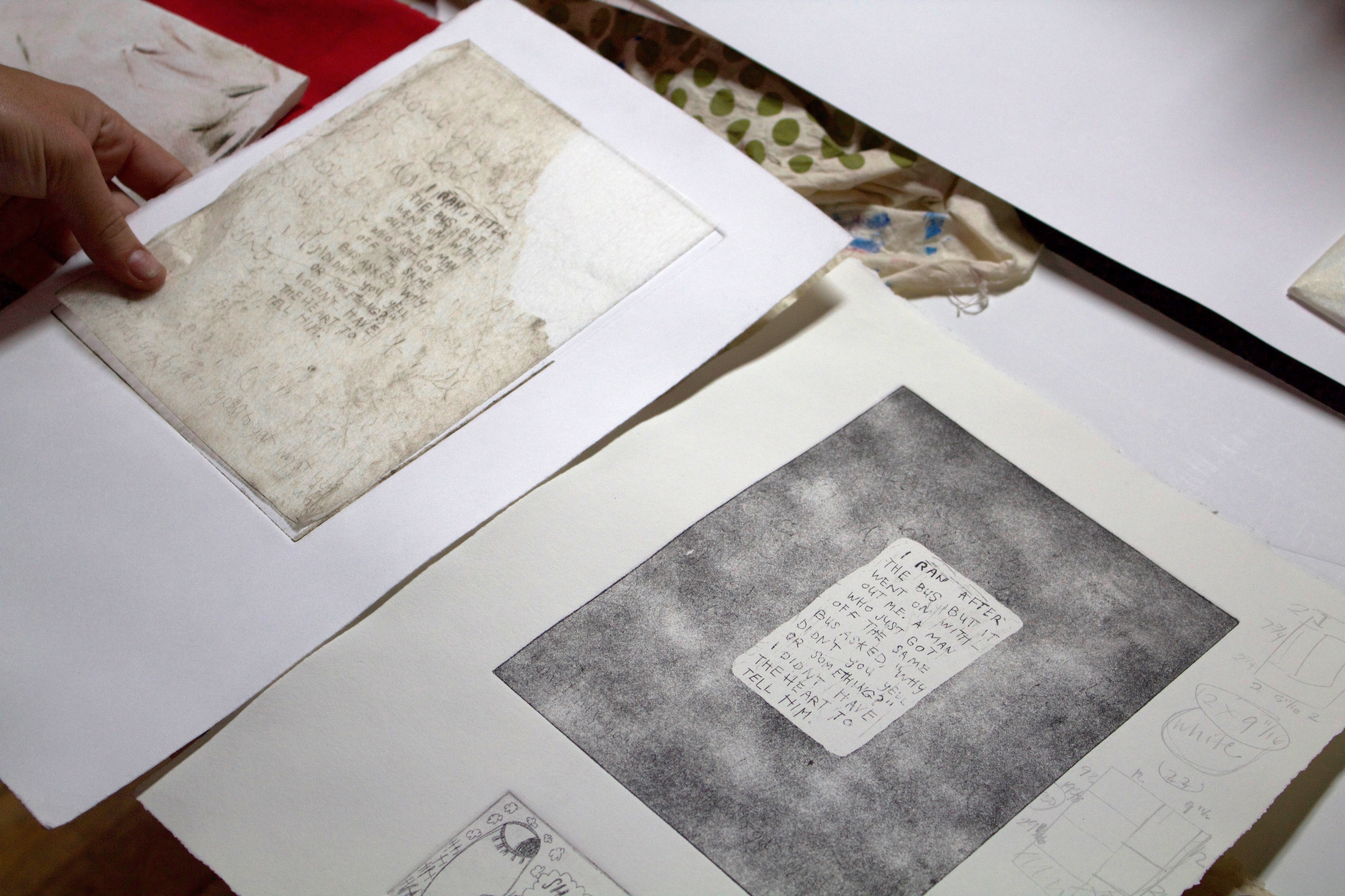
I had been doing the @polenta_girl thing, which is my drawing project and I had been trying to figure out how to move forward from there. It was not serving me anymore, so I started thinking more about writing as a practice, and then I made this print during my fellowship, which perhaps is nothing and everything at the same time?

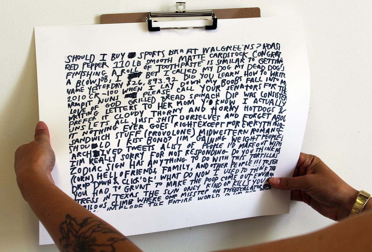
I was really interested in exploring the finality of the monoprint in congruence with the finality of language. I started writing, and if I messed up I had to scratch it out and keep writing and writing and I did it all in one take.

LJ: It’s almost like an exercise.

GM: Yeah, for sure. I started making more of these writing pieces, or exercises, and then I created a series of work in response to the thought: “if I could talk to God, what would I say?” First I made the monoprints, and then after my fellowship I made a triptych of paintings called Conversations With God.

LJ: Oh wow! I hadn’t realized those were paintings.

GM: Yeah, they are about 4 feet by 9 feet when they are all hung up together. The paintings are from my perspective talking to God, from a businessman’s perspective talking to God, and from a baby’s perspective talking to God—but in the end it’s all me, calling out to God. The conversations get cut down to be abstracted, which makes it difficult to decipher for the viewer. I’m still figuring out why, but I have these two constant conflicting urges to either make something really confusing or make something abundantly clear. So this was me doing a visually confusing project.

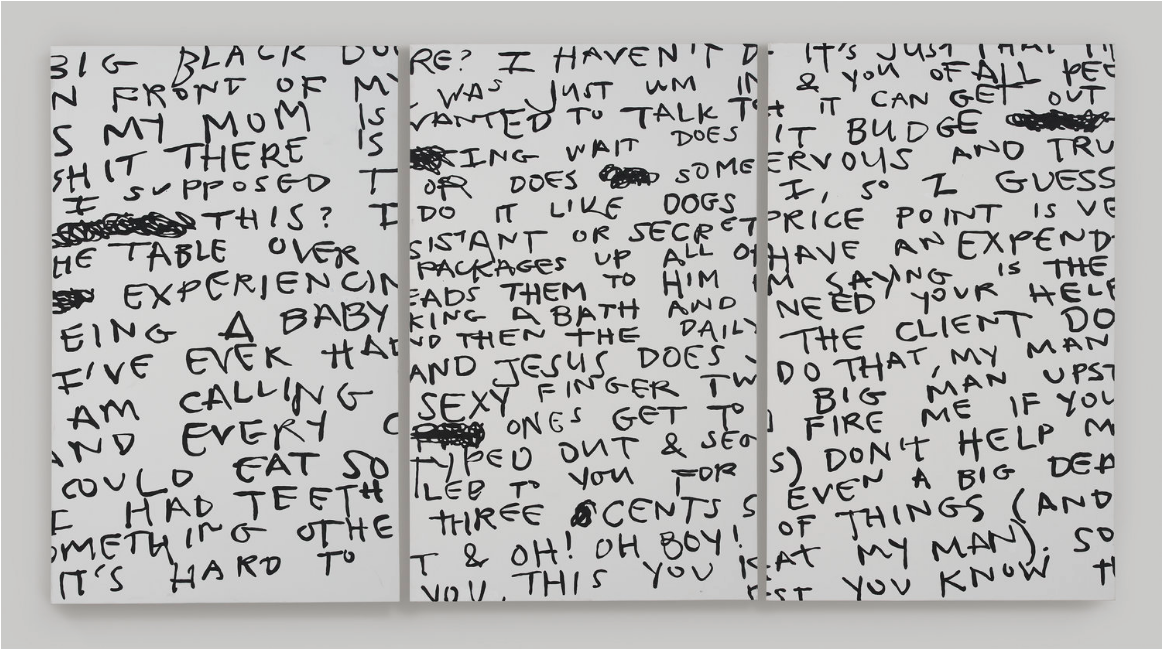
LJ: As a viewer, it’s such a natural response to want to be able to finish the sentence, to figure it out.

GM: Yeah! I’m so glad you said that. That’s a huge part of my practice now. I’m currently making work that revolves around the idea of making one good sentence. If I could just make one ‘good’ sentence, what would it look like? What would the language be like? How would it sound coming out of someone else’s mouth? I think it’s a very millennial urge to want to be brief about something – 140 characters or less.

LJ: You said you’re working on a new etching series. How is that going?

GM: These are the plates for my etchings. They’re in the Twitter font, Helvetica Neue Light, but it’s hand lettering that I’ve done. They read “You took a shower” and “I watched a 20 minute Vine compilation on my phone,” and it’s about feeling sad after you have sex.

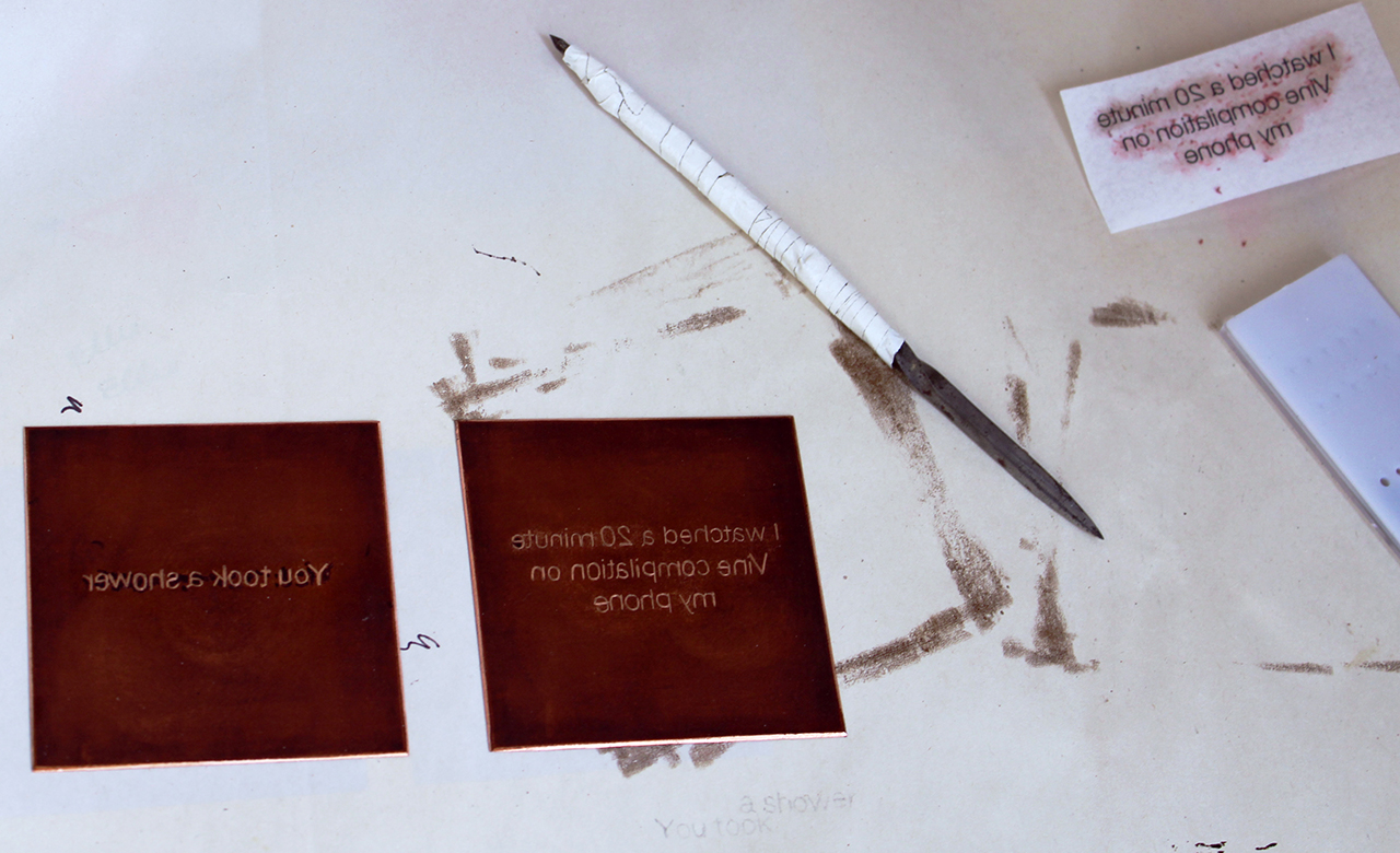
LJ: Why is it important that you replicate the font by hand?

GM: For me, the Twitter font is super important because […] I think of it as my number one source of inspiration. The people who know me best are the people who follow me on Twitter. I’ve had a Twitter account since I was 14 in 2009. I’ve tweeted nearly 25,000 times. I treat it like an encyclopedia of every thought I’ve ever had that I felt was important enough to share. I think a lot about the millennial disposition of knowing that the people who read my twitter might be able to speak more to my daily state of being than my employers, family members, and even certain close friends.

LJ: Beyond Twitter, what are your biggest inspirations or driving forces behind your work?

GM: Right now I’m reading all of Maggie Nelson’s work and she’s blowing my mind constantly. The way she writes and her ability to move from one thought to the next are effortless. People have referred to her writing as genre-bending and I agree. People need to read The Argonauts!

Also, meme culture is a big influence for me. I think people of different generations are really quick to discredit memes as an important and unique form of communication. I think the way that our generation disseminates crucial information and knowledge is really incredible because it’s visual now, and I think about that all the time. We shouldn’t discredit memes.

LJ: I agree.

GM: Thirty or forty years down the line I don’t know if people will still be making memes, but right now it’s this creative burst of: “Let’s only talk to each other in pictures!”

LJ: Let’s talk about Chicago. Are you from Chicago originally?

GM: I’m from a suburb about 30 minutes north called Northbrook. I went to school in Austin and I really missed Chicago the entire time I was there. There are some things about this city that are super unique to it that I just really missed. I think it’s a great place to live especially if you’re into printmaking.

LJ: Yeah, it seems like there’s a lot going on here.

GM: There’s a ton of printmakers everywhere! I went on the Chicago Print Crawl recently and was blown away by the number of printmaking spaces that exist here! I love living in Chicago. I have a small 5 year old dog and we love the city, we’re just two city girls.

LJ: You already touched on this briefly, but I’m pretty interested in the role your identity plays in your work. You mentioned striving for this sort of intense clarity and when I was looking at your drawing projects some of them struck me as very vulnerable. Yet the way that you’re putting your work out there sometimes makes it seem more like a statement. It’s an interesting balance that I also struggle with in my own work—how intimate do I get with this anonymous audience, the Internet?

GM: It’s interesting that you say that because I get super vulnerable on Twitter and then I refine it with my art. When I say Twitter is a big part of my process, it’s huge. I really do use it like a personal encyclopedia.

Touching on the humor as part of my identity, I come from a family that is really goofy and makes fun of each other a lot. There have also been a few really traumatic things that have happened in my life within the past five years. My dad got diagnosed with Parkinson’s when I was in High School and when I turned 19, I ended up becoming his primary caretaker. So, in addition to working two jobs, and trying to be an artist, and going to school, I was taking care of my dad. That’s a huge part of my identity that a lot of people don’t know about and informs a lot of my personality, and who I am, and how I carry myself. I have this blind optimism all the time because—and this is why I think a lot of my work is funny or really vulnerable—I always think you have two options: you’re either going to laugh or you’re going to cry. And for me, I always prefer to laugh. I make a lot of work where I can open up about things to an extent, but leave it after getting to a certain point and then I cover it back up with humor. It’s a really fine line.

LJ: Right, how much do you give, and…

GM: …how much do you keep to yourself […]. Yeah, my dad, has this great phrase that I think everyone should hear. He says: “It’s all going to be okay, how could it not be?” It’s not necessarily good advice [laughs], but it’s that sort of blind optimism thing can really get people through the heavier stuff.

LJ: Right, sometimes you kind of have to lie to yourself a little bit to push through things.

GM: I’m actually working on a new painting right now that’s just going to be the words “faith beyond reason” over and over again. It’s going to start out as a regular font, and then I’m going to make it italicized, and then bold it. I’ll keep adding layer after layer, which represents my total mentality that sometimes you have to do things without asking why.

LJ: How do you juggle all the different mediums you work in?

GM: That’s a great question. I used to be really scared of sculpture, but for the first time this past year I’ve started to make work that’s not 2D and it’s blowing my mind to be honest. I don’t know if I’m just doing it with faith beyond reason.

LJ: Sometimes it just takes being out of a classroom setting to explore other things.

GM: Yeah, there’s so much pressure in school. Honestly, I think a big turning point for me has been this recent piece I made out of children’s letter blocks.

You know how I was talking about this overwhelming urge to make one good statement or sentence? So far I’m just getting fragments, but I think that’s okay. I’ve decided to allow myself to just keep making fragments.

LJ: Maybe it’s not really a fragment because you are the subject of everything you’re writing.

GM: Yeah, I think it’s interesting. It says: “In a rush to find comfort,” but it’s also not easy to read and that kind of goes back to the paintings I made. I want to say something, but then I feel the need to mask it either through humor or confounding it some other way.

LJ: Do you have a favorite memory associated with Spudnik?

GM: There’ve been a lot of good times, but the most memorable I think was during the 10th Birthday Bash when me, Yewon, Jess, and Jazmin (they were part of my fellowship cohort) were competing against Hoofprint Workshop in a screenprinting competition with a mini squeegee and a big screen. We did the worst job ever! It was pitiful and we were all trying pretty hard, too. That was pretty funny.

LJ: Do you have an artist(s) that inspired you to want to become one?

GM: I don’t think there’s a specific artist that inspired me. My parents met in grad school in an MFA writing program. My dad’s a painter and my mom writes and is actually writing plays right now which is so cool – she’s really getting back into it. I grew up around all that energy and my parents did a really great job of taking us to museums. I remember seeing my mom’s favorite painting, Time Transfixed by Rene Magritte, at the Art Institute of Chicago when I was young. I’ll always remember her asking me these wonderful and specific questions about it while we stood there looking at it together. My parents did an amazing job educating me about art and they just really wanted me to be an artist. I know that [my family] will blindly support me no matter what. I say that from a place of incredible privilege and I’m very thankful for that. Also, I’m thankful for my family’s goofiness in general.

LJ: What are your current obsessions?

GM: Oh, yes! Here we go: anti-inflammatory diets, Phoebe Bridgers, reading Barron’s SAT vocabulary flashcards, following mid-century modern antique companies on instagram, my dog, Oscar Chavez’s show Fashion Nova Presents: Carpe DM at Chicago Artists Coalition, and of course, Dolly Parton.

If you want to find out more about Grace and her work you can visit her website or follow @gracemakuch on Instagram.

Alumni Highlight: Julia Arredondo

Every year, we welcome three amazing artists unfettered access to our studios through our unique Residency Program. We are excited highlight an alumni from this program, our 2015 Resident Artist, Julia Arredondo and share her post-Residency trajectory.

Julia Arredondo is an artist, writer, budding entrepreneur, and zine maker. She runs two publishing entities, Vice Versa Press and Curandera Press. Arredondo is originally from Corpus Christi, Texas and her mixed Latinx-Italo background has inspired a lifetime of exploration. She cut her chops early by making show flyers and organizing community events; and now she designs, creates, and produces artwork both for aesthetic and functional purposes.  She is currently pursuing her MFA at Columbia Chicago.

Angee Lennard (AL): What were you up to before your residency at Spudnik Press? Were you making lots of art or more in an incubation phase?

Julia Arredondo (JA): Before my Spudnik residency, I was living in a one-bedroom apartment with my Mom in rural Oklahoma. I like to consider my time in Oklahoma an incubation period, where I worked on my websites and developed the vision for my DIY business, Vice Versa Press. I documented old work, re-examined half-written zines, cooked meals for my Mom, cleaned. It wasn’t the most pleasant of times, which is why the residency provided me with such a pivotal opportunity for my practice. There was no future for me in Oklahoma.

AL: During your residency, your main project was developing the zine Guide to Being Broke & Fabulous. Can you talk about your goals for this project?

JA: I had been wanting to write Guide to Being Broke & Fabulous for at least a year. I’d done some time interning at Island Press in St. Louis (which is where the idea initially came to be) and traveling from residency to residency had provided me a life of freedom, but without much cushion and without any luxury. People always asked me how I was able to get around so efficiently, and I wanted Guide To Being Broke & Fabulous to detail the lifestyle that I had grown accustomed to but which was very foreign a concept to a majority of people. My goal was to express the lifestyle of instability, which I think a lot of people romanticize, but to express the ups and downs and the magic that is intertwined with the politics of cool and socio-economic disparity.

AL: Now that it’s been a few years since your residency, can you talk about if or how the Spudnik residency impacted your artistic trajectory?

JA: The residency pretty much put me back on track to having the art career that I worked so hard to attain. I’m still working at it, but the residency provided me with the space and tools necessary to see my vision through without having to pick up and go for the zillionth time. I’m still located in Chicago, and I attribute that to Spudnik Press completely. I’m pursuing my MFA at Columbia College and I’m part of a creative community that would have been near impossible to penetrate without the help of the Spudnik residency. The Midwest art circuit is insular in many ways; Spudnik Press welcomed me into the community, no questions asked.

AL: After your residency, you stuck around Spudnik as a studio artist and are now working towards a masters degree at Columbia College. You’ve mentioned how you’ve enjoyed “infiltrating academia.” Can you share a joy and challenge of heading back to school?

JA: Academia is full of opportunities and this I recognized early on having grown up in a poorer part of the country. Academia was my ticket out of the lifestyle that I had grown up in, and I didn’t want to struggle the way I had watched my family struggle in order to get by. Sure, I struggle in my own way, but the life I’ve chosen is pretty much that…MY choice. Academia has classist and racist tendencies which are obviously problematic, so it’s difficult at times navigating those spaces. And as a person without support from my family, getting a leg up in the art world seemed to require me to talk the talk even if I wasn’t born to walk the walk if you know what I mean. But I’m here regardless, here to infiltrate the bourgeois systems and have a decent time doing it.

My favorite part of going back to school is learning how to read again. I hadn’t realized that I’d lost so much focus in my artistic research practice.

AL: Your work includes DIY zines, punk fliers, craft, and fine art objects, and often it’s hard to tell what category to place your artwork. Is it important to you that these often isolated art forms are brought together? 

JA: Ugh I don’t know, I’m still struggling with all of my different practices that vary so widely. My answer to this dilemma is branding. I have Vice Versa Press, which began as a counter-cultural publishing entity but is transitioning into a lifestyle brand. I have Curandera Press, which is a web shop that specializes in handmade ritual and magic goods. And then I have Julia Arredondo, fine artist and designer looking to make the big bucks. Business is a huge part of my practice, and I’m trying to incorporate my making practices into a sustainable career.

AL: Speaking of sustainability, we recently were talking about the conflict between “punk economy” and sustainability and how value is perceived in different economies. Is your priority to find a way for your own economic sustainability? Or are you more focused on tinkering with these established value systems? 

JA: Hell yes my priority is carving out a sustainable career for myself. Otherwise I’ll be at the mercy of a global economy that places little value on labor by women and people of color. The odds are against me in that market! However, I’m also interested in exploring the alternatives that exist within our capitalist system and playing within that realm that is so incredibly oppressive. Maybe I’m here to troll. It’d be great to bank, but mostly I’m here to work and push boundaries–hopefully without going to jail. That is my real goal.

AL: Do you have any shows coming up soon? Where can people see your art in person?

JA: I’ll be exhibiting with Curandera Press at the Slow & Low lowrider fest in September, but I’m pretty much just working and reading and trying to center myself for the next big project I’m planning to release this year titled “Addicted to the Money”. It’ll be a poetry suite documenting my time working as a Sugar Baby. I’ve got plans to release a cassette tape this year, but I’ve gotta get back to my musical roots for that. It’s been a while. I’m currently off the grid for a month, so the best place to view my art right now is on Instagram via @cop_charmer_69@viceversapress, and @curanderapress.

Where can you read more about Julia?

The Overlook, June 2018
ReMezcla, December 2017
Bmore Art Blog, April 2016
Project Nerd, September 2015
Clocktower Radio, September 2015
Citypaper (Review of Baltimore Breakups), February 2015

Member Interview: Colleen Hardison

Colleen Hardison is a Chicago-based freelance illustrator. She graduated from Massachusetts College of Art and Design with a BFA in Illustration and moved to Chicago in the summer of 2015. Her illustrations and drawings are raw, dark and vivid, often making a subtle reference to current social and political issues. Her process is very iterative and often builds off of old sketches or evolves from a collage of her previous ideas. She works primarily out of her sketchbook, rendering drawings with ink pens and then developing them through illustrator, before deciding to print them out. She is currently learning how to incorporate screenprinting and risograph printing into her practice.

Manisha: How would you describe your work and what medium do you primarily work in?

Colleen: So I would describe my work as naïve and graphic. I like to use gouache, which is unfortunate because it’s really expensive. I also enjoy flat and inky things. When I first started school, I was focused on executing my renderings in a realistic style and worked primarily with oil paint. But then one of my professors at the time told me: “Great job, but this is boring. Your sketches are finals.” And that stayed with me because I like to work pretty fast and loose using a lot of colors.

Manisha: That’s something that caught my eye about your work. While it may be loose and painterly, it can be interpreted both as a work in progress or something that is finished.

Colleen: Yeah, because if I mess things up from the start, I don’t feel married to it so I can keep pushing the idea until I like it or just throw it out. Mostly I just throw it out. So I have a graveyard of scraps from previous sketches. I also like to work on five different things at once. What usually happens with most of my projects is that I draw something, thinking to myself “well, this looks good enough,” and then end up re-doing it until I’m happy with it. Or sometimes I scan my work and play with it in Photoshop. I like ink and Photoshop a lot. So I would say I work with a combination of the two. However, something that I do try to keep intact in all of my work is the initial sketchy feeling.

Manisha: Have you worked with any other forms of printmaking?

Colleen: When I was in school I tried etching and monotypes. I did a little bit of offset, which I really enjoyed. But because of the way my school was set up, you couldn’t be a print major and an illustration major. So I stopped printing at that time. Later when I found Spudnik I decided to become a member and take up printmaking again.

Manisha: Does your work deal with specific themes or subjects?

Colleen: I like the idea of combining two disparate things together as much as I can. I am also drawn to things that are goofy and childlike, but at the same time weird and a little off-kilter. For instance, I am a fan of outsider art and I like how things are unexpected, and sometimes brash.

Manisha: What kinds of things are you reading or looking at that are influencing your work right now?

Colleen: Right now I am looking at old tattoo flash art from the 40s. I keep a close eye on anything that strikes me as an odd quality in the sketches. In some ways, the tattoo flash art reminds me of American Folk Art and how artists then would create paintings and figuring things out as they went along. It’s all about the little imperfections for me. And on the opposite end of that, I am also studying Japanese woodcuts because they are so precise and mechanical. I am also looking at the way they separate colors and compose an image.

Manisha: Is there a project you are working on right now?

Colleen: I brought home a DIY silkscreen kit because I am trying to re-learn how to use screen filler and create a reductive print. Most of it is off-registration so of the twenty prints I made; I am happy with maybe just two of them. I’ve also been spending a lot of time adding new and interesting things to my portfolio. I’m at a stage where I am just forcing myself to draw and keep going. But I made something goofy this morning. My friend showed me this Facebook group called “Show Me Your Aspic”; aspic is similar to jello and the old term for gelatin. But it’s also a play on the more vulgar reference it’s making. So I made some art for that. It’s really kitschy and funny and I am obsessed with that stuff.

Colleen Hardison, a sketch for ‘Show Me Your Aspics,’ February 2018.

Manisha: There were two illustrations on your website that stood out to me because of the social message in them. One was called Serving Size and the other was called Bad Dog. Are those things that bother you or that you are consciously making work about?

Colleen: I’d say both. The Bad Dog piece was part of a larger series of work I did about child abuse. For this series, I was inspired by my interest in editorial illustration. I was focused on making something tangible out of a big idea. The Serving Size piece was for Tufts Magazine and it was about how portion sizes at Italian restaurants are inherently big. Those are just two takes on social issues that I try to represent in my style. But I do want to be an editorial illustrator someday so I constantly take up social issues and try to create images in response to them.

Colleen Hardison, ‘Serving Size,’ n.d.

Manisha: Do you have a pre-studio ritual?

Colleen: I linger. I linger a lot. I talk myself into it. Usually my pre-work routine is to watch a video of another artist doing something and then I’ll tell myself: “That’s what you could be doing if you weren’t sitting in your pajamas!” I have to psyche myself into it. I have this thing where my brain doesn’t turn on until nearly 10:00 p.m. at night. Sometimes I’ll draw something I enjoy, but most of the time I scrap it and then try again and it goes on. And that’s my process. It’s kind of insane.

A peek into Hardison’s sketchbooks from college.

Manisha: It feels like a frustrating writer process.

Colleen: It is annoying because sometimes I would have spent all day trying to come up with something and not accomplish anything. My process has never been easy.

Manisha: Did moving to Chicago influence your practice in any way?

Colleen: I like the artist community of Chicago and I want to be part of it. But occasionally, social anxieties get in the way. There are so many artists here and it’s overwhelming at times. It’s like being a freshman again and having to make new friends. But then this year I found spaces like Spudnik, and I pushed myself to try new things.

A selection of Hardison’s sketches.

Manisha: Where can people go to see you work?

Colleen: In April I am going to have my work up at Atomix Café in Chicago.

Manisha: And one last question. I know you love everything pastry. What would you say is your favorite kind of pastry stuffing?

Colleen: Ooh, oh there are so many. I love a buttery flaky outside and a really tart middle, maybe blackberry or raspberry. Something I didn’t experience until recently was Matcha. I think I got it in Chinatown and it was delicious!

If you want to find out more about Colleen or her work you can visit her website or follow dammitcolleen on Instagram.

Member Interview Series: Carla Fisher Schwartz

Carla Fisher Schwartz is a visual artist and educator based in Chicago, IL. Her studio practice investigates the relationship between the mapped image and contemporary notions of exploration, virtuality, and the simulated environment through print media, sculpture and video installation. Carla received her MFA in Visual Arts from Washington University in St. Louis. Her work has been exhibited at the Chicago Artists Coalition (Chicago, IL), Hyde Park Art Center (Chicago, IL)and the Kemper Art Museum (St. Louis, MO) among others.

Martin Feld : To get started could you tell me a little about yourself and your work?

Carla Fisher Schwartz:  Sure. I’m from California originally and came to the Midwest for Graduate School in Missouri and then ended up in Chicago. I took my first printmaking class in my sophomore year of college at the University of California Santa Cruz. They have a large lithography, intaglio, and relief studio overlooking the redwoods and the pacific ocean. When I first walked in, I instantly knew I wanted to stick around. I worked on my prints throughout college and afterwards interned at the Kala Art Institute in Berkley, California. Shortly thereafter I moved to Chicago for grad school. Right now, I would say my work has turned into many different things, but it’s definitely informed by the same thought process that I developed in my printmaking classes.

MF: Thinking about the work that does make use of print media, could you talk about the forms you are making with Binder’s board and speak to the shift from screen printing to using inkjet for those?

CFS: So I actually started those when I was a fellow at Spudnik in 2015. I was printing these open source textures for use in world-building video games, also known as sandbox games. I played these games in earlier iterations, such as SimCity, when the textures were pretty low resolution. While screenprinting the textures I experimented by turning them into more ambiguous forms, distorting them further and using halftones, without necessarily knowing what I would ultimately do with these. Eventually, I just cut one up and started folding and gluing it and that turned into a really fast way for me to work because I had access to screenprinting. I could print as many as I wanted without having to worry about technical specification. I let the process degrade the image instead of having to intentionally do it on a computer. At that time, I was just using paper to create these forms, so they had no support system and they would sink. In an effort to make them more archival and to be able to go bigger I switched to Binder’s board and started to use ink jet prints. This allowed me to work larger, and as quickly as I needed.

MF: Going back then, I was curious how your familiarity with printmaking informs the work that doesn’t fall within print media?

CFS:  The way I think about it is that the first art medium you learn is going to inform the way your brain works whether or not you keep on doing it. So with printmaking I’m thinking in terms of variability and testing variables and this often carries over into my other projects. For example, when I’m making a video or working on an installation with found objects, I’m still doing the same thing I might do with an intaglio plate. I apply the idea of a matrix being variable to my work, regardless if it’s a digital file or and installation. It may not be explicit in the end, but thats how I work through an idea. I also think printmaking informs how I think about images. I think of what happens when we multiply an image and how does that gain or hide its power? That definitely conceptually informs everything I do.

MF: In that realm, you are looking at older maps that are being produced with various printmaking techniques and I’m curious how your tactile understanding of producing those maps informs how you look at them?

CFS:  Well, I suppose there are certain conventions and styles of early print ephemera and mapmaking, for example, hand painted lithographs, that inform what I do. For a time, I was making images that were mimicking 19th-century print ephemera, like scientific and diagrammatic reproductions. When you look at that kind of image, you read it as a certain degree of truth. So there is some kind of authority there that comes with those aesthetic conventions.

MF: Thinking about truth, one of the things I was really interested in while I was looking at your work is the idea of “un-discovery” that you explored in an older series, We Do Not Profess to Construct Planets, and it seems to be a thread that is still evident in your art work? That was the first time I had ever seen that term. Could you talk about “un-discovery?”

CFS:  I don’t think I made it up, but it’s not a term that people necessarily use. In the age of discovery, exploration, and colonization, there was adding. The adding of places, adding of territories and adding of landmasses to the map, and then after there had to be the process of “un-discovering,” or removing from the map. For example, removing Atlantis from the map, or acknowledging that California isn’t an island inhabited by Amazons. So there was this simultaneous process of “un-discovering” happening in a time period we tend to associate more with the act of ‘discovery’. The reason that came up for me stems from a project I was doing about Sandy Island, a nonexistent island in the South Pacific, that spans many different works. In the case of Sandy Island, however, it’s not a unique event. That kind of thing used to happen all the time; removing an island when it was determined to not exist. What is interesting about Sandy Island is that it was removed in 2012, at a time in which we have become accustomed to that not happening anymore, which makes us question our confidence in satellite imagery as an authoritative representation of the world.


MF: In that realm and thinking about Sandy Island Travel Bureau, I was curious about the role that fiction plays into your work.

CFS: Oh, I love fiction [laughter].

MF: What is your working process like in relation to fiction, especially with something like Sandy Island Travel Bureau that is fictitious but very much real in its fiction?

CFS: I’ve always been very interested in the blurring of fact and fiction. One of my favorite examples of artwork that does that well is the Museum of Jurassic Technology in Los Angeles. It’s a project by Dave Wilson, where once you are inside this museum, you’re never quite sure if the information in the exhibitions is factual or not. As a viewer, I love that kind of experience. The museum appears to present fiction as fact and then gives you information that is true, but seems like it is fictional. I think, in terms of my work, I’ve always been interested in how something that is fictional, like a place that exists on a map but not in the world, is in a sense real, because representations like maps very much inform our experience of the world. So for me, the line between fact and fiction, or physical and virtual, is indistinct. I enjoy artwork that uses tropes of science and museums to convey authority; Mark Dion, for example, does this so well.

MF: You toy with these ideas that have become absurd, like the mapped islands that don’t exist. I thought that piece were very funny in a certain way.

CFS: Thank you. That’s what I want.

MF: Can you talk about the use of humor in art and you’re approach to using humor given the difficulties it presents in terms of clear communication?

CFS: I I think there should be more funny art [laughter]. I guess I really enjoy funny artwork. Sometimes I struggle with this and feel this impulse that humor needs to be separate from art – that in order to have work that makes effective arguments and communicates ideas, my work should be serious. Yet it’s something I really try to emphasize in my own practice and really enjoy in other artists’ work. I think absurdity is a really effective tool for poking or exposing conventions that we have become accustomed to.

MF: Yeah, I’m a big fan of humor in art. I think of the ways in which humor is hard to control. The difficulty of knowing exactly how it works makes it a useful tool.

CFS:  That’s definitely something I’m still learning: How to not only make something funny, but make it funny in the way that I want to be funny.

MF: Thinking about being a virtual explorer and traveling across the globe from the comfort of your couch, how does that relates to your local context here in Chicago?

CFS:  In terms of the physical space of Chicago, it’s a place that’s full of hints of what the city used to look like. Even in little ways, hinting at how the street level of my neighborhood was originally at a different elevation, or the changing coastline of the city. When you walk around, you get these reminders of the city’s transformation. They are like traces of the invisible side of Chicago, and not totally apparent but really fascinating to me. I think it’s all part of the way we think about a place. A place is not just what it looks like; it’s all these stories, myths, maps and contexts that are layered within a place.

MF: Do you ever go around Chicago in street view using Google Maps?

CFS:  Oh yeah, all the time. You can do more now with the current Google earth. A lot of this work stems from me asking myself: is what I’m doing actually exploring in any way? What’s the space that I’m exploring? I know I’m not alone in that hobby. I’m a fan of physically traversing a space virtually and the slowness of the street level interface, while still being, of course, much faster than walking.

MF: As you mentioned, you were a studio fellow here at Spudnik in 2015. What were you doing while you were here? How was your practice influenced by your time spent here and how has it changed since then?

 CFS:  So I was a studio fellow here a couple of year after I finished graduate school. I I didn’t know a lot of people here in Chicago, and I didn’t have a connection academically to the area, which were challenges I encountered after moving here. My fellowship at Spudnik was really helpful, not just in terms of having access to the equipment, but also in meeting other Chicago print and art people. I had a little space at home to work from, but it wasn’t ideal. I know a lot of people like myself have trouble divorcing their art practice from their living space, so having this space to come to and not only get work done, but also work collaboratively was just what I needed. Being able to speak with the other fellows and studio users and bounce off my ideas was a huge boost and just what I needed in terms of getting going after school. I started making those sculptural prints and landforms and working through my ideas, figuring out what kind of images worked with what kind of forms. That was a large part of what I was doing here, and also getting to play with printmaking processes that I hadn’t had access to do in a while. I was getting back to my mono-printing, polymer plate lithography, getting some more time to play around with screen printing. Spudnik has such a comfortable place to do screen printing, and I needed to have a non-academic situation to play with materials. So that’s a lot of what I did, what was the second part of your question?

MF: How has your practice changed?

CFS: The fellowship at Spudnik was definitely a tipping point in terms of what came next. After the fellowship ended, I stayed on as a key holder for a while and that was when I started thinking about three-dimensional print as a place to locate myself. I think that happened here and started me going in that direction of visualizing these non-existent landmasses as dimensional forms, as well as the other tangents that have emerged since then.

MF: Does your teaching practice pertain to print media and how does that play into your studio practice?

CFS:  I largely teach art appreciation classes at Harold Washington College. I also occasionally teach printmaking there, which I love to do. I have taught at Spudnik and I’m also teaching an experimental print class this semester for high schoolers at the School of the Art Institute. To me, teaching and making are inseparable because it’s the same kind of output — drawing connections between ideas. I find that teaching always informs what I’m doing outside of the classroom.

 MF: Earlier we spoke about fiction and I was interested in your relationship to literary sources and their influence on your practice.

CFS:  Peter Turchi’s book, Maps of the Imagination, which uses mapping as a way to think about writing, was actually really important in framing how I think about mapping in my work, and also made me realize how much the fiction I read is important to what I do. I read a lot of science fiction and related genres. My latest obsession is the Southern Reach Trilogy by Jeff Vandermeer, which centers around this mysterious unknown territory, and I keep drawing all these analogies to the interests of my own practice.

I think a lot about how books are able to describe the kind of spaces I’m interested in, like how China Mieville’s The City and The City describes this idea of two cities coexisting in the same space. There is something about the way fiction can describe invisible spaces or spaces that exist and don’t exist at the same time, that are useful to me as I consider the spaces depicted through the visual representation of the map.

A lot of titles that I use are from fiction, and I look to a wide variety of texts for inspiration. These texts, for example Flatland, can introduce alternate ways to think about how we experience a place and how it can be radically different, or that show us how specific and limited our experience of a place is. I spend almost as much time looking at these sources as I do the historical records. Perhaps that’s how I would want to approach this kind of work if I had the aptitude for creative writing.

MF: What are you currently working on and what projects do you have coming up? Are you currently showing work anywhere?

CFS:  So my next project involves printed fabric and I’m thinking about it in relationship to a Jorge Luis Borges story about mapping, On Exactitude in Science. It’s still in progress, but it involves using printed textiles for installations, and will probably end up in a group exhibition at ACRE Projects here in Chicago. So that’s what I’m working on now and I’m hoping to do some larger floor and wall installations as a part of this project.

If you want to find out more about Carla and her work, visit her website or follow her on Instagram @carla_f_s.